In this post, we will learn to do cross-tabulation in R, a good technique that we can use to show relationships within categorical variables. Specifically, we will learn how to create cross-tabulations, often called contingency tables, and have a look at their role in data analysis.
Unlike frequency tables that provide a one-dimensional view of categorical data, cross-tabulations offer a multidimensional perspective. We can use them to get a quick look at how categories within one variable intersect with those in another, enabling us to grasp dependencies, trends, and associations that may otherwise remain concealed.
Through examples, we will showcase how to create cross-tabulations using base R. We will further use functions from the dplyr and tidyr packages, such as count() and pivot_wider(). We will also use a function from the sjPlot package. Moreover, we will look at how we can interpret the results, calculating row and column percentages.
Whether analyzing psychological survey data, analyzing survey responses, or investigating trends in hearing science research, cross-tabulation in R provides a good tool to analyze and interpret categorical data. In this post, we will generate synthetic data to facilitate hands-on learning, enabling you to practice creating and interpreting cross-tabulations. Let us begin and learn to create and interpret contingency tables in R.
Table of Contents
- Outline
- Prerequisites
- Cross-tabulation
- Synthetic Data
- Creating a Cross-Tabulation in R using the table() Function
- Using R to Create a Cross-Tabulation with Proportions/Percentages
- Creating Cross-Tabulation in R Using xtabs()
- Cross-Tabulation in R with dplyr and tidyr
- Enhancing Cross-Tabulation: Row and Column Totals with dplyr
- Making a Cross-Tabulation with dplyr and tidyr: Percentages
- Creating Cross-Tabulation with sjPlot in R
- Interpreting a Cross-Tabulation in R
- Conclusion
- References
- Resources
Outline
This post is organized to provide an overview of cross-tabulation techniques in R. We begin by looking at the prerequisites and briefly introducing the concept of cross-tabulation. Here we learn the difference between cross-tabulation and frequency tables. Interpreting cross-tabulation data is then addressed, looking at its role in learning from data. An example will teach us how to interpret cross-tabulation tables.
Next, we generate synthetic data we will use for practicing cross-tabulation. With this dataset, we will look at various R methods of creating cross-tabulations. We begin by having a look at base R function table(). Next we extend this by incorporating proportions and percentages using prop.table() for a view of data distribution.
In the following section, we look at the base R function xtabs() function, learning its syntax for cross-tabulation. We demonstrate its application with and without percentages. Next, we will work with dplyr and tidyr to learn how to do cross-tabulations for subgroups, among other things.
Furthermore, the sjPlot package is utilized to create cross-tabulations that include percentages and parametric tests. In the concluding example, we interpret cross-tabulation results to draw meaningful conclusions from the data.
Prerequisites
Of course, to fully engage with the content of this post, you should have a foundational understanding of R programming. In this post, we will make use of the dplyr, tidyr. and sjPlot packages to create cross-tabulation in R. Therefore, you should install these packages to maximize your learning experience and put the demonstrated techniques to practical use. To install dplyr, execute the command install.packages("dplyr"). Additionally, consider installing the comprehensive Tidyverse package, which includes dplyr, tidyr and other valuable components that streamline data manipulation.
dplyr, a package handy for data transformation, includes powerful functions. For example, the package has functions that can rename a column in R, select columns by index and name, remove duplicates, and aggregate data.
As part of your preparation, check your R version in RStudio. To achieve this, run the command R.version$version.string within the R console. Keeping your R version up-to-date is important for accessing the latest features, bug fixes, and advancements in the R ecosystem. Should an update be necessary, the installr::updateR() command offers a convenient method to update R to the latest version.
Cross-tabulation
In data analysis, cross-tabulation, or contingency tables, is a dynamic tool for showing us the relationships between categorical variables. By systematically organizing data, cross-tabulation allows us to discern patterns, dependencies, and associations that may not be immediately apparent. But what exactly is a cross-tabulation?
What is a Cross-Tabulation?
A cross-tabulation, or contingency table, is a tabular representation that displays the frequency distribution of two categorical variables. It provides a multidimensional view of how categories within one variable intersect with those in another. Each cell in the table represents the count or frequency of observations that fall under a particular combination of categories from the two variables. This structure aids in identifying trends and relationships that can be important for data analysis and decision-making.
Interpreting Cross-Tabulation Data
Interpreting cross-tabulation data involves examining the patterns and associations revealed within the table. By calculating row and column percentages, we can gain insights into the relative distribution of categories and explore relationships between variables. These percentages reveal the proportional contribution of each category to the total count, aiding in understanding the strength and direction of the relationship.
Example
Let us dive into an illustrative example from cognitive psychology to grasp the practical application of cross-tabulation. For example, imagine that we want to study the relationship between working memory capacity (WMC) and attention level among participants. We can create a contingency table that showcases the frequency distribution of the memory task outcomes across different attention levels. Cross-tabulation can help us find associations and patterns between working memory and attention. Here is a simple crosstab:
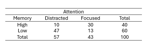
From the table, we observe that:
- Among participants with a high working memory capacity, ten individuals were distracted. Moreover, More individuals with high working memory were focused (30 individuals)
- For participants with a low working memory capacity, 47 were distracted, and only 13 were focused.
This cross-tabulation suggests a potential relationship between memory capacity and attention. Participants with high memory capacity are likelier to maintain focused attention, whereas those with low memory capacity are likelier to be distracted. The following section will teach us how to create a cross-tabulation in R.
Synthetic Data
Here is the synthetic data we will use in this post to create crosstabs in R:
# Set seed for reproducibility
set.seed(20230819)

# Generate synthetic data
n <- 200
participant_id <- 1:n
working_memory <- sample(c("High", "Low"), 200, replace = TRUE)
hearing_loss <- rep(c("Normal Hearing", "Hearing Impairment"), each = n / 2)

# Adjusted probability for FATIGUE == TRUE
fatigue_probs <- ifelse((working_memory == "Low" &
                           hearing_loss == "Hearing Impairment"),
                        0.7,  # Adjusted probability for this group
                        ifelse((working_memory == "Low" &
                                  hearing_loss == "Normal Hearing"),
                               0.5,
                               ifelse((working_memory == "High" &
                                         hearing_loss == "Hearing Impairment"),
                                      0.6, 0.2)))

# Generate synthetic data for Fatigue using adjusted probabilities
fatigue <- rep("No", n)
for (i in 1:n) {
  fatigue[i] <- sample(c("Yes", "No"), size = 1,
                       prob = c(fatigue_probs[i], 1 - fatigue_probs[i]))
}

# Add age
age <- sample(18:65, n, replace = TRUE)

# Create the synthetic dataset
synthetic_data <- data.frame(ID = participant_id,
                             Working_Memory = working_memory,
                             Hearing_Loss = hearing_loss,
                             Fatigue = fatigue,
                             Age = age)Code language: R (r)
In the code snippet above, we generated a synthetic dataset to practice cross-tabulation techniques in this post. We initiate reproducibility using set.seed(20230819) to ensure consistent results.
With 200 participants, each assigned a unique participant ID, we used the sample() function to randomly allocate participants’ working memory as “High” or “Low”. Similarly, we constructed a categorical variable for hearing loss, evenly distributing “Normal Hearing” and “Hearing Impairment” levels.
To add complexity, we adjust the probability of “Fatigue” being “Yes” based on working memory and hearing loss combinations. Here we used nested ifelse() statements. Moreover, we tailored probabilities to specific participant groups.
Again, we used the sample() function. We will generate the “Fatigue” variable for each participant based on our established probabilities. Incorporating age into the dataset, we used the same sample() function to select ages ranging from 18 to 65.
Notably, the sample() function can randomly select rows from R’s dataframe. Additionally, the colon : operator allows us to create sequences in R, as demonstrated in this case, to generate age values.
Creating a Cross-Tabulation in R using the table() Function
Creating a cross-tabulation with R’s table() function is quite straightforward:
# Create a cross-tabulation using the table() function
crosstab <- table(synthetic_data$Working_Memory,
                   synthetic_data$Hearing_Loss)

# Print the cross-tabulation
print(crosstab)Code language: R (r)
In the code chunk above, we created a cross-tabulation using the table() function. By selecting columns using the $ operator, we focused on the ‘Working_Memory’ and ‘Hearing_Loss’ variables from the synthetic dataset. Printing the crosstab displays the tabulated data, indicating the counts of observations within each combination of categories.
The table() function takes multiple arguments, with the first two being the categorical variables to be cross-tabulated. It also includes optional parameters like exclude and useNA for managing missing values and dnn for specifying the dimension names in the resulting table. The deparse.level parameter influences how column names are displayed.
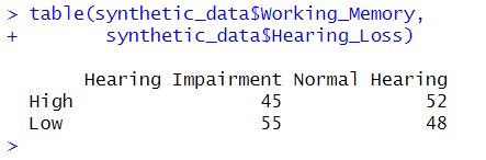
While the output shows us the raw counts, it does not immediately offer proportions or percentages. However, this can still serve as a useful initial assessment for further analysis.
Using R to Create a Cross-Tabulation with Proportions/Percentages
We can use the prop.table() to dig deeper into our dataset’s categorical relationships function to create a cross-tabulation displaying proportions.
# Create a cross-tabulation with proportions using prop.table()
prop_crosstab <- prop.table(table(synthetic_data$Working_Memory,
                                  synthetic_data$Hearing_Loss),
                            margin = 2)

# Print the proportion-based cross-tabulation
print(prop_crosstab)Code language: R (r)
In the code chunk above, we used the prop.table() function to generate a cross-tabulation containing proportions. By specifying margin = 2, we normalized the counts based on the column-wise totals. This normalization enables us to view the distribution of each ‘Hearing_Loss’ category within the ‘Working_Memory’ groups as a percentage of the respective column’s total.
The syntax of prop.table() is relatively straightforward. The function takes two arguments: x, the table of counts to be normalized, and margin, which determines whether rows do the normalization (margin = 1), columns (margin = 2), or both (margin = c(1, 2)).
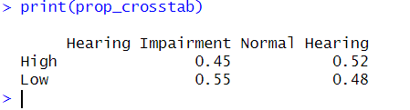
This proportion-based cross-tabulation provides a meaningful perspective on the interplay between the categorical variables, making it easier to discern patterns and trends within the data.
Creating Cross-Tabulation in R Using xtabs()
The xtabs() function provides another option to generate cross-tabulation in R. Here is how we get the same crosstab as in the previous example:
In the code snippet above, we used the formula xtabs(~ Working_Memory + Hearing_Loss, data = synthetic_data) to create a basic cross-tabulation. The formula uses the ~ symbol to specify the relationship between the variables ‘Working_Memory’ and ‘Hearing_Loss’.

The xtabs() function also offers additional arguments for further customization, such as subset, sparse, na.action, addNA, and exclude. These options allow us to filter the data, handle missing values, and control the inclusion of NAs. We will look at using the subset parameter next.
Cross-Tabulation in R for Subgroups
Let us have a look at the subset parameter of the xtabs() function by using the ‘Fatigue’ variable as a subset criterion. This will allow us to create a cross-tabulation focusing on specific conditions within our dataset.
# Create a cross-tabulation with subset using xtabs()
subset_crosstab <- xtabs(~ Working_Memory + Hearing_Loss, data = synthetic_data,
                         subset = Fatigue == "Yes")

# Print the subset-based cross-tabulation
print(subset_crosstab)Code language: R (r)
In the code above, we used the subset parameter to create a cross-tabulation that includes only observations where ‘Fatigue’ is equal to “Yes”. This subset-based cross-tabulation provides insights into how the relationships between ‘Working_Memory’ and ‘Hearing_Loss’ may differ when participants report feeling fatigued.
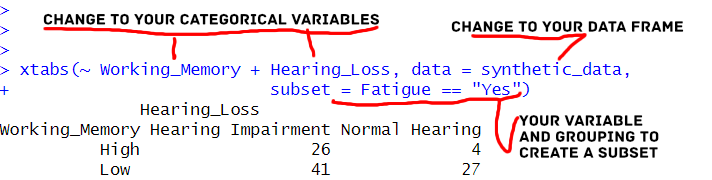
Utilizing the subset parameter can tailor our cross-tabulations to focus on specific conditions or criteria within our data.
Cross-Tabulation in R with dplyr and tidyr
We can create a basic cross-tabulation in R using the dplyr and tidyr packages. Here is a code example:
library(tidyr)
library(dplyr)

# Create a basic cross-tabulation with dplyr and tidyr
cross_tab <- synthetic_data %>%
  count(Working_Memory, Hearing_Loss) %>%
  pivot_wider(names_from = Hearing_Loss, values_from = n, values_fill = 0)

# Print the cross-tabulation
print(cross_tab)Code language: PHP (php)
In the code above, we first used the count() function to calculate the frequency of observations. Specifically, we do this for each combination of ‘Working_Memory’ and ‘Hearing_Loss’. Then, we used the pivot_wider() function to transform the data from long to wide format, creating a cross-tabulation table.
Let us look at the pivot_longer() function and how we use it. The names_from argument specifies the variable to create new column names, and the values_from argument specifies the variable from which to populate the cell values. The values_fill argument is used to fill in any missing values with zeros. Note that tidyr also has a pivot_longer() function that we can use to transform a dataframe from wide to long in R.
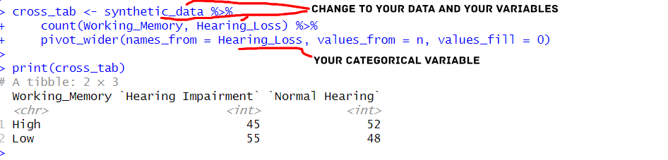
This approach with dplyr and tidyr provides a flexible and efficient way to create cross-tabulations in R, allowing us to quickly perform additional data manipulations and visualizations based on the results.
Subgroups
We can use the filter() function in combination with dplyr and tidyr to create cross-tabulations for specific subgroups. Here is an example:
# Create a cross-tabulation for subgroups using filter(), dplyr, and tidyr
subgroup_cross_tab <- synthetic_data %>%
  filter(Fatigue == "Yes") %>%
  count(Hearing_Loss, Working_Memory) %>%
  pivot_wider(names_from = Hearing_Loss, values_from = n, values_fill = 0)

# Print the subgroup cross-tabulation
print(subgroup_cross_tab)Code language: R (r)
In the code example above, we used the filter() function to select only the rows where Fatigue equals “Yes”. Then, we proceed with the same steps: counting the frequency of observations for each combination of Working_Memory and Hearing_Loss, and pivoting the data to create the cross-tabulation table.
By utilizing filter() along with dplyr and tidyr, we can generate cross-tabulations for specific subsets of data based on various conditions.
Enhancing Cross-Tabulation: Row and Column Totals with dplyr
With a bit of modification of the code, we can add row and column totals to the cross-tabulation table:
crosstab_w_total <- synthetic_data %>%
  count(Hearing_Loss, Working_Memory) %>%
  bind_rows(group_by(. ,Hearing_Loss) %>%
              summarise(n=sum(n)) %>%
              mutate(Working_Memory='Total')) %>%
  bind_rows(group_by(.,Working_Memory) %>%
              summarise(n=sum(n)) %>%
              mutate(Hearing_Loss='Total')) %>%
  pivot_wider(names_from = Hearing_Loss, values_from = n, values_fill = 0)Code language: R (r)
In the code snippet above, we used the dplyr package and the count() function to compute the counts for each combination of “Hearing_Loss” and “Working_Memory.”
Next, we used bind_rows() to append additional rows representing row and column totals. We achieved this by first grouping the data by “Hearing_Loss,” summarizing the counts with sum(), and adding a new row labeled “Total” with a corresponding value in the “Working_Memory” column. Similarly, we grouped the data by “Working_Memory,” calculated the sum of counts, and appended a “Total” row with “Hearing_Loss” labeled.
Finally, we again used the pivot_wider() function to reshape the data, creating columns for “Hearing Impairment,” “Normal Hearing,” and their respective row and column totals. Here is the resulting table:
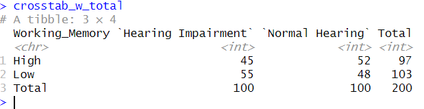
This code chunk generates a comprehensive cross-tabulation table with row and column totals, offering a comprehensive view of the data distribution across “Hearing_Loss” and “Working_Memory” categories.
Making a Cross-Tabulation with dplyr and tidyr: Percentages
# Create a cross-tabulation for subgroups using filter(), dplyr, and tidyr
crosstab_percentages <- synthetic_data %>%
  count(Hearing_Loss, Working_Memory) %>%
  pivot_wider(names_from = Hearing_Loss, values_from = n, values_fill = 0) %>%
  mutate(Total = `Hearing Impairment` + `Normal Hearing`,
         `Hearing Impairment (%)` = (`Hearing Impairment` / Total) * 100,
         `Normal Hearing (%)` = (`Normal Hearing` / Total) * 100) %>%
  select(-Total)Code language: PHP (php)
In the code example above, we begin by tallying the counts, much like our earlier example involving the count() function. Following this, we apply pivot_wider(), as before.
However, we introduce a new step. After computing the overall count for each combination, we calculate percentages by dividing the individual counts by the respective total count and multiplying by 100. We then add new columns in the table, “Hearing Impairment (%)” and “Normal Hearing (%).” These percentages indicate the relative distribution within each “Working Memory” category.
While this intermediary table, named subgroup_cross_tab, encompasses both counts and temporary percentages, the primary purpose of the percentages is to offer insights into each subgroup’s distribution. Later in the process, we remove the total column using select(), resulting in a table exclusively displaying the percentages. This approach resonates with specifying margin = 1 in the xtabs() function, where the row percentages are computed across the table.
Creating Cross-Tabulation with sjPlot in R
Here is a simple example of using sjPlot and tab_xtab() to do cross-tabulation in R:
# Create a cross-tabulation using tab_xtab()
cross_tab <- tab_xtab(synthetic_data$Hearing_Loss, synthetic_data$Working_Memory,
                      show.summary = FALSE)

# Print the cross-tabulation
print(cross_tab)Code language: R (r)
In the code chunk above, we first loaded the sjPlot package using library(sjPlot). Then, we used the tab_xtab() function to create a cross-tabulation between the “Hearing_Loss” and “Working_Memory”. The show.summary = FALSE argument ensures that additional statistical tests are not displayed in the results. However, sjPlot offers more advanced capabilities. We can also use the show.statistics = TRUE argument to display statistical significance tests, such as the chi-square test.
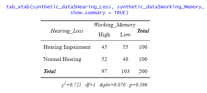
Moreover, the sjPlot package allows us to present the results with percentages and raw counts. Adding percentages can provide a clearer picture of the distribution within each category, making it easier to interpret the data. The generated tables and plots can be saved as files, enabling us to integrate them into presentations, reports, or publications seamlessly.
Interpreting a Cross-Tabulation in R
After creating a cross-tabulation, it is essential to understand how to interpret the results. As previously mentioned, a cross-tabulation provides a convenient way to explore the relationships between two categorical variables and analyze data distribution within different categories.
Example
Let us create, again, a crosstab in R using our synthetic data:
library(sjPlot)

tab_xtab(synthetic_data$Hearing_Loss,
         synthetic_data$Fatigue, show.summary = FALSE)Code language: R (r)
In this table, each cell represents the count of participants falling into a specific category based on their “Hearing Loss” and “Fatigue” status. The “Total” row and column provide the overall counts for each category.
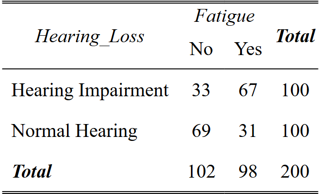
Interpretation
To interpret this cross-tabulation:
- We can look at the relationship between “Hearing Loss” and “Fatigue” by comparing the counts across the “Hearing Loss” rows. For instance, among participants with “Hearing Impairment,” 67 individuals experience fatigue (“Yes”), while 33 do not (“No”).
- By looking at the “Fatigue” columns, we can see the distribution of participants based on their fatigue status. Among participants with “Normal Hearing,” 29 individuals experience fatigue, while 71 do not.
- The “Total” row and column give the overall counts for each category. In this example, out of 200 participants, 104 have no fatigue, and 96 experience fatigue.
Conclusion
In this post, we learned how to carry out cross-tabulation in R, equipping us with different techniques for analyzing categorical data. We learned about crosstabs and how to interpret them. Specifically, we used the table() and xtabs() functions in the following sections. These functions both offer swift and straightforward ways to generate basic cross-tabulations. Furthermore, we used the versatile dplyr and tidyr to explore more advanced cross-tabulation scenarios.
Moreover, we used the sjPlot package, which provided us with an all-in-one solution with its sjt_xtab() function. This approach enabled us to generate tables with additional features, streamlining the presentation of results and minimizing the need for multiple steps (e.g., we got chi-square tests, p-values, etc.)
Please share this post with your fellow data enthusiasts and engage in the comments section below. I strive to update and add new content based on suggestions and requests.
References
Lovett, A. A. (2013). Analysing categorical data. Methods in Human Geography, 207-217.
Momeni, A., Pincus, M., Libien, J., Momeni, A., Pincus, M., & Libien, J. (2018). Cross tabulation and categorical data analysis. Introduction to statistical methods in pathology, 93-120.
Resources
Here are some other great R tutorials you will find helpful:
- How to Sum Rows in R: Master Summing Specific Rows with dplyr
- Correlation in R: Coefficients, Visualizations, & Matrix Analysis
- How to Create a Sankey Plot in R: 4 Methods
- Plot Prediction Interval in R using ggplot2
- Probit Regression in R: Interpretation & Examples