In this post, we will walk you through creating a Sankey plot in R using four different packages: ggsankey, gg alluvial, networkD3, and Plotly. Sankey plots are powerful visualizations that can help us understand data flow or resources between different categories or stages. However, creating a Sankey plot can be challenging, especially if you are unfamiliar with the programming language or visualization tools.
First, we will discuss the basics of Sankey plots and the data format required to create them. Then, we will dive into each package and show you how to create Sankey plots using them.
If you are new to Sankey plots or R programming, do not worry. Luckily, this post is aimed to be beginner-friendly and assumes little prior knowledge of Sankey plots or the R language. By the end of this post, you should be able to create stunning Sankey plots that will impress your colleagues and clients.
So, let us get started and explore how to create Sankey plots in R using ggsankey, ggalluvial, networkD3, and plotly packages!
Table of Contents
- Sankey Plot
- Requirements
- Example Dataset for Sankey Diagram in R
- How to Create a Sankey Plot in R: Four Different Methods
- Summary
- Resources
Sankey Plot
A Sankey plot is a graphical representation of flow quantities or amounts. Furthermore, the plot typically uses arrows or lines of varying widths to illustrate the flow from one category to another. The width of each arrow is proportional to the quantity or magnitude of the flow it represents. Sankey plots help show complex systems, networks, or processes where tracking the flow of items or energy from one stage to another is important.
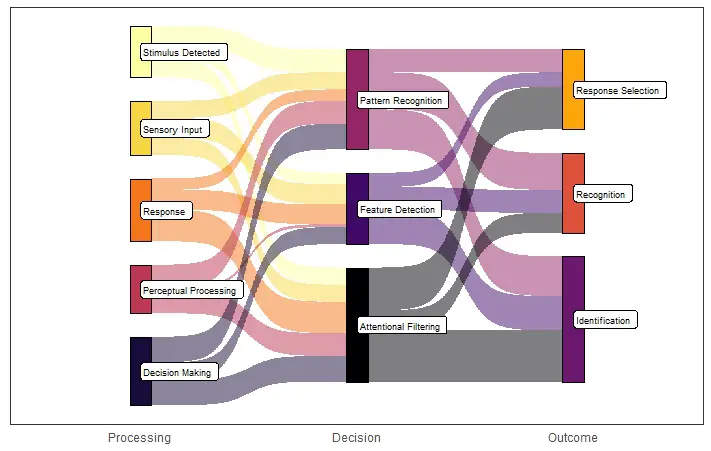
Examples of Sankey plots in Psychology and Hearing Science:
Sankey plots are useful in psychology and hearing science to illustrate the flow of information from one stage of a cognitive or perceptual process to another. Here are some examples of when Sankey plots might be helpful:
- In cognitive psychology, Sankey plots can represent the flow of information from the sensory input stage to the decision-making stage in a perceptual task.
- In hearing science, Sankey plots can be used to illustrate the flow of sound energy from the ear canal to the cochlea and then to the auditory nerve.
- Sankey plots can also represent the flow of patients through a healthcare system, from the initial diagnosis to treatment and follow-up.
- In social psychology, Sankey plots can illustrate the influence flow from one person to another in a social network.
Requirements
To follow this blog post on creating a Sankey diagram in R, you need the following:
- Prior knowledge of the R programming language.
- Knowledge of data manipulation in R is required.
- Be familiar with data visualization and creating plots in R.
Required Packages
In terms of packages, the blog post covers five different packages for creating Sankey plots: ggplot2, ggsankey, ggalluvial, networkD3, and plotly. To install the required packages in R, you can use the install.packages() function followed by the package names. For example, install.packages("ggalluvial", "networkD3", "plotly") will install three of the packages. However, the third, ggsankey, need to be installed from GitHub. Here is how to install ggsankey using devtools: devtools::install_github(“davidsjoberg/ggsankey”). Additionally, you need to install dplyr.
Data structure
We need to have our data in a specific format. Specifically, each row in the dataframe should represent a flow from one node to another. Moreover, the nodes themselves need to be represented in a separate dataframe.
Example Dataset for Sankey Diagram in R
Here is an example dataset and code to generate a Sankey plot in R based on a hypothetical psychology example:
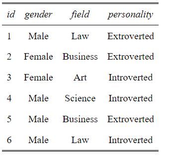
In the example data, we suppose we have conducted a study on the relationship between personality traits and career choices. We collected data on 100 participants and grouped their personality traits and career choices into four categories. Here is the summary table (descriptive statistics) of the data collection:
# create a dataframe with 100 participants
df <- data.frame(id = 1:100)

# randomly assign gender and personality traits
df$gender <- sample(c("Male", "Female"), 100, replace = TRUE)
df$field <- sample(c("Science", "Art", "Business", "Law"), 100, replace = TRUE)

# assign personality traits based on field of study
df$personality <- ifelse(df$field %in% c("Science", "Art"),
                                   sample(c("Introverted", "Introverted",
                                            "Introverted", "Extroverted"), 100,
                                          replace = TRUE),
                                   ifelse(df$field == "Business",
                                          sample(c("Introverted", "Extroverted",
                                                   "Extroverted"), 100, replace = TRUE),
                                          sample(c("Introverted", "Extroverted"),
                                                 100, replace = TRUE)))

# use ifelse() to set gender proportions based on field of study
df$gender <- ifelse(df$field %in% c("Science", "Business"),
                              sample(c("Male", "Female"), 100, replace = TRUE,
                                     prob = c(0.611, 0.389)),
                              ifelse(df$field == "Art",
                                     sample(c("Male", "Female"), 100,
                                            replace = TRUE, prob = c(0.388, 0.612)),
                                     sample(c("Male", "Female"), 100,
                                            replace = TRUE, prob = c(0.545, 0.455))))Code language: R (r)
In the code chunk above, we start by using the set.seed() function to ensure reproducibility of the results.
Next, we create a dataframe df with 100 rows representing 100 participants. Here we use the data.frame() function to create a new dataframe. In this dataframe, the id column is initialized with values ranging from 1 to 100 (a unique number for each participant).
We then use the sample() function to assign gender and field of study to each participant randomly. The sample() function selects a random subset of values from the specified vector, and the replace argument allows for sampling with replacement.
We also used R’s %in% operator to check if the df$field values belong to the specified categories. This operator returns a logical vector indicating if the element on the left-hand side is found in the vector on the right-hand side.
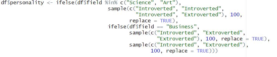
Based on the field of study, we use the ifelse() function to assign personality traits to each participant. If the field is science or art, the personality is randomly assigned to be either introverted or extroverted, with introverted being more likely to be assigned. Extroverted personalities are more likely to be assigned if the field is business. Otherwise, introverted and extroverted personalities are equally likely to be assigned.
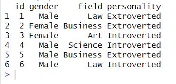
Finally, we use the ifelse() function again to set gender proportions based on field of study. If the field is science or business, the gender is randomly assigned with probabilities based on the proportion of males and females in the respective fields. If the field is art, the probabilities are swapped. Otherwise, equal probabilities are used. Here are the first six rows of the generated data:
How to Create a Sankey Plot in R: Four Different Methods
In this section, we will dive into how to create a Sankey graph in R. Each example is followed by information on how the data have to be formatted.
1. Sankey Plot in R using ggplot2 and ggsankey
To create a Sankey graph in R, we can use ggplot2 and the ggsankey packages. Here is a pretty straightforward example of how to use ggplot2 and ggsankey to create a Sankey plot:
library(ggplot2)
library(ggsankey)
# Creating a Sankey diagram:
skeypl <- ggplot(df_skey, aes(x = x
, next_x = next_x
, node = node
, next_node = next_node
, fill = factor(node)
, label = node)) +
geom_sankey(flow.alpha = 0.5
,node.color = "black"
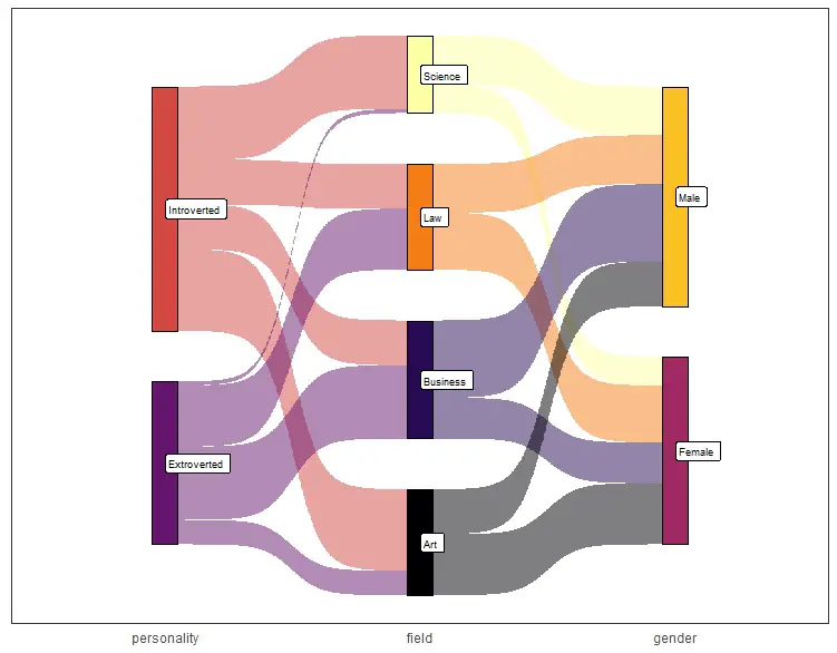
,show.legend = FALSE)Code language: R (r)In the code chunk above, we start by loading the two R libraries ggplot2 and ggsankey. We use the ggplot() function to create a plot object called skeypl. The plot shows a Sankey diagram which displays the flow of data or information between different categories or levels.
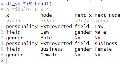
Next, we specify the data for the plot in a dataframe called ‘df’, which has columns for ‘x’, ‘next_x’, ‘node’, and ‘next_node’. The ‘x’ and ‘next_x’ columns represent the values of the flow from one node to another node. The ‘node’ and ‘next_node’ columns represent the names of the nodes.
We use the aes() function to specify the aesthetics of the plot. The ‘x’ and ‘next_x’ columns are mapped to the horizontal axis, while the ‘node’ and ‘next_node’ columns are mapped to the nodes of the Sankey diagram. The ‘fill’ argument colors the nodes based on their factor level, and the ‘label’ argument labels the nodes with their names.
Importantly, we create the plot using two ggsankey functions: geom_sankey() and geom_sankey_label(). We use the geom_sankey() function to create the Sankey diagram in R. In this function, we use the parameters for the flow alpha value, node color, and whether to show the legend. We did not want a legend, so we set it to FALSE. Finally, we use the geom_sankey_label() function to add node labels. Moreover, we used the font size, color, fill, and horizontal justification parameters here.
More data visualization tutorials:
- How to Make a Residual Plot in R & Interpret Them using ggplot2
- How to Create a Violin plot in R with ggplot2 and Customize it
- How to Make a Scatter Plot in R with Ggplot2
Transforming Data and Renaming Columns for Sankey Plotting in R
As you may have noticed, when creating a Sankey plot in R using ggplot2 and ggsankey, the data must be in a specific format. Specifically, the dataframe should be in long format. The dataframe should have columns for the source and target nodes and the value or flow between them.
To prepare a data frame for Sankey plotting, we can use the tidyr package. We use it to convert the dataframe to a long format. If we were to use this method, it would involve using the gather() function. This function can convert the columns to rows and specify the column names. However, this may involve renaming the columns using e.g., dplyr.
Alternatively, the ggsankey package provides a make_long() function that can convert the dataframe to a long format directly. This function takes the original dataframe and the column names for the source node, target node, and flow columns as arguments. When using make_long() we get a new dataframe in long-format suitable for Sankey plotting. Here is how we can use the function on the example data:
df_skey <- df %>%
    make_long(personality, field, gender)Code language: R (r)
2. Sankey Plot in R using ggplot2 and ggalluvial
To create a Sankey graph in R, we can also use ggplot2 and ggalluvial:
library(ggplot2)
library(ggalluvial)
# Create the Sankey plot:
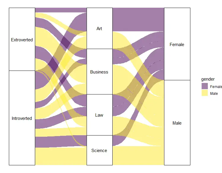
skeypl2 <- ggplot(data = frequencies,
aes(axis1 = personality, # First variable on the X-axis
axis2 = field, # Second variable on the X-axis
axis3 = gender, # Third variable on the X-axis
y = n)) +
geom_alluvium(aes(fill = gender)) +
geom_stratum() +
geom_text(stat = "stratum",
aes(label = after_stat(stratum))) +
scale_fill_viridis_d() +
theme_void()
skeypl2Code language: PHP (php)In the code chunk above, we use the ggplot() function to specify the dataframe and aesthetics. We use the aes() function to specify the aesthetics. Here we include the three variables “personality”, “field”, and “gender” on the X-axis, and the frequency count “n” on the Y-axis. Next, we use three functions to create the Sankey plot in R. First, the geom_alluvium() function is used to create the alluviums or “flows” between the different levels of the plot. In this case, the alluviums are determined by the “gender” variable and filled with different colors using the fill aesthetic. Next, we use the geom_stratum() function to create the rectangular blocks representing each level of the Sankey plot.
Additionally, we use the geom_text() function to add labels to the rectangular blocks, which in this case, are the names of the different levels. Finally, we use two functions to make a visually more attractive plot. First, the scale_fill_viridis_d() function sets the color scale used in the plot. Finally, we use the theme_void() function to remove unnecessary visual elements from the plot, leaving only the Sankey plot itself. Here is the result:
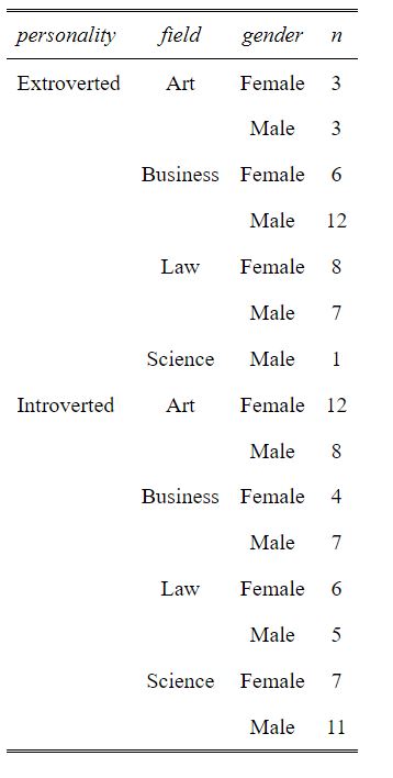
As you may have noticed, we used a different dataframe than we created (and then in the first example). Again, we need to transform our data. In this case, we use dplyr to calculate descriptive statistics in R (i.e., frequencies).
Transforming Data for ggalluvial
To use ggaluvial, we need to restructure the data into a format that allows us to specify the variables we want to plot on each axis of the Sankey plot. This is why we created a new data frame frequencies using the dplyr package:
library(dplyr)

# summarize the data and count the frequencies
frequencies <- df %>%
  count(personality, field, gender) %>%
  arrange(field, desc(n))Code language: PHP (php)
In the code chunk above, we use the count() function to summarize the data by counting the frequency of each combination of personality, field, and gender. The %>% operator is then used to pass the resulting dataframe as input to the next operation, which is arrange(). Here, we sort the data by field and the descending order of the frequency n.
The resulting frequencies data frame has columns for personality, field, gender, and n (the frequency count), which is suitable for creating the Sankey plot using ggaluvial.
3. Sankey Plot in R using the networkD3 package
To create a Sankey plot in R using the networkD3 package, we can use the sankeyNetwork() function:
# create Sankey plot using networkD3
sankeyNetwork(Links = links, Nodes = nodes, Source = "source",
Target = "target", Value = "value", NodeID = "name",
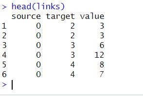
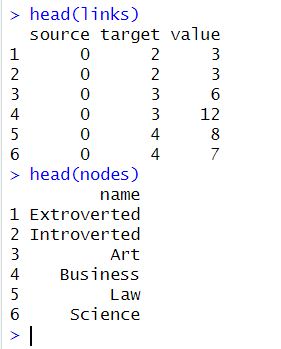
sinksRight = FALSE)Code language: R (r)In the code chunk above, we make a Sankey plot using the sankeyNetwork function from the networkD3 package in R. We use a range of different arguments. First, we use the Links argument to specify the links between nodes. This means our data should have at least three columns: source, target, and value. Next, we use the Nodes argument to specify the nodes in the plot. Here we need a second dataframe with a column of unique node IDs.
Moreover, we use the Source, Target, and Value arguments to specify the column names in the Links dataframe for the links’ source, target, and value. Next, we use the NodeID argument to specify the column name in the Nodes dataframe for the node IDs. Finally, we use the sinksRight argument to specify whether the nodes without outgoing links should be displayed on the right or left side of the plot. In this case, it is set to FALSE, which means the nodes without outgoing links will be displayed on the left side.
Transforming Data to use with networkD3
You may have noticed in the previous section that we used two dataframes as arguments in the sankeyNetwork() function. To create a networkD3 visualization in R, we need to transform our data into a specific format that the function can read. This format requires three columns in our data frame: the source, target, and value.
Nodes
Here is how we create the `nodes´ dataframe from the previous example:
# create a table of frequencies
freq_table <- df %>% group_by(personality, field, gender) %>%
  summarise(n = n())

# create a nodes data frame
nodes <- data.frame(name = unique(c(as.character(freq_table$personality),
                                    as.character(freq_table$field),
                                    as.character(freq_table$gender))))Code language: PHP (php)
In the code chunk above, we perform two tasks. First, we used the %>% pipe operator to create a table of frequencies named freq_table. We create this table by grouping a dataframe df by three variables: personality, field, and gender. Then, we use the summarise() function to calculate the frequency count of each unique combination of these variables, and named it as n.
Second, we created a data frame named nodes. This dataframe contains a column named name that holds unique values of all distinct combinations of personality, field, and gender variables found in the freq_table data frame. We created this dataframe by using the unique() function to extract unique values from three different columns of the freq_table data frame and then combining them using the c() function. We can also use dplyr to convert a list to dataframe in R, if necessary.
Links
In the next step, we will create the links datframe:
# create links dataframe
links <- data.frame(source = match(freq_table$personality, nodes$name) - 1,
                    target = match(freq_table$field, nodes$name) - 1,
                    value = freq_table$n,
                    stringsAsFactors = FALSE)

links <- rbind(links,
               data.frame(source = match(freq_table$field, nodes$name) - 1,
                          target = match(freq_table$gender, nodes$name) - 1,
                          value = freq_table$n,
                          stringsAsFactors = FALSE))Code language: PHP (php)
In the code chunk above, we make the dataframe using the data.frame() function. Here we use the match() function to find each unique personality value index in the nodes$name vector. Moreover, we subtract one from it to adjust the index starting from 0 instead of 1. Similarly, we repeat the same process for the field and gender columns of the freq_table dataframe, and named these indices as source and target columns in the links dataframe.
Second, we create a new row in the links data frame using the rbind() function. This new row represents the relationship between field and gender variables. We use the same match() and subtraction process to find the indices of field and gender values in the nodes$name vector. Next, we assign the frequency counts of this relationship to the value column of the links data frame.
Finally, we use the stringsAsFactors = FALSE parameter to both data.frame() function calls to avoid converting string columns to factor data type.
4. Sankey Plot in R using Plotly
To use Plotly to create an interactive Sankey Plot in R, we can use the following code:
# Make Sankey diagram
plot_ly(
  type = "sankey",
  orientation = "h",
  node = list(pad = 15,
              thickness = 20,
              line = list(color = "black", width = 0.5),
              label = nodes$name),
  link = list(source = links$source,
              target = links$target,
              value = links$value),
  textfont = list(size = 10),
  width = 720,
  height = 480
) %>%
  layout(title = "Sankey Diagram: Personality, Field, and Gender",
         font = list(size = 14),
         margin = list(t = 40, l = 10, r = 10, b = 10))Code language: R (r)
In the code chunk above, we use the plot_ly() function from the plotly package to create a Sankey plot visualization. We set the type argument to “sankey” to specify the type of plot we want to create. Moreover, we set the orientation to “h” to specify horizontal orientation.
Next, we use the node argument to define the properties of the nodes in the plot. We set the pad parameter to 15 to add padding around the node labels. Next, we set thickness to 20 to set the thickness of the nodes, and label to nodes$name to specify the labels of the nodes. We also set the line color to “black” and the width to 0.5 for the node outlines.
Additionally, to define the properties of the links between nodes, we use the link argument. Next, we set source to links$source to specify the source nodes of each link, target to links$target to specify the target nodes, and value to links$value to specify the width of each link. We also set textfont to specify the font size of the node labels, and width and height to set the size of the plot.
Finally, we use the %>% operator to add a layout to the plot. We set the title and font properties, as well as the margin parameter to add some space around the plot. Here is the resulting Sankey plot:
As you can see in the plot above, we can move the mouse pointer over the different nodes to get some information. Note also that the data format for a Sankey plot using plotly is the same as when using networkD3.
Data format for plotly Sankey Plot in R
Here is how we can format the data to create an interacftive Sankey diagram with plotly:
nodes <- data.frame(name = unique(c(as.character(freq_table$personality),
                                    as.character(freq_table$field),
                                    as.character(freq_table$gender))))

links <- data.frame(source = match(freq_table$personality, nodes$name) - 1,
                    target = match(freq_table$field, nodes$name) - 1,
                    value = freq_table$n,
                    stringsAsFactors = FALSE)

links <- rbind(links,
               data.frame(source = match(freq_table$field, nodes$name) - 1,
                          target = match(freq_table$gender, nodes$name) - 1,
                          value = freq_table$n,
                          stringsAsFactors = FALSE))Code language: PHP (php)
In the code chunk above, we create a dataframe called “nodes”. This dataframe includes all unique values of personality, field, and gender from the “freq_table” data frame. Then, we create another dataframe called “links” that is used to connect the nodes in the Sankey plot. We do this by matching the personality and field values in the “freq_table” data frame with their corresponding indices in the “nodes” dataframe. Here, we subtract 1 from each index to match the zero-based indexing used in R. We also add the frequency count value to each link. Finally, we add another set of links to connect field and gender nodes using a similar approach. See the example in which we transform data to use networkD3 to create a Sankey plot in R. Here are the the dataframes:
Summary
This blog post taught us how to create a Sankey plot in R using four packages. Namely, the ggsankey, ggalluvial, networkD3, and plotly packages. Sankey plots are a great way to visualize flow or connections between different categories or groups.
To create a Sankey plot, we need to structure the data in a specific way. The data need nodes representing the categories and links representing the flow between them. Therefore, we learned how to transform data into this format using functions like dplyr and tidyr.
We started with ggsankey and ggalluvial, both great options for creating static Sankey plots. Additionally, both packages offer various customization options, allowing us to tailor the plot to our needs.
Next, we looked at networkD3, a popular package for creating interactive Sankey plots. With networkD3, we can create dynamic plots that allow the user to explore the data in more detail.
Finally, we learned how to create Sankey plots using plotly, which offers even more interactivity options than networkD3. With plotly, we can create highly customized plots that are easy to share and embed in websites.
In conclusion, if you notice any errors or suggestions for improvement, please comment and let us know! Finally, if you found this post helpful, please share it on social media to help others learn.
Resources
Here are some useful R tutorials:
- Correlation in R: Coefficients, Visualizations, & Matrix Analysis
- How to Create a Violin plot in R with ggplot2 and Customize it
- Modulo in R: Practical Example using the %% Operator
- Check R Version in RStudio: A Quick and Simple Tutorial
- How to Remove/Delete a Row in R – Rows with NA, Conditions, Duplicated

This was very useful! Thanks a lot for posting. Just a note, when doing the last method, using plotly, I came into the issue (for my purposes) that the count in the links was showing the split of future source/target stages. For example, in your plot instead of getting the count that 18 people went from Introverted to Science, you get the breakdown of 7.0 and 11.0, because 7.0 were female and 11.0 were male.
If you don’t want to show that breakdown, a fix would be to create separate frequency tables for your links:
freq_table1 % group_by(Personality,Field) %>% summarise(n = n())
freq_table2 % group_by(Field,Gender) %>% summarise(n = n())
…
And call each table when you are creating the links, so in your first part you’d call “freq_table1”, and in the second one, when using rbind(), you’d call “freq_table2”.
In case someone wants to get a bulk count at each stage.
Thank you!
Thanks for your comment and you’re suggestion. I think it’s a great idea to guse group_by like that.