This data visualization tutorial will teach us how to make a violin plot in R using ggplot2. We can use several techniques to visualize data (see, for example, the Python-related post “9 Data Visualization Techniques You Should Learn in Python“) to visualize our data in r. Briefly described, violin plots combine a box plot and a histogram in the exact figure. In the next section, after the table of contents, you will get a brief overview of the content of this blog post.
Click to Tweet
Table of Contents
- Outline
- Requirements
- Example Data to Visualize
- How to Make a Violin Plot in R with ggplot2
- Making the Violing Plot Horizontal in R
- How to Create a Violin Plot in R: interquartile range, median
- How to add Quantiles to the Violin Plot in R
- How to Change the Color of a Violin Plot in R
- How to Fill a Violin Plot in R
- Changing the Labels on Violin Plots in R
- Alternative R Packages to Make a Violin Plot
- Conclusion
- Resources
Outline
Before creating a violin plot in R, we will look at what you need to be able follow in this data visualization tutorial. We will answer some questions when we have what we need (e.g., learn what a violin plot is). In the sections following this, we will get into the practical details. We will learn how to create violin plots in R using ggplot2. Furthermore, we will also learn how to customize the plots. For example, you will learn to show the plot horizontally, fill it with a color based on category, and add/change labels.
Requirements
First, you need to have an active installation of R. Second, to use both ggplot2, you need to install the package. Installing R packages can be done by using the install.packages() command:
install.packages("ggplot2)Code language: CSS (css)Note that it is also good to run an updated environment. You can easily check the R version in RStudio with the R.version command. If, needed, you can download and update R to a newer version. It is worth pointing out that ggplot2 is part of the Tidyverse package. You can install Tidyverse to get ggplot2, among many other handy R packages. For example, you can use dplyr to rename a column in R, remove duplicates, and count the number of occurrences in a column. In the next section, we will get answers to some commonly asked questions.
As mentioned earlier in the post, a violin plot is a data visualization method combining box plots and histograms. This type of plot will display the distribution, median, and interquartile range (iqr) of data. The iqr and median are the statistical information in the box plot, whereas the histogram displays distribution.
A violin plot shows numerical data. Specifically, it will reveal the numerical data’s distribution shape and summary statistics. It can explore data across different groups or variables in our datasets.
You can use ggplot2 and the geom_violin() function to make a violin plot in R. For example, if we have the dataframe dataF and want to create a violin plot of the two groups’ response times, you can use the following code: p <- ggplot(aes(Group, RT), data = dataF)).
Example Data to Visualize
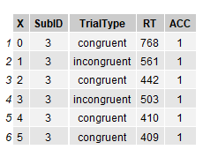
In this post, we will work with fake data from a Psychology experiment. The dataset can be downloaded here and is fake data that could be obtained using e.g., the Flanker task created with OpenSesame. Here is how we can read the data into R using read.csv() function:
data = 'https://raw.githubusercontent.com/marsja/jupyter/master/flanks.csv'

df <- read.csv(data)
head(df)Code language: R (r)
Note you can import data from different sources than CSV files:
- How to Read and Write Stata (.dta) Files in R with Haven
- How to Read & Write SPSS Files in R Statistical Environment
Here’s a quick overview of the dataframe in which we can see the first six rows of the columns:
If you already have your data in a list, you can convert a list to dataframe in R. In the next code chunk, we will use some neat functions from the dplyr package: group_by() and summarise_all() to calculate descriptive statistics in R:
df %>% group_by(TrialType) %>%
  select(ACC, RT) %>%
  summarise_all(list(mean = mean,
                     std = sd,
                     min = min,
                     max = max))Code language: R (r)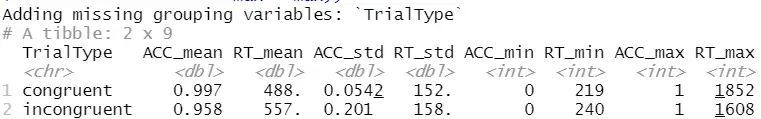
In the code above, we first used dplyr’s group_by to group the data by trial type (i.e., the column TrialType). Second, we used dplyr to select columns by name using the select() function. Finally, we used the summarise_all() function (also from dplyr) together with list(). Here we calculate mean, standard deviation, min, and max. For more information about summary statistics in R, see the following posts:
- Learn How to Calculate Descriptive Statistics in R the Easy Way with dplyr
- How to Calculate Five-Number Summary Statistics in R
In the next section, we will load the ggplot2 library and learn how to create a simple violin plot in R.
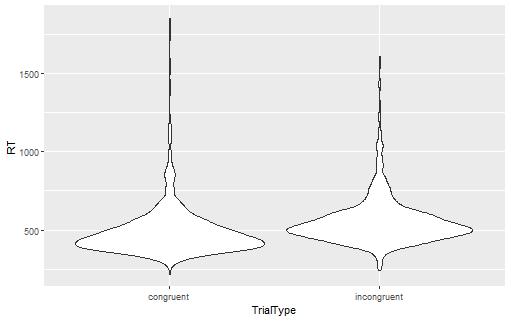
How to Make a Violin Plot in R with ggplot2
Here’s how to create a violin plot with the R package ggplot2:
p <- ggplot(df, aes(TrialType, RT))
p + geom_violin()Code language: R (r)
In the code above, we first created a plot object with the ggplot() function. Here we used the aes() function as input. Moreover, we used the grouping column (i.e., TrialType) as the first argument and the dependent variable (response time) as the second. In the next row, we use the geom_violin() function. This will, in turn, create the violin plot layer. Here’s the resulting violin plot that we created using R and ggplot2:
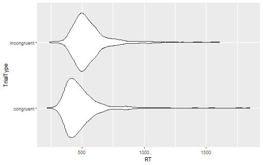
Making the Violing Plot Horizontal in R
In the next example, we will use the coord_flip() function to create a horizontal violin plot:
p <- ggplot(df, aes(TrialType, RT))
p + geom_violin() +
  coord_flip()
As you can see, in the code chunk above, we just added the function, and this will result in this plot:
- ggplot Center Title: A Guide to Perfectly Aligned Titles in Your Plots
- Plot Prediction Interval in R using ggplot2
- How to Create a Sankey Plot in R: 4 Methods
In the next section, we will continue creating a violin plot using R and ggplot2 overlaying a boxplot.
How to Create a Violin Plot in R: interquartile range, median
Here is how we can display a violin plot in R and add interquartile range and median by overlaying a boxplot:
p <- ggplot(df, aes(TrialType, RT))
p + geom_violin() + geom_boxplot()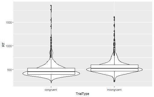
As you can see, the only addition to the previous code is that we also use the function. However, the created violin plot (see image above) can be better. For example, if we use the width argument, we can get a better violin plot:
p <- ggplot(df, aes(TrialType, RT))
p + geom_violin() + geom_boxplot(width = .2)Code language: HTML, XML (xml)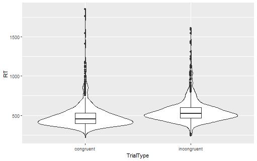
The next section will use the quantiles argument in the geom_violin() function. We will see that we can use this to display 25th, 50th, and 75th quantiles, for example. In the following examples, we will play around with the color and theme of violin plots we created with R.
How to add Quantiles to the Violin Plot in R
Here’s how we use the quantiles parameter to add quantiles to a violin plot:
p <- ggplot(df, aes(TrialType, RT))
p + geom_violin(draw_quantiles = c(.25, .50, .75))Code language: R (r)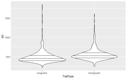
As you can see, we get three lines in the violin plot now. In the next example, we will learn how to customize the violin plot we create in R using the color parameter.
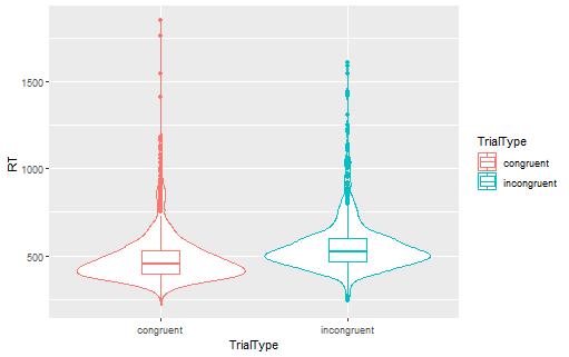
How to Change the Color of a Violin Plot in R
Here is how we can change the color of a violin plot in R:
p <- ggplot(df, aes(TrialType, RT, color = TrialType))
p + geom_violin() + geom_boxplot(width = .2)Code language: HTML, XML (xml)
In the code chunk above, we added one argument to the aes() function: the color argument. We can use this parameter if we want the lines of the violin plot to be different for the different groups (i.e., of different colors). Here is the resulting plot:
In the following example, we will also fill the violin plot. As you will see, this is easy, and we use the fill parameter.
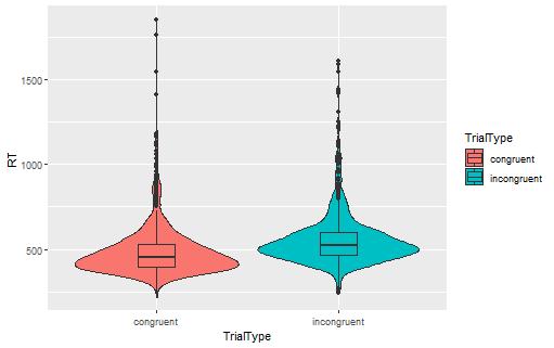
How to Fill a Violin Plot in R
Here is how you can change the color (or fill) of a violin plot in R:
p <- ggplot(df, aes(TrialType, RT, fill = TrialType))
p + geom_violin() + geom_boxplot(width = .2)Code language: HTML, XML (xml)
In the code chunk above, we added a parameter: fill. Moreover, we used the TrialType (a categorical variable) column here to fill the violin plots and box plots based on the trial type they belong to. Here is the resulting plot:
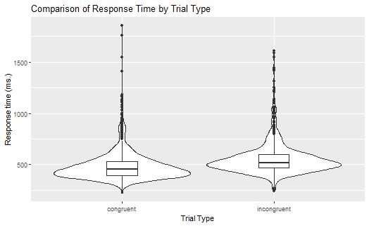
Changing the Labels on Violin Plots in R
Here’s how we can change the labels of the violin plot we have created in R:
p + geom_violin() + geom_boxplot(width = .2) +
  labs(
    title = "Comparison of Response Time by Trial Type",
    x = "Trial Type",
    y = "Response time (ms.)"
  )Code language: R (r)
In the code chunk above, we added the labs() function. In this function, we worked with a couple of parameters. First, we added a title by using the title parameter. In the next two rows, we changed the x- and y-titles. This may be useful when we want to present the data to other researchers (e.g., publishing our results) and our variables (in the dataset) have shortened names (such as RT). To learn more about customizing ggplot2 figures, see, e.g., the post How to Make a Scatter Plot in R with Ggplot2. In a recent post, you can learn how to make a Residual plot in R using ggplot2.
Alternative R Packages to Make a Violin Plot
Now, before concluding this post, it may be worth mentioning that there are plenty of other options (e.g., vioplot, violinplotter) that can be used to create violin plots in R. For example, here’s how to install and create a plot using the violinplotter package:
install.packages("violinplotter")
library(violinplotter)
violinplotter(RT ~ TrialType, data = df)Code language: R (r)
As you can see, in the code chunk above, we use a formula as the first parameter (the second is the dataframe). Here’s the resulting violin plot:
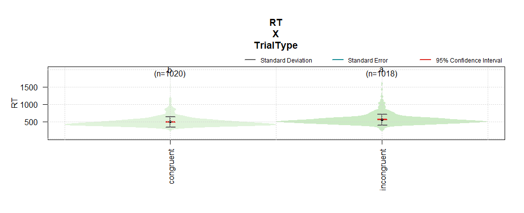
In the image above, we get more information from the violin plot: the number of observations in each category, the standard deviation, standard error, and 95% confidence intervals.
Conclusion
In this post, you have learned how to make a violin plot in R. First; you learned what you need to create a violin plot. Second, you learned more about this data visualization technique. Second, you learned how to use ggplot2 to create a violin plot by a couple of examples. Specifically, you learned how to display the violin plot horizontally, add a boxplot to the violin plot, change the color and fill the plot, and finally, change the plot’s labels. Hopefully, you have learned something. I hope you did. If you have any questions about the blog post, please comment below. Moreover, if you have any suggestions on what I should cover on this blog, comment below.
Resources
Here are some R tutorials for your needs:
- How to use %in% in R: 8 Example Uses of the Operator
- Modulo in R: Practical Example using the %% Operator
- How to Rename Column (or Columns) in R with dplyr
- How to Sum Rows in R: Master Summing Specific Rows with dplyr