This post will teach you how to make a residual plot in R. Moreover, you will learn when to use different residual plots and how to interpret them. Residual plots are a graphical tool that we can use to evaluate the quality of our regression models. These plots are good for identifying issues with the model assumptions, such as non-linearity, non-normality, and heteroscedasticity.
The first section of this blog post will cover when you may have used for a residual plot. Additionally, you will learn about some of the different types of residual plots, and how to interpret them. Here you will learn about the residual vs. fitted plot, the normal probability plot (Q-Q plot), and a histogram of the residuals. The following section will cover how to make the different residual plots in R. In the final section, before the post’s conclusion, other diagnostical tools will be mentioned.
Table of Contents
- Requirements
- When to use Residual Plots
- Types of Residual Plots
- Interpreting Residual Plots in R
- How to Make a Residual Plot in R with ggplot2
- Other Diagnostical Tools
- Conclusion: Residual Plot in R
- Resources
Requirements
To create and interpret the residual plots using R statistical programming language, you would need the following:
- Basic knowledge of R: You should be familiar with the basics of R, including data types, objects, functions, and data manipulation.
- Data: You should have the dataset in a format that can be imported into R, such as a CSV file.
- R libraries: You must load the necessary libraries, including ggplot2 and dplyr (used in this post).
- Regression model: You must use R’s
lm()function to fit a regression model. At least, to follow the examples in this tutorial. - Plots: You need to create the residual plots using R, including the residuals vs. fitted plot, normal probability plot, and a histogram of the residuals. You can use the ggplot2 package to create the plots. In this post, we will use the ggplot2 package for plotting.
- Interpretation: You need to interpret the residual plots to identify issues with the model assumptions, detect outliers and trends in the data, and ensure that your regression model is valid and reliable.
Creating and interpreting residual plots using R requires basic knowledge of R, data, and R libraries. Moroever, it requires knowledge of regression models and plots, as well as data analysis and interpretation skills. Before we go to on and learn when to use a residual plot in R, we will quickly check how to create a residual plot in R. Then, we will also quickly look at what a residual plot might tell us about the data.
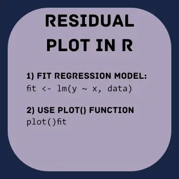
To create a residual plot in R, we can use the plot() function after fitting a linear regression model using the lm() function: plot(fit). The plot() function will automatically produce a scatterplot of the residuals against the fitted values.
A residual plot tells us about the quality of the linear regression model by showing the differences between the predicted and actual values. In addition, it can help to identify patterns in the residuals, such as non-linearity or heteroscedasticity. Finally, a residual plot with random scatter indicates that the linear regression model is appropriate for the data.
Now, before creating a residual plot you might want to use r to remove duplicate rows. Another thing that might be helpful is to rename columns in r with dplyr. Especially, if the column names are long or contain strange characters.
When to use Residual Plots
Residual plots can be used in any situation where we have used a regression model to analyze the relationship between two or more variables. These plots are useful when you need to evaluate the validity of the assumptions of the model. For example, the linear model assumes linearity between the independent and dependent variables, and we can then use a residual plot to evaluate whether this assumption is met.
Types of Residual Plots
Regression models can be evaluated using several different types of residual plots. This section will describe three of common types:
- Residuals vs. fitted plot,
- Normal probability plot,
- Histogram of residuals
1. Residuals vs. Fitted Plot
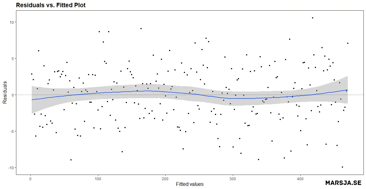
A residuals vs. fitted plot is a scatter plot that shows the residuals on the y-axis and the fitted values on the x-axis. The fitted values are the dependent variable’s predicted values based on the model’s independent variable(s). The residuals are the difference between the observed values and the fitted values. Here is a residuals vs. fitted plot:
- How to Make a Scatter Plot in R with Ggplot2
- Plot Prediction Interval in R using ggplot2
- How to Create a Violin plot in R with ggplot2 and Customize it
- ggplot Center Title: A Guide to Perfectly Aligned Titles in Your Plots
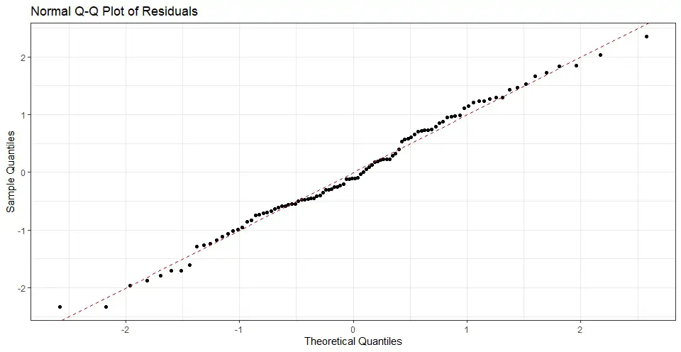
2. Normal Probability Plot aka Q-Q Plot
A normal probability plot, also known as a Q-Q plot, is a plot of the quantiles of the residuals versus the expected values. If the residuals are normally distributed, the points should, more or less, follow a straight line. Here is an example of a normal probability plot created in R:
If your independent variables are measured on different scales you might need to standardize your data before you set up a regression model. Here is a more recent post dealing with standardization:
3. Histogram of Residuals
A histogram of the residuals from a linear regression model is a graphical way to visualize the distribution of the difference between the predicted and observed values of the dependent variable. Remember, the residuals are essentially errors or deviations from the regression line, and analyzing the distribution of the residuals can provide valuable insights into the adequacy of the model.
Interpreting Residual Plots in R
In this section, we will cover how to interpret residual plots. Specifically, we will look at the three different residual plots from the previous section.
1. Interpreting a Residuals vs. Fitted Plot
In a residuals vs. fitted plot, the residuals should be randomly scattered around the zero line. In the plot neöpw, we can see that the residuals are randomly scattered around the zero line, indicating that the assumption of linearity is likely valid.
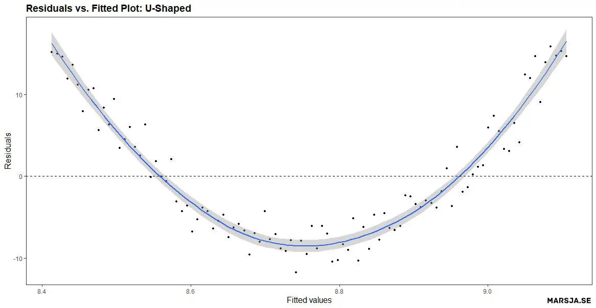
On the other hand, if there is a pattern in the residuals, it may indicate an issue with the model. For example, if the residuals have a U-shaped pattern, this may indicate non-linearity in the relationship between the independent and dependent variables. See the Figure figure below for a residual plot created in R showing an U-shaped pattern.
In a more recent post, you can learn how to create a Sankey plot in R.
2. Interpreting a Normal Probability Plot (Q-Q plot)
When interpreting a normal probability plot, we check if the points fall along a straight line. If the points deviate from a straight line, this may indicate non-normality in the residuals. For example, if the points deviate from a straight line in the tails, this may indicate heavy-tailedness or skewness in the data.
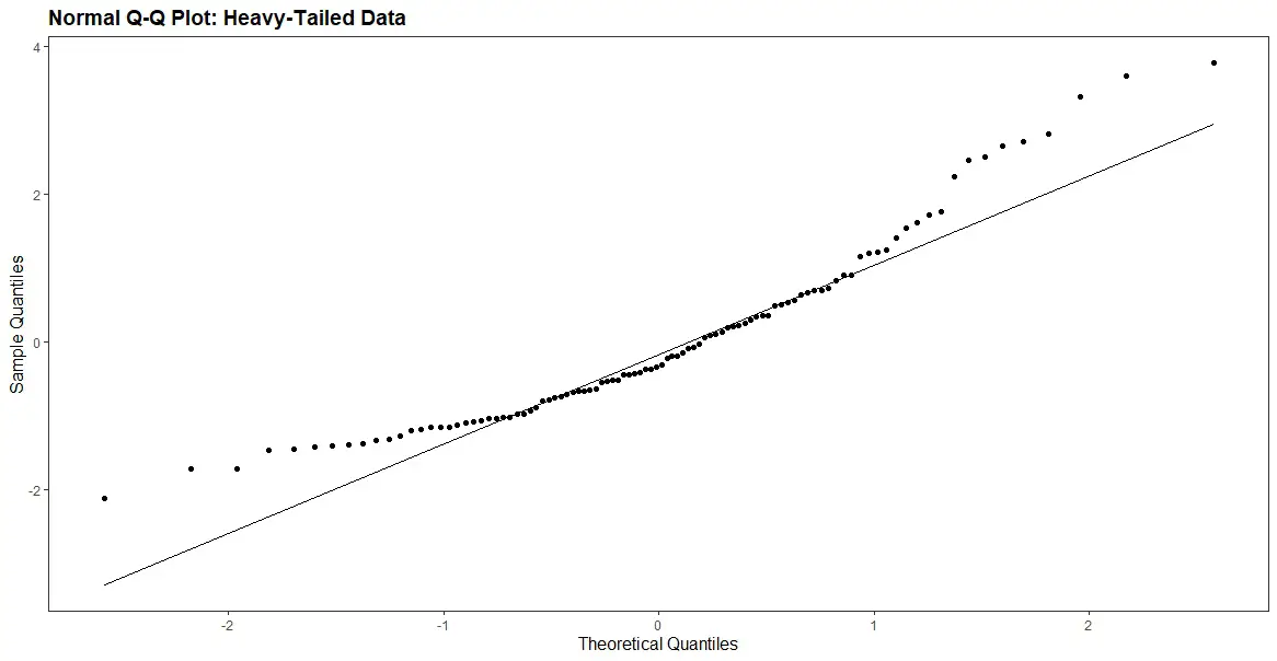
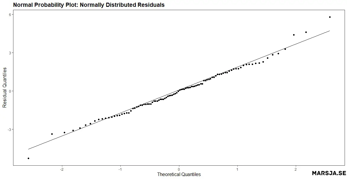
The figure above shows that the points deviate from a straight line, particularly in the tails. This indicates that the residuals are not normally distributed. Non-normal residuals may indicate that the model is misspecified or that there are outliers in the data. Here is an example of a Q-Q plot of normally distributed residuals:
3. Interpreting a Histogram of Residuals
Histograms can be used to assess the normality assumption of the residuals, which is a key assumption in linear regression modeling. In general, if the residuals are normally distributed, it suggests that the errors are random and the model is appropriate.
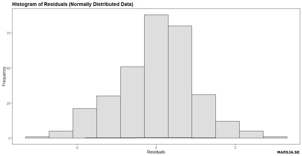
On the other hand, if the residuals are not normally distributed, then it may indicate that the model is misspecified and the assumptions of the linear regression are not satisfied. For example, if the histogram shows a bell-shaped curve with a symmetrical distribution, it indicates normality, while a skewed or multi-modal distribution suggests non-normality. The figure below shows that the residuals from the regression model are not normally distributed. Specifically,
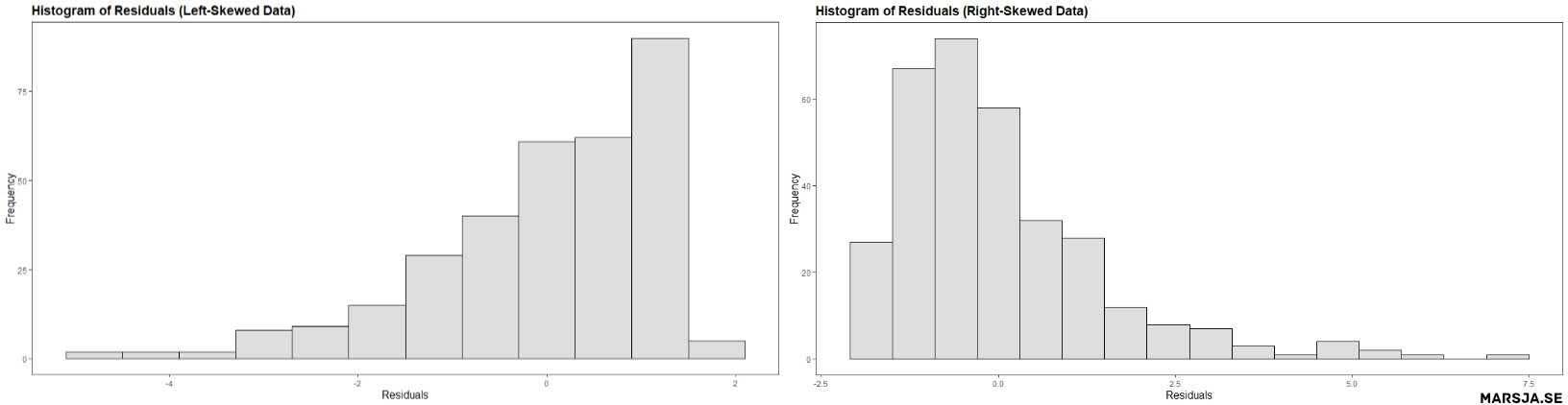
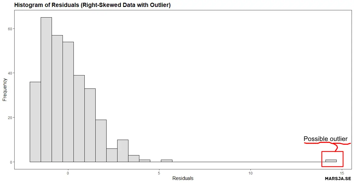
Histograms of residuals can help detect outliers, which are data points that do not follow the general pattern of the data. Outliers can significantly impact the regression results, and their removal may improve the model. For example, if a histogram shows a peak or bulge at one or both tails of the distribution, it may indicate outliers.
Now we know that a residual plot is a graphical method for assessing the adequacy of linear regression models. In the next Note, if your data is non-normal and you have categorical predictors you can use non-parametric tests. For example, instead of an ANOVA you can carry out the Kruskal Wallis test in R. In the next section we will learn how to create them in R using ggplot2.
How to Make a Residual Plot in R with ggplot2
In this section, you will learn how o create a residual plot in R. First, we will learn how to use ggplot to create a residuals vs. fitted plot. Second, we will create a normal probability plot and, finally, a histogram of the residuals. Of course, we will use simulated data and then use ggplot2 on the simulated data. If you, however, have your own data you can load it into R using different packages or functions:
- How to Read and Write Stata (.dta) Files in R with Haven
- How to Read & Write SPSS Files in R Statistical Environment
- How to Import Data: Reading SAS Files in R with Haven & sas7dbat
Residual Plot in R Example 1: Residuals vs. Fitted Plot
To create the first residual plot in R: a residuals vs. fitted plot using ggplot2, we first need to generate some data and fit a linear regression model. Here is an example code for simulating data and fitting a linear regression model in R:
# Load the required library
library(ggplot2)

# Simulate data
set.seed(20230218)
x <- rnorm(120, mean = 10, sd = 5)
y <- x + rnorm(120, mean = 0, sd = 5)

# Fit linear regression model
fit <- lm(y ~ x)Code language: R (r)
In the code chunk above, we first set the seed for reproducibility. Next, we created the variables x and y (our independent and dependent variables) using the rnorm() function. In the last row, we fitted a regression model in R.
Now, you can also create new dataframes with the variables of interest, before carrying out linear regression. For example, you can use dplyr to select columns in R.
Creating the Residuals vs. the Fitted Plot
Once we have our model, we can create a residuals vs. fitted plot in R using ggplot2 as follows:
# Create residuals vs fitted plot
p.fvr <- ggplot(fit, aes(x = .fitted, y = .resid)) +
  geom_point() +
  geom_hline(yintercept = 0, linetype = 2) +
  xlab("Fitted Values") +
  ylab("Residuals") +
  ggtitle("Residuals vs. Fitted Plot Created using ggplot2") +
  theme_bw()

# Display the residual plot
p.fvrCode language: R (r)
In the code chunk above, the first line initializes the ggplot object. Here we also specify the dataframe, “fit”, as the data source. The aes() function is used to specify the x and y variables, which are the fitted values and residuals, respectively. Note that the “.” before the variable names indicates that these variables are part of the fit dataframe.
The second line of the code adds points to the plot using the geom_point() function. Each point on the plot represents a data point from the original data set. Here the x-coordinate being the predicted values from the linear regression model. The y-coordinate are the difference between the predicted value and the observed value (i.e., the residuals).
The third line of the code adds a horizontal line at y = 0 using the geom_hline() function. This line represents the line of a perfect fit, where the predicted values match the observed values exactly.
The fourth and fifth lines of the code set the x and y-axis labels, respectively, using the xlab() and ylab() functions. Next, we use the ggtitle() function add a title to the plot. Finally, in the last line we display the plot:
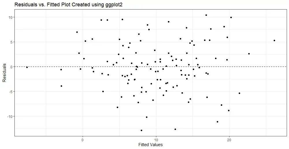
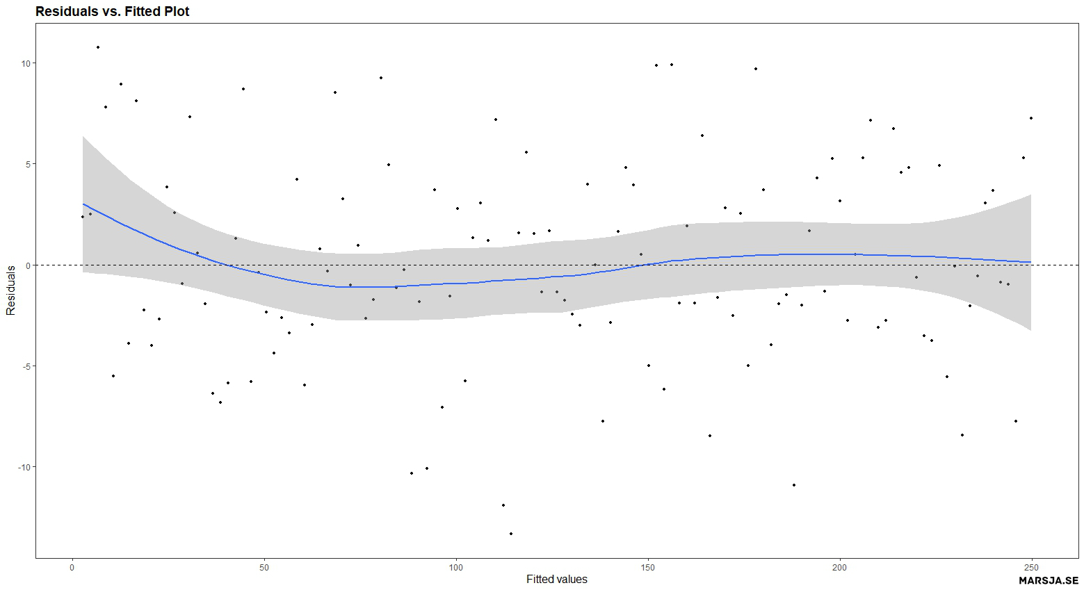
The resulting plot should show a scatter of points with no discernible pattern or trend, which suggests that the linearity assumption of the model is satisfied.
Next we will use geom_smooth(se = FALSE) to the ggplot object to create a smoothed curve that is fitted to the scatterplot of the residuals versus the fitted values.
# Add a smoothed curve to the ggplot object:
p.fvr + geom_smooth(se = FALSE)Code language: R (r)
By default, the geom_smooth function fits a loess (locally estimated scatterplot smoothing) curve to the data, a non-parametric smoothing method that works well for non-linear relationships. The se argument controls the display of the standard error bands around the smoothed curve. By setting se = FALSE, we remove the standard error bands from the plot. Here is the resulting plot:
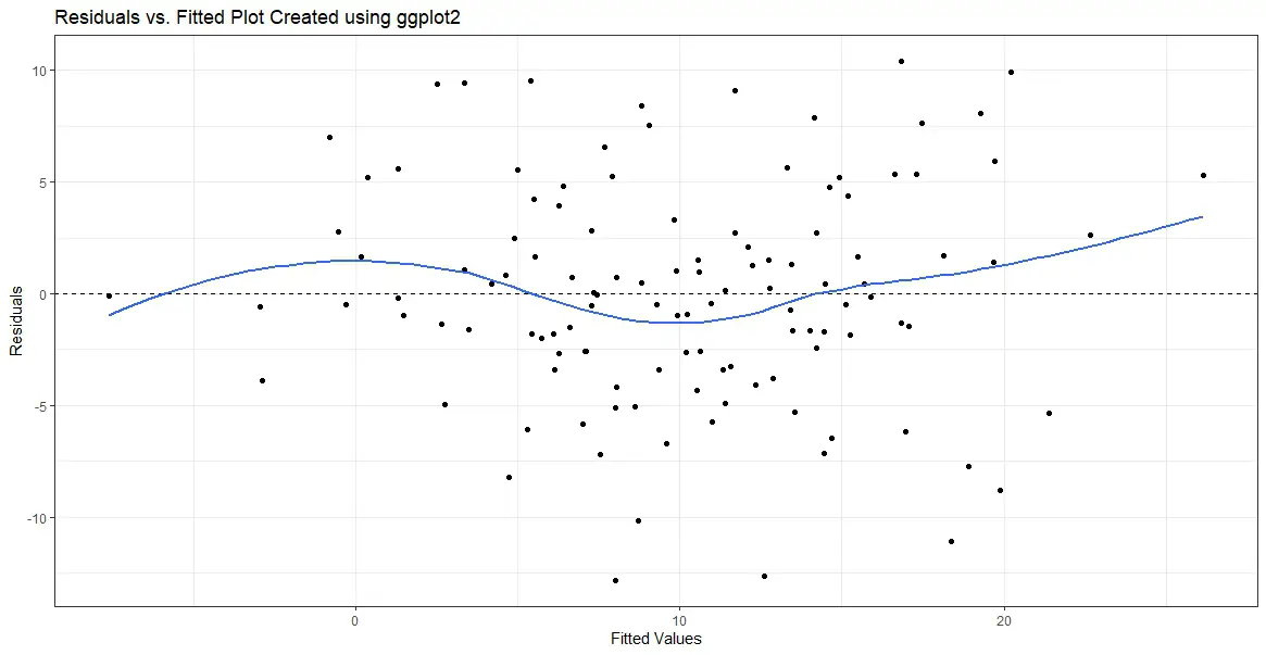
The smoothed curve can help visualize the residuals’ overall pattern. Additionally, this will help detect any non-linearities or patterns in the data that may not be apparent in the scatterplot alone. For example, if the curve appears to follow a straight line, it suggests that the relationship between the predictor and response variable is linear. This means that the linear regression model’s assumptions are met. However, if the curve deviates from a straight line, it indicates that the relationship may be non-linear, and the model assumptions may be violated.
It is important to note that the use of geom_smooth is not a substitute for a thorough analysis of the residuals, but rather a tool that can aid in interpreting the residual plot created in R (or any other software). Therefore, it is always recommended to examine the residuals in multiple ways. This includes a scatterplot of residuals versus fitted values, a histogram of the residuals, and a normal probability plot (Q-Q plot). In the next section, we will create the next residual plot in R: the normal probability (Q-Q ) plot. For more information about ggplot2 check the documentation.
Residual Plot in R Example 2: Normal Probability Plot (Q-Q plot)
To create a Q-Q plot using ggplot2, we first need to simulate some data and fit a linear regression model. Here is an example code for simulating data and fitting a linear regression model in R:
# Load ggplot2:
library(ggplot2)

# Simulate data
set.seed(123)
x <- rnorm(100)
y <- 2*x + rnorm(100)

# Fit linear regression model
fit <- lm(y ~ x)Code language: R (r)
In the code chunk above, we first load ggplot2 (note that if you already have loaded it, you do not have to do it again). Next, we simulate some data where y is a linear function of x with some added noise. Finally, we fit a linear regression model in R to the data using the lm() function.
Creating the Normal Probability Plot
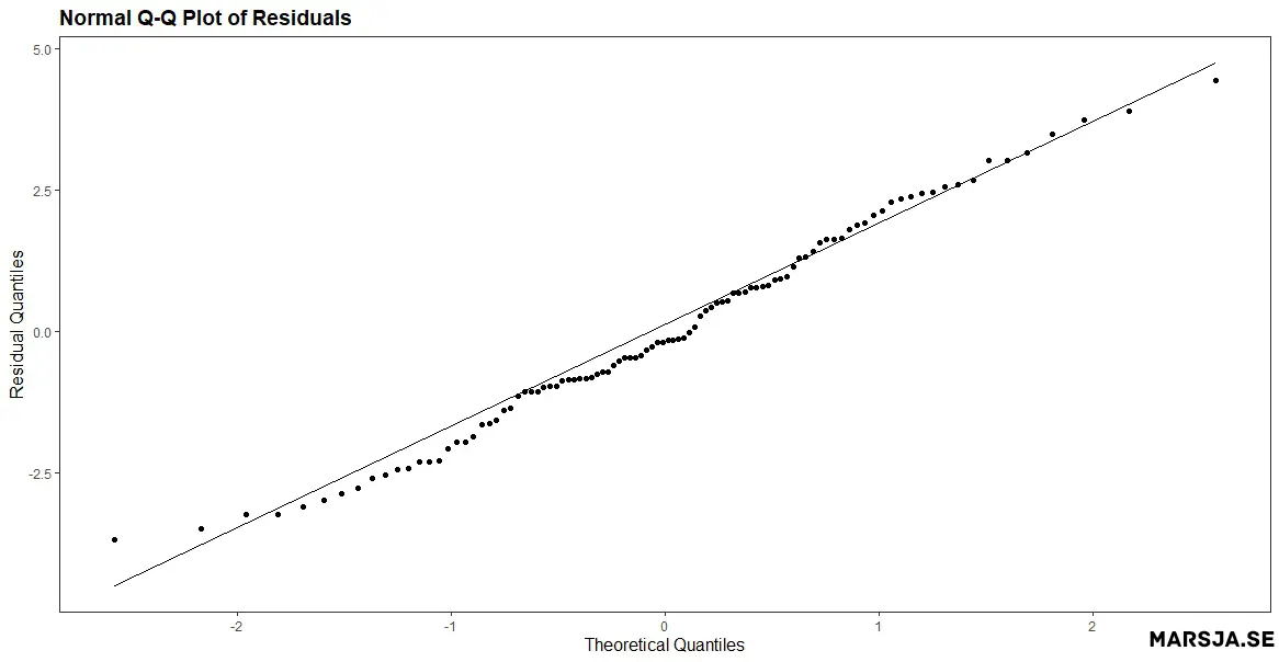
To create the Q-Q plot of the residuals, we use ggplot() with the fitted model object fit and specify the sample aesthetic (i.e., within the aes() function) to plot the sample quantiles against the theoretical quantiles. Next, we added a red dashed line to indicate the expected line if the residuals were normally distributed.
Here, we first simulate some data where y is a linear function of x with some added noise. Then we fit a linear regression model to the data using the lm() function.
# Create Q-Q plot from residuals
qq_plot <- ggplot(fit, aes(sample = .resid)) +
  geom_qq() +
  geom_abline(slope = 1, intercept = 0, color =
                "red", linetype = "dashed") +
  xlab("Theoretical Quantiles") +
  ylab("Sample Quantiles") +
  ggtitle("Normal Q-Q Plot of Residuals") +
  theme_bw()

# Display plot
qq_plotCode language: R (r)
In the code chunk above, we use ggplot() with the fitted model object fit and specify the sample aesthetic to plot the sample quantiles against the theoretical quantiles (i.e., create a residual plot in R). Moreover, we use the geom_qq() function to create the Q-Q plot. Next, the geom_abline() function adds a straight line to the plot. In this case, slope = 1 and intercept = 0 specify that the line should be the diagonal reference line, where the predicted and observed values are equal. The line is colored red and has a dashed linetype.
Finally, we add labels for the x- and y-axes (i.e., using the xlab() and ylab() functions), a title for the plot (i.e., the ggtitle() function), and a theme (black and white; theme_bw(). Running the code above produces a normal probability plot in R of the residuals of the linear regression model. Here is the resulting plot:
Residual plot in R Example 3: Histogram of Residuals
In this example, we first simulate data for a linear model with a normal distribution using rnorm(). We then fit a linear model to the simulated data using lm(). Here is the code for simulating data:
# Load the library we need
library(ggplot2)

# Simulate data for a linear model
set.seed(20230219)
x <- rnorm(500, mean = 10, sd = 4)
y <- 2*x + rnorm(500, mean = 10, sd = 4)

# Fit the linear model
fit <- lm(y ~ x)Code language: PHP (php)
To create a histogram of residuals using ggplot2, we can will use the ggplot() function and specify the geom_histogram() layer. Here is an example of how to create a histogram of residuals using ggplot2:
# Create a histogram of residuals using ggplot2
p.hist <- ggplot(fit, aes(x = .resid)) +
  geom_histogram(binwidth = 0.5, fill = "skyblue", color = "black") +
  xlab("Residuals") +
  ylab("Frequency") +
  ggtitle("Histogram of Residuals Created using ggplot2") +
  theme_bw()
p.histCode language: R (r)
In the code chunk above, we use ggplot(fit, aes(x = .resid)), which specifies the fitted model object fit as the data source and maps the x variable to the .resid column (containing the residuals). We then add the geom_histogram() layer, which creates the histogram with a bin width of 0.5, a sky blue fill color (i.e., using the fill argument), and black borders around the bars. (i.e., using the color argument).
The xlab() and ylab() functions are used to label the x-axis and y-axis, respectively. We also include a title for the plot using ggtitle(). Finally, we apply the theme_bw() theme to the plot to create a clean, white background. Here is the resulting residual plot:
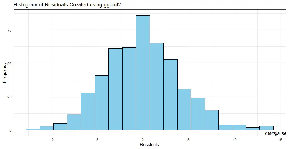
The histogram shows the distribution of residuals, which should ideally be normally distributed with a mean of 0. In this example, the histogram shows a roughly symmetric distribution centered around 0, indicating that the residuals are normally distributed. However, if the histogram is skewed or has outliers, it may indicate that the linear model is not an appropriate fit for the data (e.g., see previous examples).
Overall, creating a histogram of residuals using ggplot2 is a simple and effective way to assess the distribution of residuals visually. Moreover, it can be used to assess the goodness of fit of a linear model.
Other Diagnostical Tools
In addition to using graphical tools such as residual plots, there are several other methods to examine the assumptions of linear regression:
- Normality tests: Various statistical tests can be used to assess the normality of the residuals, such as the Shapiro-Wilk test or the Kolmogorov-Smirnov test. These tests assess whether the residuals follow a normal distribution.
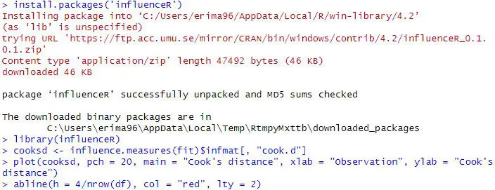
- Outlier detection: Outliers can significantly impact the results of a linear regression model. There are several methods for detecting outliers, such as Cook’s distance or the Mahalanobis distance.
- Homoscedasticity tests: Homoscedasticity refers to the assumption that the variance of the residuals is constant across all levels of the predictor variable. Various statistical tests can be used to assess homoscedasticity, such as the Breusch-Pagan test or the White test.
- Multicollinearity tests: Multicollinearity occurs when predictor variables have a high correlation. This can lead to unstable estimates of the regression coefficients. There are various methods for detecting multicollinearity, such as calculating the variance inflation factor (VIF) or performing a correlation analysis between the predictor variables.
We may also want to check whether there is autocorrelation in the data. See a more recent post:
By combining these methods, we can better understand the assumptions of linear regression. Moreover, we can ensure that the results of your model are valid and reliable. However, graphical tools such as residual plots are a good start!
Conclusion: Residual Plot in R
In summary, we have learned about residual plots and their significance in examining the assumptions of linear regression models. Residual plots are used to identify patterns in the residuals, which are the differences between the observed and predicted values of the dependent variable. Three residual plots were discussed: the fitted vs. residuals plot, the normal probability plot, and the histogram of residuals. These plots are used to check the assumptions of linearity, normality, and homoscedasticity of the errors. We learned how to create each type of residual plot using the ggplot2 package in R.
It is important to note that residual plots are just one tool to examine the assumptions of linear regression models, and other methods should also be used. Checking for outliers, influential observations, multicollinearity, and nonlinearity are other techniques that can be used. It is also important to remember that the results of any statistical analysis, including linear regression, should not be solely relied upon, and the data and analysis limitations should be considered.
Resources
Here are some R tutorials that you might find helpful:
- How to use %in% in R: 8 Example Uses of the Operator
- How to Create a Sankey Plot in R: 4 Methods
- Correlation in R: Coefficients, Visualizations, & Matrix Analysis
- Countif function in R with Base and dplyr
- How to Sum Rows in R: Master Summing Specific Rows with dplyr