Correlation in R is a crucial skill to know and apply. It allows us to answer research questions concerning relationships between variables and, therefore, gain valuable insights from our datasets. This tutorial will explore how to do correlation in R, including calculating coefficients and constructing matrices. We will learn how to calculate correlation coefficients. Creating a correlation matrix in R will be another key focus of this post. This matrix offers a comprehensive overview of the correlations between multiple variables, aiding in identifying complex patterns and dependencies within our data.
Additionally, adequate visualization of correlations enhances our understanding of the data and makes the interpretation easier. We will look at visualization techniques that enable us to present patterns clearly and concisely, allowing us to grasp the relationships between variables at a glance. In the next section of the post, we will provide a detailed outline.
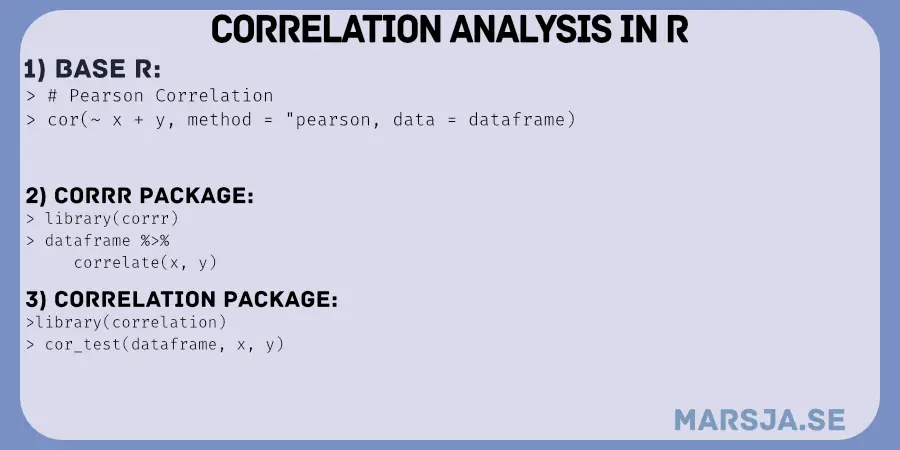
Table of Contents
- Outline
- Correlation
- Examples
- Prerequisites
- Synthetic Data
- Correlation in R using cor.test
- Scatter Plot of Correlation in R
- Partial Correlation in R
- Reporting Correlation According to APA 7
- Correlation Matrix in R using cor()
- Correlation Matrix in R using correlate from the corrr package
- Correlation Heatmap in R
- Correlation Table APA 7 Style
- Corrr Package for Correlation Analysis in R
- Alternative Packages for Correlation Analysis in R
- Conclusion: Correlation in R is straightforward
- Resources
Outline
This post aims to provide a comprehensive guide to calculating correlation using R, covering various aspects of correlation analysis and reporting. Moreover, we will look at different types of correlation coefficients, when to use correlation analysis, and the assumptions underlying this statistical technique. Additionally, we will explore practical examples from psychological research and hearing science to illustrate the application of correlation analysis.
First, however, we will ensure that you have the necessary prerequisites, such as basic knowledge of R and familiarity with data manipulation. We will also generate synthetic data to allow for following the examples in the post. Furthermore, we will learn how to create correlation heatmaps using ggplot2. To report correlation results in APA 7 style, we will have a look at the apaTables package.
Correlation
Correlation is a statistical measure that allows us to explore the relationship between variables. It helps us understand how changes in one variable are associated with changes in another. We can use it to quantify the strength and direction of a relationship. Thus, it can provide us with valuable insights into the connections within our data.
Correlation in general:
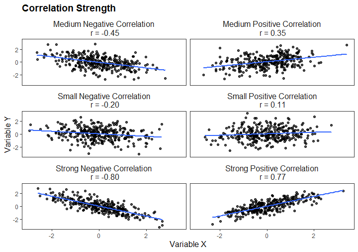
As previously mentioned, correlation generally refers to the statistical association between two or more variables. It allows us to examine how changes in one variable correspond to changes in another. The most common correlation coefficient is Pearson’s product-moment correlation coefficient, which measures the linear relationship between continuous variables. This coefficient ranges from -1 to 1, where 1 indicates a perfect positive linear relationship, 0 indicates no linear relationship, and -1 indicates a perfect negative linear relationship. Here is a visualization showing different strengths of correlation:
Types of Coefficients:
Different correlation coefficients serve specific purposes and accommodate different types of data. While Pearson’s correlation coefficient is commonly used for continuous variables, other coefficients are suitable for non-linear relationships and ranked data.
Spearman’s rank correlation coefficient, denoted by ρ (rho), is based on the ranks of the observations rather than the actual values. It assesses the monotonic relationship between variables, which may follow a consistent pattern without adhering to a linear trend. Spearman’s correlation ranges from -1 to 1, similar to Pearson’s correlation, but it also captures non-linear relationships.
Kendall’s rank correlation coefficient, denoted by τ (tau), is also based on ranked data. It measures the rank-based association between variables, specifically focusing on the number of concordant and discordant pairs. Kendall’s correlation ranges from -1 to 1, with 1 representing complete concordance, -1 representing complete discordance, and 0 representing no association.
When to use correlation analysis?
Correlation analysis is applicable in various scenarios. It is often used to explore the strength and direction of relationships between variables in research, including psychology, social sciences, and business. Correlation helps us identify patterns, find dependencies, and make predictions. However, it is important to note that correlation does not imply causation. While variables may be correlated, it does not necessarily mean one variable causes the other. Correlation indicates an association between variables. Spurious correlation can also occur when variables appear correlated but have no meaningful connection. It is crucial to exercise caution and consider additional evidence before inferring causal relationships.
Partial Correlation
Partial correlation analysis is a statistical technique used to explore the relationship between two variables while controlling for the influence of one or more additional variables. It allows us to examine the unique association between two variables, removing the effects of confounding variables.
Assumptions of Correlation:
Correlation analysis is based on several assumptions. One fundamental assumption is that the analyzed variables are measured on at least an interval scale, allowing for meaningful numerical comparisons. Additionally, the variables should follow a bivariate normal distribution for certain correlation coefficients, such as Pearson’s correlation. Violations of these assumptions can affect the validity of correlation results. It is important to assess the suitability of correlation analysis for the specific data and research question, considering the variables’ nature and distribution.
Examples
Here are two examples when we may want to use correlation analysis.
Psychological Research:
In psychological research, correlation analysis is crucial in understanding the connections between variables. For instance, researchers may examine the relationship between stress levels and cognitive performance, investigating whether higher stress levels are associated with lower cognitive abilities. Correlation analysis allows for quantifying this relationship, providing insights into the factors influencing cognitive functioning. However, it is important to note that correlation does not imply a causal relationship. Other factors, such as individual differences or mediating variables, may contribute to the observed association.
Hearing Science:
In hearing science, correlation analysis is frequently employed to investigate the relationships between hearing abilities and various factors. For instance, researchers may explore the correlation between pure-tone audiometry results and age to understand the impact of aging on hearing acuity. Such analyses help identify patterns and trends, contributing to a deeper understanding of hearing impairment and its association with age-related changes. However, it is essential to recognize that correlation does not establish causation. Factors other than age, such as noise exposure or genetic predispositions, may also influence hearing abilities.
In summary, correlation analysis is a powerful tool for exploring relationships between variables. It allows researchers to quantify the strength and direction of associations, providing valuable insights in various fields. However, it is crucial to remember that correlation does not imply causation and that spurious correlations can arise. By considering the correlation assumptions and interpreting the results with caution, we can gain a deeper understanding of the connections within our data and make informed decisions based on statistical evidence.
Prerequisites
Let us ensure you have a solid foundation. Here are a few prerequisites to consider:
First, it is important to have a basic understanding of correlational data analysis, including interpreting correlation coefficients. Additionally, familiarity with data manipulation in R will be beneficial for performing correlation analysis effectively.
When it comes to required packages, there are a few that will be useful for this post. One essential package is the tidyverse, which includes ggplot2, tidyr, and dplyr, among other useful tools. The tidyverse provides a cohesive set of packages that can be utilized for various data manipulation tasks in R.
For example, with the tidyr package, you can easily rename columns in your dataset, concatenate columns, or even reshape your data from wide to long format. The dplyr package offers convenient data summarization, filtering, and transformation functions. Moreover, the ggplot2 package within the tidyverse is widely used for creating visualizations, including scatter plots and heatmaps. Moreover, for partial correlation, we will use the ppcor package.
To ensure you have the necessary packages installed, you can use the install.packages() function in R. For instance:
install.packages(c('tidyverse', 'ppcor'))
Code language: R (r)
Keeping your R version updated is also recommended to benefit from the latest features and security enhancements.
With the prerequisites covered, we can now generate some example data and explore the world of correlation analysis in R.
Synthetic Data
Here is a synthetic dataset generated to practice correlation analysis in R:
library(dplyr)

# Set the random seed for reproducibility
set.seed(123)

# Generate correlation matrix
cor_matrix <- matrix(c(
  1, 0.4, 0.4, 0.4, 0.4, 0.4, 0.4, 0.4, 0.4,
  0.4, 1, 0.68, 0.5, 0.5, 0.5, 0.5, 0.5, 0.5,
  0.4, 0.68, 1, 0.68, 0.68, 0.68, 0.68, 0.68, 0.68,
  0.4, 0.5, 0.68, 1, 0.68, 0.68, 0.68, 0.68, 0.68,
  0.4, 0.5, 0.68, 0.68, 1, 0.68, 0.68, 0.68, 0.68,
  0.4, 0.5, 0.68, 0.68, 0.68, 1, 0.68, 0.68, 0.68,
  0.4, 0.5, 0.68, 0.68, 0.68, 0.68, 1, 0.68, 0.68,
  0.4, 0.5, 0.68, 0.68, 0.68, 0.68, 0.68, 1, 0.68,
  0.4, 0.5, 0.68, 0.68, 0.68, 0.68, 0.68, 0.68, 1
), nrow = 9, byrow = TRUE)

# Generate synthetic data
n <- 1000

age <- rnorm(n, mean = 40, sd = 10)
pure_tone_avg <- age * 0.4 + rnorm(n, mean = 0, sd = 5)

operation_span <- rnorm(n, mean = 10, sd = 2)
reading_span <- operation_span * 0.68 + rnorm(n, mean = 0, sd = 2)
digit_span <- operation_span * 0.5 + rnorm(n, mean = 0, sd = 2)

listening_ratings <- runif(n, min = 1, max = 10)
other_ratings <- listening_ratings + rnorm(n, mean = 0, sd = 1)

# Combine variables into a data frame
data <- data.frame(age, pure_tone_avg, operation_span, reading_span, digit_span,
                   listening_ratings, other_ratings)Code language: R (r)
In the code chunk above, we utilize the dplyr package to perform various operations on our data. Firstly, we set the random seed using set.seed(123) to ensure the reproducibility of our results. Next, we create a correlation matrix using the matrix() function. This matrix specifies the correlations between our variables based on the values provided. Each element in the matrix represents the correlation between a pair of variables.
Subsequently, we generate synthetic data for our variables using random number generation functions such as rnorm() and runif(). For example, we create the ‘age’ variable by sampling from a normal distribution with a mean of 40 and a standard deviation of 10. Similarly, we generate the ‘pure_tone_avg’ variable by multiplying ‘age’ by 0.4 and adding random noise.
Following this, we create additional variables such as ‘operation_span‘, ‘reading_span‘, ‘digit_span‘, ‘listening_ratings‘, and ‘other_ratings‘, each with specific formulas and correlation patterns based on the correlation matrix. Finally, we combine all the variables into a data frame named ‘data’ using the data.frame() function. This dataframe serves as a container for our synthetic data, allowing us to manipulate and analyze it easily.
Correlation in R using cor.test
We can use the cor.test() function to analyze the correlation between variables. This function allows us to compute correlation coefficients in R and test their significance.
Syntax
The syntax for cor.test() follows this structure:
cor.test(x, y, method = c("pearson", "kendall", "spearman"),
         alternative = c("two.sided", "less", "greater"))Code language: R (r)
Here, x and y represent the two variables we want to calculate the correlation coefficient. We can specify the correlation method using the method parameter, choosing from “pearson”, “kendall”, or “spearman”. Additionally, the alternative parameter allows us to define the alternative hypothesis for the correlation test.
Using the cor.test() function, we can explore and analyze the relationships between variables in our data. In the following sections, we will look deeper at different correlation methods and their applications in R.
Pearson’s Product-Moment Correlation Coefficient in R
Pearson’s product-moment correlation coefficient is widely used to quantify the strength and direction of a linear relationship between two continuous variables. We can easily calculate this coefficient using the cor.test() function with the “pearson” method in R.
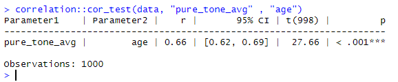
Let us calculate Pearson’s correlation coefficient in R between the ‘pure_tone_avg’ variable and ‘age’ in our synthetic data:
pearson_cor_result <- cor.test(data$pure_tone_avg, data$age, method = "pearson")
pearson_cor_coefficient <- pearson_cor_result$estimate

# Print the correlation coefficient
pearson_cor_coefficientCode language: PHP (php)
In the code chunk above, we obtain Pearson’s correlation coefficient between ‘pure_tone_avg’ and ‘age’ in our data. Remember, this coefficient ranges from -1 to 1, where values close to 1 indicate a strong positive linear relationship, values close to -1 indicate a strong negative linear relationship and values close to 0 indicate little to no linear relationship. In the next section, we will calculate Spearman’s correlation coefficient in R.
Spearman’s Correlation Coefficient in R:
Again, Spearman’s rank-order correlation coefficient is a non-parametric measure used to assess the strength and direction of the monotonic relationship between two variables. In R, we can calculate this coefficient using the cor.test() function with the “spearman” method. Here is how to find this correlation coefficient in R between the ‘listening_ratings’ and ‘other_ratings’ variables in our synthetic data:
spear_cor_result <- cor.test(data$listening_ratings,
                       data$other_ratings, method = "spearman")
spear_cor_coefficient <- spear_cor_result$estimate

# Print the correlation coefficient
spear_cor_coefficientCode language: R (r)
In the code chunk above, we obtain Spearman’s rank-order correlation coefficient in our data between ‘listening_ratings’ and ‘other_ratings’. Remember, this coefficient ranges from -1 to 1, where values close to 1 indicate a strong positive monotonic relationship, values close to -1 indicate a strong negative monotonic relationship, and values close to 0 indicate little to no monotonic relationship.
Spearman’s rank-order correlation is particularly useful when the relationship between variables is not linear but still follows a consistent pattern. It focuses on the order of observations rather than the specific values, making it robust to outliers and assumptions of normality. The following section will find the Kendal rank correlation coefficient in R.
Kendall’s Correlation Coefficient in R
We can compute Kendall’s correlation coefficient using the cor.test() function with the “kendall” method in R.
Here is how to calculate Kendall’s correlation coefficient (Tau) between the ‘listening_ratings’ and ‘other_ratings’ variables in our synthetic data:
kendall_cor_result <- cor.test(data$listening_ratings, data$other_ratings, method = "kendall")
tau_cor_coefficient <- kendall_cor_result$estimate

# Display the correlation coefficient
tau_cor_coefficientCode language: R (r)
In the code chunk above, we calculate Kendall’s correlation coefficient between listening_ratings and other_ratings in our data. As with the other two coefficients, Tau ranges from -1 to 1.
Kendall’s correlation coefficient is particularly suitable when dealing with ranked or ordinal data. It focuses on the number of concordant and discordant pairs of observations, making it robust to non-linear relationships and unaffected by the specific values of the variables.
Scatter Plot of Correlation in R
We can create a scatter plot using the ggplot2 package in R to understand the relationship between two variables better. In this example, we will visualize the correlation between age and pure_tone_avg from our synthetic data. Additionally, we will include the correlation coefficient on the plot to provide further context.
library(ggplot2)

# Create a scatter plot
ggplot(data, aes(x = age, y = pure_tone_avg)) +
  geom_point() +
  geom_smooth(method = "lm", se = FALSE) +
  labs(x = "Age", y = "Pure Tone Average") +
  geom_text(x = max(data$age), y = max(data$pure_tone_avg),
            label = paste("Correlation:", round(pearson_cor_coefficient, 2)),
            hjust = 1, vjust = 1)Code language: R (r)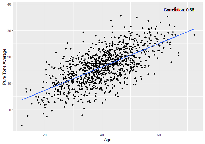
Partial Correlation in R
To calculate the partial correlation between pure_tone_avg and another variable, such as listening_ratings, while controlling for the variable age, we can utilize the ppcor package in R:
# Load the necessary package (ppcor)
library(ppcor)

# Compute the partial correlation coefficient
partial_corr <- pcor.test(data$pure_tone_avg, data$listening_ratings, data$age)$estimate

# Print the partial correlation coefficient
partial_corrCode language: R (r)
In the code chunk above, we find the partial correlation coefficient between pure_tone_avg and listening_ratings while considering the influence of age. This partial correlation coefficient represents the unique association between pure_tone_avg and listening_ratings after removing the influence of age.
Reporting Correlation According to APA 7
Here is how to report correlation results following APA 7 guidelines:
- Pearson’s Product-Moment: Pearson’s correlation was used to assess the relationship between pure-tone average and age (r = .66, p < .001, 95% CI [.62, .69], N = 1000).
- Spearman’s Rho: Spearman’s rho was used to assess the relationship between listening ratings and other ratings (ρ = .92, N = 1000 p < 0.001).
- Kendall’s Tau: Kendall’s tau-b was used to assess the relationship between listening ratings and other ratings (τ_b = .76, p < .001).
Correlation Matrix in R using cor()
In R, we can easily calculate the correlation matrix using the cor() function. Let’s explore the syntax of the cor() function and provide an example of how to use it.
Syntax of cor()
The cor() function in R has the following syntax:
cor(x, y = NULL, use = "everything",
method = c("pearson", "kendall", "spearman"))Code language: R (r)xandy: The variables for which we want to calculate the correlation. We can pass either a vector or a data frame.use: Specifies how to handle missing values in the variables. The default value is “everything,” which includes all observations with complete data.method: Specifies the correlation coefficient to be used. Options include “pearson” (default), “kendall,” and “spearman.”
Example
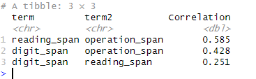
To illustrate the computation of a correlation matrix in R, let us select only the span tests from our dataset using the select() function from the dplyr package and then calculate the correlation matrix for these variables:
library(dplyr)

# Select only the span tests using select() from dplyr
span_tests <- select(data, ends_with("span"))

# Calculate the correlation matrix
cor_matrix <- cor(span_tests)Code language: R (r)
In the code chunk above, we use the select() function from the dplyr package to select columns that start with “span” from our dataset. We assign these variables to the span_tests object. Then, we apply the cor() function to the span_tests data frame to compute the correlation matrix.
The resulting cor_matrix will contain the pairwise correlation coefficients between the selected span test variables. Each cell in the matrix represents the correlation between two variables. Here is the correlation matrix:
Correlation Matrix in R using correlate from the corrr package
The correlate function from the corrr package provides a convenient way to calculate a correlation matrix in R. This function offers various functionalities to explore and analyze the correlations between multiple variables. Let’s explore how to use the correlate function and provide an example.
Syntax of correlate
The correlate function in R has the following syntax:
correlate(
  x,
  y = NULL,
  use = "pairwise.complete.obs",
  method = "pearson",
  diagonal = NA,
  quiet = FALSE
)Code language: JavaScript (javascript)xandy: The variables for which we want to calculate the correlation. We can pass either vectors or a data frame.use: Specifies how to handle missing values in the variables. The default value is “pairwise.complete.obs,” which includes only observations with complete data.method: Specifies the correlation coefficient to be used. The default is “pearson,” but other options include “kendall” and “spearman.”diagonal: Specifies the value to be assigned to the diagonal of the correlation matrix. The default is NA.quiet: Controls the verbosity of the function. The default is FALSE, which displays the progress and results.
Example
To illustrate the computation of a correlation matrix in R using the correlate function from the corrr package, let us select only the span tests from our dataset. Here is the code to calculate the correlation matrix for these variables:
library(dplyr)
library(corrr)

# Select only the span tests using select() from dplyr
span_tests <- select(data, ends_with("span"))

# Calculate the correlation matrix using correlate()
cor_matrix <- correlate(span_tests, y = NULL, method = "pearson", use = "pairwise.complete.obs")Code language: R (r)
In the code chunk above, we use the select() function to select the vairables that start with “span” from our dataset. Then, we apply the correlate() function from the corrr package to the span_tests data frame, specifying the method as “pearson” and the use as “pairwise.complete.obs”.
The resulting cor_matrix will contain the correlation coefficients between the selected span test variables, calculated using the Pearson correlation coefficient. Each cell in the matrix represents the correlation between two variables.
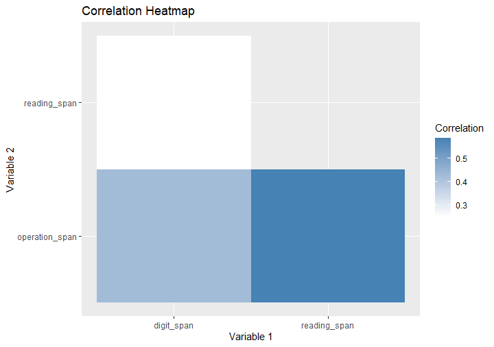
Correlation Heatmap in R
A correlation heatmap is a useful visualization tool that allows us to explore the correlation matrix visually. In this section, we will create a correlation heatmap using the corrr package and the steps involved.
Step 1: Melt the correlation matrix
We must first convert the correlation matrix from wide to long format to create a heatmap. This step is necessary to prepare the data for visualization using the ggplot2 package.
library(tidyr)
# Melt the correlation matrix
melted_corr <- cor_matrix %>%
  shave() %>%
  pivot_longer(-term, names_to = "term2", values_to = "Correlation") %>%
  drop_na()

# View the melted correlation matrix
head(melted_corr)Code language: PHP (php)
In the code chunk above, we first apply the shave() function from the corrr package to retain only the upper triangle of the correlation matrix. This step is necessary to eliminate duplicated information since the symmetric correlation matrix.
Next, we utilize the pivot_longer() function from the tidyr package to convert the correlation matrix from wide to long in R. By specifying names_to = "term2" and values_to = "Correlation", we reshape the data frame so that each row represents a unique pair of variables and their corresponding correlation coefficient.
Finally, we use the drop_na() function to remove any rows containing missing values in the melted correlation matrix. This ensures that only valid and complete observations are retained.
The resulting melted_corr dataframe is now in a long format, ready to be used for further analysis or visualization.
Step 2: Create the correlation heatmap using ggplot2
Next, we use ggplot2 to create the correlation heatmap in R:
library(ggplot2)

# Create the correlation heatmap
heatmap <- ggplot(melted_corr, aes(x = term, y = term2, fill = Correlation)) +
  geom_tile() +
  scale_fill_gradient(low = "white", high = "steelblue") +
  labs(x = "Variable 1", y = "Variable 2", title = "Correlation Heatmap")

# Display the correlation heatmap
heatmapCode language: R (r)
In the code chunk provided, we start by loading the ggplot2 package, essential for creating data visualizations in R.
Next, we create the correlation heatmap using the ggplot() function from the ggplot2 package. We specify the melted_corr data frame as the data source for the plot.
Within the ggplot() function, we define the aesthetics of the heatmap by mapping the variables term and term2 to the x and y axes, respectively. The fill aesthetic is mapped to the Correlation column, which determines the color of each tile in the heatmap based on the corresponding correlation coefficient.
To create the heatmap, we add the geom_tile() layer, which generates rectangular tiles representing the correlations between variables.
To enhance the visual representation, we use scale_fill_gradient() to specify the color gradient for the fill aesthetic. In this case, the heatmap will use a gradient from "white" for lower correlation values to "steelblue" for higher correlation values.
Furthermore, we use the labs() function to provide descriptive labels for the heatmap’s x-axis, y-axis, and overall title.
To display the resulting correlation heatmap, we assign the entire ggplot() expression to the heatmap object. Then, by simply calling the heatmap object, the heatmap is rendered and displayed in the R environment. Here is the resulting plot:
In the following section, you will learn how to create an APA 7-style correlation table for your publications.
Correlation Table APA 7 Style
APA correlation table is a widely used format for presenting correlation coefficients and their statistical significance. To create an APA-style correlation table in R, we will use the apa.cor.table() function from the apaTables package. This function automates generating a table that adheres to the guidelines specified in the 7th edition of the Publication Manual of the American Psychological Association (APA).
Here is how to create an APA correlation table in R:
library(apaTables)

span_tests <- dplyr::select(data, ends_with("span"))
apa.cor.table(span_tests, filename = "APA_Correlation_Table.doc",
              table.number=1)Code language: R (r)
In the code chunk above, we first load the apaTables package, which provides the necessary functions for creating APA-style tables in R.
Next, we select the variables related to working memory span tests from our dataset using the select() function from the dplyr package. We assign these variables to the span_tests object.
To generate the APA-style correlation table, we use the apa.cor.table() function, specifying span_tests as the input data frame. Additionally, we provide the filename parameter to specify the output file name where the correlation table will be saved. In this case, it will be saved as “APA_Correlation_Table.doc”.
We also specify the table.number parameter to assign a number to the table following APA guidelines. Here is the resulting APA table:
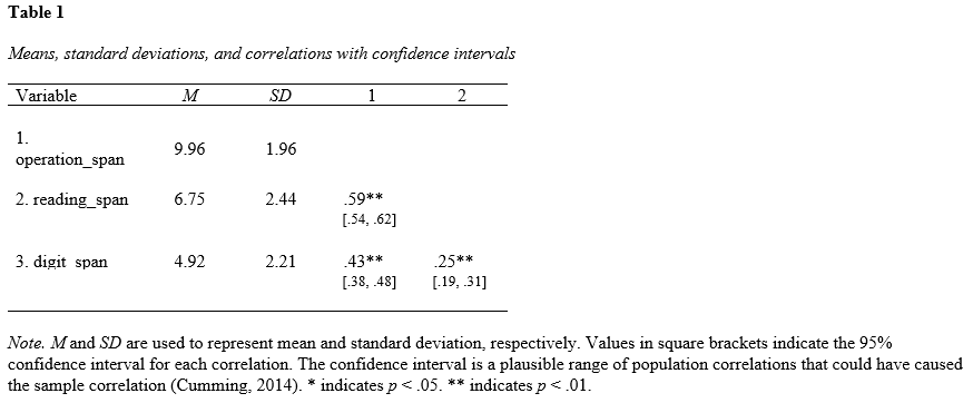
By executing this code, the apa.cor.table() function will create an APA-style correlation table for the selected span test variables. The table will include the mean, the standard deviation, correlation coefficients, their statistical significance, and any other relevant information required by the APA guidelines. The resulting table will be saved as a Word document with the specified filename. In the next section, we will touch upon the advantages of using the corr package.
Corrr Package for Correlation Analysis in R
Here are some advantages of using the corrr package for calculating correlation coefficients in R:
Enhanced functionality
The corrr package provides additional functionalities for exploring and analyzing correlation matrices. It offers various methods for calculating correlations, including correlate() for Pearson, Kendall, and Spearman coefficients. Additionally, it provides options to handle missing values and control the behavior of the correlation matrix calculation.
Automatic handling of missing values
The correlate() function in corrr straightforwardly handles missing values. By default, it uses pairwise complete observations, calculating the correlation coefficients based on available data points while excluding missing values. This approach ensures the correlation matrix is based on the maximum available information.
Informative visualization
The corrr package offers powerful visualization functions, enabling us to interpret and communicate correlation matrices effectively. Integration with ggplot2 allows for visually appealing and customizable plots of correlation matrices, making it easier to identify patterns and relationships between variables.
Flexible output
The output of the correlate() function is a cor_df object, which provides a comprehensive representation of the correlation matrix. This object contains the correlation coefficients and additional information such as p-values, significance stars, and confidence intervals. These attributes can be accessed and utilized for further analysis and interpretation.
Alternative Packages for Correlation Analysis in R
When it comes to calculating and visualizing correlations in R, there are alternative packages available that offer unique features and functionality. One such package is the correlation package, part of the easystats ecosystem.
The correlation package provides a user-friendly interface for computing correlations in R, offering various methods such as Pearson, Spearman, and Kendall coefficients. It also includes options for handling missing values and supports the calculation of partial correlations.
Another alternative for correlation analysis is the psych package, which provides a comprehensive set of descriptive and inferential statistics functions, including correlation analysis. The correlate() function in the psych package allows for calculating various correlation coefficients and provides additional statistics such as p-values and confidence intervals.
When it comes to visualizing correlations, the ggplot2 package, along with the ggcorrplot extension, offers a wide range of customization options. This combination creates visually appealing correlation plots with color-coded tiles, clearly representing the relationships between variables.
Alternatives such as rempsyc and Papaja can generate APA-style correlation tables. The rempsyc package provides functions for generating APA-style correlation tables, allowing for easy integration of correlations into research papers or reports. Similarly, the Papaja package offers seamless integration with LaTeX and allows for creating APA-formatted tables and documents.
Conclusion: Correlation in R is straightforward
In conclusion, this post has provided a comprehensive guide to reporting and interpreting correlation results in R. We have explored various aspects of correlation analysis, including the different types of coefficients available, when to use correlation analysis, and the assumptions underlying correlation calculations.
One key takeaway is the importance of accurately and effectively reporting correlation results. Understanding how to interpret correlation coefficients and their significance is crucial for drawing meaningful conclusions from your data. Following the guidelines and examples presented in this post, you can confidently report correlation results in APA 7 style, ensuring clarity and adherence to standardized practices.
Furthermore, we have demonstrated how R offers powerful tools and packages for conducting correlation analysis and creating insightful visualizations. From calculating correlation coefficients using functions like cor.test(), to creating correlation matrices and heatmaps using ggplot2 and the corrr package, R provides a flexible and versatile environment for exploring and analyzing correlations in your data.
Please share this post with colleagues and fellow researchers who may benefit from learning about correlation analysis in R. Engaging in discussions and collaborations surrounding correlation analysis can lead to valuable insights and enhance the quality of your research endeavors.
Resources
Here are some data analysis-related resources:
- How to Standardize Data in R
- Probit Regression in R: Interpretation & Examples
- Plot Prediction Interval in R using ggplot2
- How to Calculate Z Score in R
- Extract P-Values from lm() in R: Empower Your Data Analysis
- Mastering SST & SSE in R: A Complete Guide for Analysts
- Test for Normality in R: Three Different Methods & Interpretation
- Durbin Watson Test in R: Step-by-Step incl. Interpretation
- Coefficient of Variation in R