In this R tutorial, you will discover how to use ggplot to center the title effectively. Centering the title is crucial to creating visually appealing plots, and, e.g., enabling better communication of insights. We will explore examples from hearing science and psychology to demonstrate the significance of centering titles in ggplot2 objects.
Table of Contents
- Outline
- Hearing Science:
- Psychology:
- Data Exploration:
- Requirements
- Synthetic Data
- Center the Title of a ggplot Scatter plot
- Center title with ggplot: Violin Plot
- Conclusion: ggplot center title
- Resources
Outline
This blog post will first review some examples from hearing science and psychology. These examples will demonstrate situations where centering the title of our plots can be beneficial, such as research publications and data exploration. Next, we will outline what you need to know and have to follow this blog post effectively. Having a basic understanding of R programming and having R installed on your system is important. Having RStudio, an integrated development environment for R, can further enhance your experience.
Following the scatter plot example, we will create a violin plot with ggplot. Again, we will focus on centering the title and highlighting its advantages to the visualization. Code snippets and explanations will be provided to help you implement this technique in your own plots. Finally, we will conclude the blog post by summarizing the importance of centered titles in ggplot visualizations.
Hearing Science:
When visualizing audiograms, a graphical representation of hearing ability, centering the title plays a vital role. By aligning the title centrally, we ensure that viewers immediately recognize the plot’s primary focus and can easily interpret the data. With ggplot, you can effortlessly center titles to enhance the visual impact of audiograms.
Psychology:
In psychological research, scatterplots are often used to display the relationship between two variables. By centering the title of a scatterplot, you draw attention to the central message of the plot, such as the strength of the correlation or the significance of the association. This positioning helps viewers comprehend the underlying patterns more effectively, making the plot more informative.
Data Exploration:
Creating facets or subplots can provide deeper insights when exploring large hearing science or psychology datasets. Centered titles for each subplot enable clear identification of the variables under consideration, facilitating comparison and analysis across multiple visualizations.
Requirements
To follow this post on how to center the title on ggplot objects, you need to understand R programming and have R installed on your system. Having RStudio, an integrated development environment for R, can also enhance your experience.
Ensure you have an updated version of R installed to use the latest features and functionalities (update R to the latest version).
This tutorial will utilize handy packages, including dplyr, ggplot2, and other related packages. Make sure you have them installed and loaded into your R environment. We will also use the awesome functionalities of dplyr, a popular data manipulation package in R, to generate subsets and perform data transformations. With dplyr, you can easily select columns in R, simplifying data manipulation tasks. Renaming factor levels becomes effortless, ensuring clear and meaningful data representation. Removing duplicates is a breeze, allowing for streamlined analysis. dplyr’s intuitive syntax empowers efficient data transformations.
ggplot2, a powerful data visualization package, will be extensively used to create various types of plots, including scatter plots, violin plots, and more. To actively engage with the content, having a code editor or IDE (such as RStudio) open alongside the blog post is recommended.
Synthetic Data
Here are some synthetic data to practice using ggplot to center titles in plots:
library(dplyr)
# Generate synthetic data for psychology and hearing research
set.seed(123)
# Categorical variable: Psychological conditions
psych_conditions <- c("Anxiety", "Depression", "Schizophrenia", "Bipolar")
# Numerical variable: Hearing thresholds
hearing_thresholds <- rnorm(100, mean = 50, sd = 10)
# Generate a dataframe with facets and subplots
data <- tibble(
ParticipantID = 1:100,
Condition = sample(psych_conditions, 100, replace = TRUE),
HearingThreshold = hearing_thresholds
)
# Create additional categorical variable: Research Group
data <- data %>%
mutate(
ResearchGroup = case_when(
Condition %in% c("Anxiety", "Depression") ~ "Group A",
Condition %in% c("Schizophrenia", "Bipolar") ~ "Group B"
)
)
# View the generated data
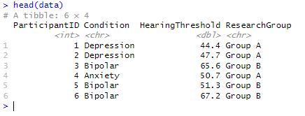
head(data)Code language: R (r)In the code chunk above, we begin by loading the dplyr package, allowing us to manipulate data easily. To generate synthetic data for psychology and hearing research, we set the random seed using set.seed(123) for reproducibility.
We define a categorical variable called psych_conditions that represents different psychological conditions, including “Anxiety,” “Depression,” “Schizophrenia,” and “Bipolar.”
Next, we generate a numerical variable named hearing_thresholds using the rnorm function. This variable represents hearing thresholds and follows a normal distribution with a mean of 50 and a standard deviation of 10.
To create a structured dataset, we use the tibble function to generate a dataframe called data. This dataframe consists of three variables: ParticipantID (ranging from 1 to 100), Condition (sampled randomly from psych_conditions with replacement), and HearingThreshold (containing the generated hearing thresholds). We then create a categorical variable called ResearchGroup using the %in% operator in R. The mutate function from dplyr allows us to add new columns to the data dataframe. Based on the values of the Condition variable, we assign participants with “Anxiety” or “Depression” to “Group A” and participants with “Schizophrenia” or “Bipolar” to “Group B” using the case_when function.
The resulting dataframe, data, now includes the ParticipantID, Condition, HearingThreshold, and ResearchGroup variables, allowing us to perform further analysis and create visualizations. The %in% operator in R determines whether elements in one vector are present in another. This code helps us assign the appropriate research group based on the conditions present in the Condition variable. Here is the first few rows of the dataframe:
This synthetic data allows us to create violin and scatter plots with centered titles using ggplot.
Center the Title of a ggplot Scatter plot
Here is how we use ggplot to center the title of a scatter plot in R:
library(ggplot2)

# Create scatter plot with centered title
scatter_plot <- ggplot(data, aes(x = HearingThreshold, y = ParticipantID)) +
  geom_point() +
  labs(title = "Scatter Plot of Hearing Thresholds") +
  theme(plot.title = element_text(hjust = 0.5))

# Display the scatter plot
scatter_plot
Code language: R (r)
In the code chunk above, we create a scatter plot with a centered title using the ggplot package in R.
We begin by initializing the scatter plot object with the line scatter_plot <- ggplot(data, aes(x = HearingThreshold, y = ParticipantID)). Here, we specify the dataset data and the aesthetic mappings within the aes() function. The x aesthetic is set to HearingThreshold, representing the x-axis values, and the y aesthetic is set to ParticipantID, representing the y-axis values.
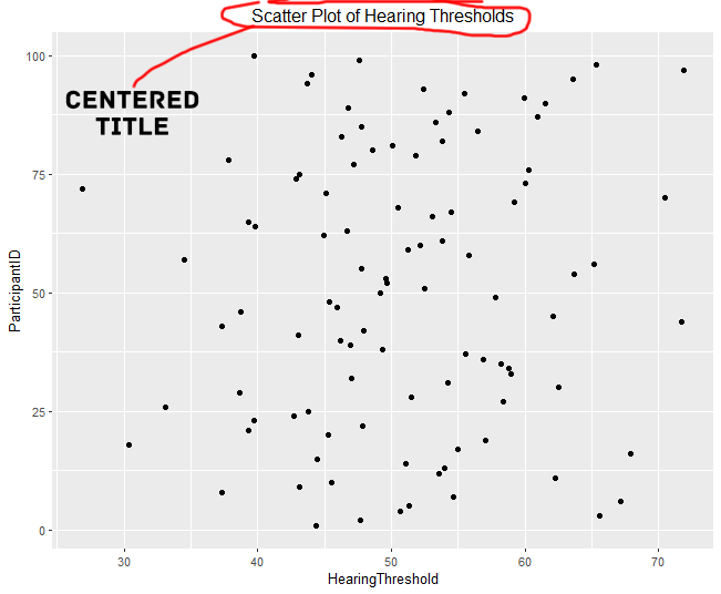
Next, we add points to the scatter plot using the geom_point() function. This function instructs ggplot to plot the data as individual points based on the specified aesthetics. We use the labs() function with the title argument to set the plot’s title. Here is where we assign the title: “Scatter Plot of Hearing Thresholds”.
Centering the Title in the ggplot Object
We modify the theme settings using the theme() function to center the title horizontally within the plot. Specifically, we set plot.title to element_text(hjust = 0.5). The element_text() function controls the appearance of the plot elements, and the hjust argument with a value of 0.5 specifies horizontal justification. We are setting it to 0.5 centers the title within the plot.
When we combine these steps, outlined above, we create the scatter plot object scatter_plot, which includes the data, aesthetics, points, title, and theme settings.
The resulting plot will be a scatter plot with the provided data, where the x-axis represents hearing thresholds and the y-axis represents participant IDs. The title, “Scatter Plot of Hearing Thresholds,” will be centered horizontally within the plot. Here is the resulting plot:
Center title with ggplot: Violin Plot
Here is how we use ggplot to center the title on a violin plot in R:
# Create violin plot with centered title
violin_plot <- ggplot(data, aes(x = ResearchGroup, y = HearingThreshold)) +
  geom_violin() +
  labs(title = "Violin Plot of Hearing Thresholds by Research Group") +
  theme(plot.title = element_text(hjust = 0.5))Code language: HTML, XML (xml)
In the code chunk above, we create a violin plot with a centered title using ggplot in R.
We start by initializing the violin plot object with the line violin_plot <- ggplot(data, aes(x = ResearchGroup, y = HearingThreshold)). Here, we specify the dataset data and the aesthetic mappings within the aes() function. The x aesthetic is set to ResearchGroup, representing the x-axis values, and the y aesthetic is set to HearingThreshold, representing the y-axis values.
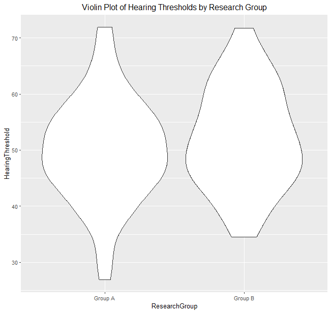
Next, we add violin plots to the plot using the geom_violin() function. This function instructs ggplot to create the density distribution of the HearingThreshold variable for each ResearchGroup, resulting in the violin-shaped plots.
We use the labs() function with the title argument to set the plot’s title. Furthermore, we assign the title the value “Violin Plot of Hearing Thresholds by Research Group”.
How to Center ggplot Title
We modify the theme settings using the theme() function to center the title horizontally within the plot. Specifically, we set plot.title to element_text(hjust = 0.5) to center the title. The element_text() function allows us to control the appearance of plot elements, and the hjust argument with a value of 0.5 specifies horizontal justification. Setting it to 0.5 aligns the title to the center of the plot horizontally. Here is the resulting plot:
- How to Create a Sankey Plot in R: 4 Methods
- Plot Prediction Interval in R using ggplot2
- How to Make a Residual Plot in R & Interpret Them using ggplot2
Conclusion: ggplot center title
In this post, we have explored the concept of centering titles in ggplot visualizations to enhance their impact and clarity. Through the use of examples, we have demonstrated how to apply this technique in scatter plots and violin plots.
The scatter plot example showcased the process of creating a scatter plot using ggplot. We then centered the title using the labs() and theme() functions, providing a clear and concise code snippet to achieve the desired result.
Similarly, we illustrated how to create a violin plot using ggplot and centered the title in the violin plot example. The labs() and theme() functions were utilized to ensure the title aligned with the plot’s center, enhancing its visual appeal.
Following these examples and understanding the underlying principles, you can confidently center titles in your ggplot visualizations. This will contribute to more engaging and visually appealing data presentations.
I encourage you to share this blog post with others who are interested in improving their data visualizations with ggplot. By sharing knowledge, we can collectively enhance the quality of data communication and visualization techniques.
Resources
Here are some other resources you might find helpful:
- How to Standardize Data in R
- Extract P-Values from lm() in R: Empower Your Data Analysis
- How to Take Absolute Value in R – vector, matrix, & data frame
- Master or in R: A Comprehensive Guide to the Operator
- Report Correlation in APA Style using R: Text & Tables