In this blog post, you will learn how to plot the prediction interval in R. If you work with data or are interested in statistical analysis, you know that making predictions is an essential part of the process. Moreover, if you are new to prediction intervals or want to refresh your knowledge, this post will cover everything you need. We’ll start with an overview of the statistical methods involved, including regression models, time series models, and Bayesian inference. We will also look at some practical examples of when and how to plot the prediction interval in R, including applications in psychology and hearing science.
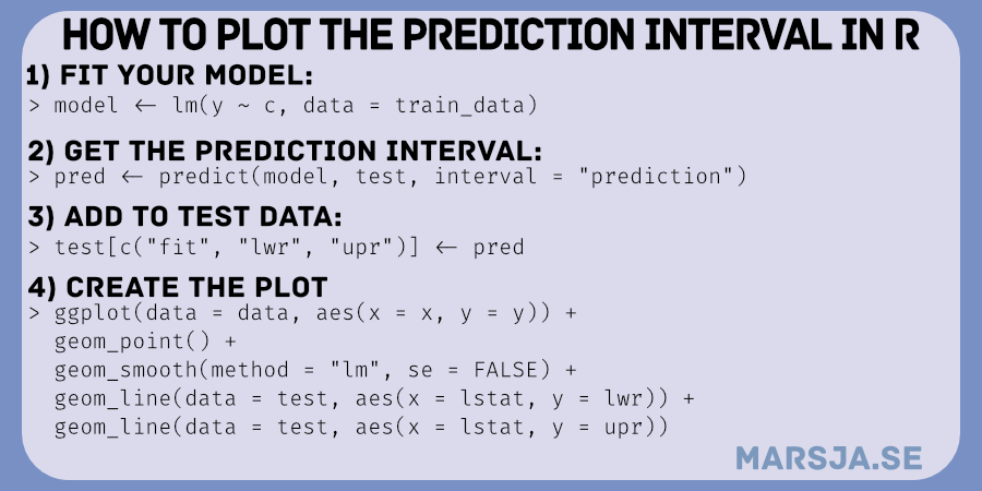
Table of Contents
- Prediction Interval
- Examples of when to plot the Prediction Interval in R
- Hearing Science Example:
- Interim Summary:
- Requirements
- Example Data to Visualize a Prediction Interval in R
- How to Plot a Prediction Interval in R
- Prediction and Confidence Interval in R
- Summary: Prediction Plot in R
- More R Tutorials:
Prediction Interval
A prediction interval is a measure that estimates the range of values within which a future observation or measurement will likely fall with a certain confidence level. It differs from a confidence interval, which estimates the precision of a point estimate, such as the mean or median of a population. A prediction interval accounts for both the uncertainty associated with the estimation of the underlying parameters and the variability of the observed data.
Statistical Methods
Prediction intervals can be obtained using different statistical methods. It all depends on the nature of the data and the assumptions made about the underlying probability distribution. Some common methods include:
Regression models:
Prediction intervals can be obtained from linear or nonlinear regression models. These models describe the relationship between predictor variables and a response variable. The prediction interval considers the variability of the residuals (the differences between the observed values and the predicted values) and the uncertainty of the regression coefficients. This post will focus on visualizing the prediction interval from regression models in R.
Time series models:
Prediction intervals can be obtained from time series models, which describe the evolution of a variable over time. The prediction interval considers the uncertainty of the model parameters and the noise in the data.
Bayesian inference:
Prediction intervals can be obtained from Bayesian models, which assign probabilities to the possible values of the parameters and future observations. The prediction interval considers the prior knowledge about the parameters and the information in the observed data.
Examples of when to plot the Prediction Interval in R
Psychology Example:
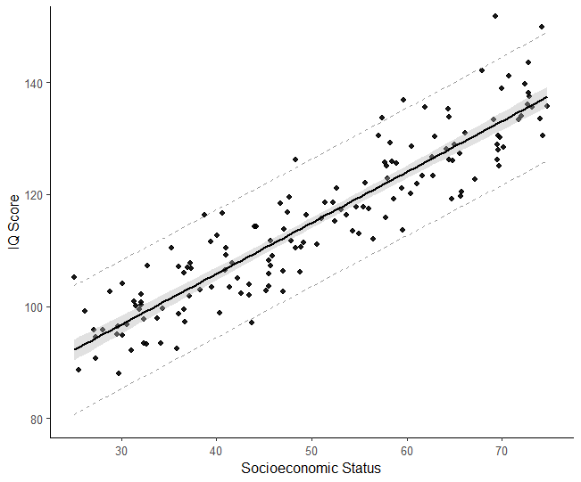
In psychology, prediction intervals can be used to estimate the variability of individual differences in a population. One example from Psychological science: predicting a new individual’s IQ score based on a sample. We set up a model to estimate the relationship between predictor variables (e.g., age, education) and the response variable (IQ score). We use prediction intervals to assess our confidence in the predicted score. The prediction interval considers the residuals’ variability and the uncertainty of the regression coefficients. We can use prediction intervals to compare the new individual’s IQ score with others in the population. Here is a scatter plot created in R with confidence and prediction intervals:
Hearing Science Example:
An example of using prediction intervals in hearing science can be seen in the study of the relationship between the pure-tone average (PTA) and the probability of hearing loss. The PTA is a measure of hearing threshold at various frequencies. A probit or logit model can estimate the probability of hearing loss. Probit regression models the relationship between the PTA and the probability of hearing loss.
Once the model is fitted, a prediction interval can be calculated to estimate the range of likely probabilities of hearing loss for a new individual, given their PTA. This prediction interval considers the PTA variability and the uncertainty of the model parameters. It measures our confidence in the predicted probability of hearing loss.
Interim Summary:
In summary, prediction intervals are a useful statistical measure that provides a range of values within which a future observation or measurement will likely fall within a certain confidence level. Prediction intervals can be obtained using different statistical methods. The method you choose depends on the nature of the data and the assumptions made about the underlying probability distribution. For example, prediction intervals can be used in psychology and hearing science to estimate the variability of individual differences and auditory thresholds, respectively. These examples demonstrate the importance of considering the uncertainty and variability of the data when making predictions and drawing conclusions.
Requirements
To plot a prediction interval in R, you must understand linear regression models and their associated concepts, such as confidence intervals, standard errors, and residuals. You should also be familiar with the R language and have some knowledge of the ggplot2 package. First, you need to fit a statistical model using regression analysis. This could be linear, logistic, or any other regression model. The model can be created using the lm() or glm() function, depending on the type of regression analysis.
In R, you can use the predict() function to generate predicted values based on, e.g., a linear regression model.
To use ggplot2, you must install the package using the install.packages() function. You must also load the package into your R session using the library() function. You will also need to understand the grammar of graphics and how to use ggplot2 to create visualizations in R.
In addition to ggplot2, you may also need to use packages such as dplyr, tidyr, and broom. We can use these packages to manipulate and clean your data, visualize data, and extract model coefficients and standard errors.
To plot a prediction interval in R, you will need a good understanding of regression models and associated concepts. Moreover, you must be familiar with the R language and ggplot2 package. You may also need to use other packages to manipulate and clean your data, fit linear regression models, and extract model coefficients and standard errors.
Example Data to Visualize a Prediction Interval in R
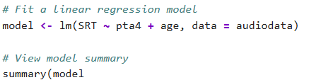
Suppose we study the relationship between pure-tone average (PTA4) and speech recognition threshold (SRT) in a speech-in-noise task. We can collect data from 300 normal-hearing participants. Moreover, we measure PTA4 in decibels hearing level (dB HL), while we measure SRT in dB signal-to-noise ratio (SNR). Here is this dataset generated in R:
library(tidyverse)

set.seed(20230318) # for reproducibility
n <- 300 # sample size
PTA4 <- rnorm(n, mean = 25, sd = 5)
SRT <- 0.3 * PTA4 + rnorm(n, mean = 0, sd = 5)

data <- tibble(PTA4, SRT)Code language: PHP (php)
The dataset consists of two variables, PTA4 and SRT, with 300 observations each. PTA4 represents the average hearing threshold levels at 500, 1000, 2000, and 4000 Hz. On the other hand, SRT represents the lowest SNR at which participants can correctly identify 50% of the target words in a speech-in-noise task. Furthermore, we created data that normally distributed (mean PTA4 = 25 dB HL, SD = 5 dB HL. Finally, the relationship between PTA4 and SRT is linear. Specifically, with a slope of 0.3 and a random error that follows a normal distribution (mean = 0, SD = dB SNR). Finally, before creating a prediction plot in R, we also need some new data:
# Generate new data with noise
PTA4_new <- seq(from = min(PTA4), to = max(PTA4), length.out = 100)
SRT_new <- predict(model, newdata = data.frame(PTA4 = PTA4_new)) + rnorm(length(PTA4_new), mean = 0, sd = 1)Code language: PHP (php)
In the code chunk above, we use predict() to get the prediction interval for new data. We specify the model and the new data using data.frame(). We set the interval argument to “prediction”. Here are some more tutorials on creating dataframes in R:
- How to Create a Matrix in R with Examples – empty, zeros
- Learn How to Convert Matrix to dataframe in R with base functions & tibble
- R Excel Tutorial: How to Read and Write xlsx files in R
How to Plot a Prediction Interval in R
To plot the prediction interval in R, we need to follow the following steps:
1. Fit a Model
First, we need to fit a linear regression model to our data:
# Fit linear regression model
model <- lm(SRT ~ PTA4, data = data)Code language: HTML, XML (xml)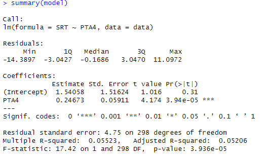
Note that you can check the assumptions of linear regression (and maybe you should) by creating a residual plot:
Finally, if your predictor variables are on different scales, you might want to use R to standardize the data using e.g., z-scores.
2. Use the predict() Function
Second, we need to use the predict() function on another dataset:
library(dplyr)
# Get prediction interval
PI <- predict(model, newdata = data.frame(PTA4 = PTA4_new), interval = "prediction")

# Combine data into a single data frame
PTA_new_df <- tibble(xvals = PTA4_new,
         pred = SRT_new,
         lwr= PI[, 2],
         upr = PI[, 3])Code language: PHP (php)
In the code chunk above, we start by loading the “dplyr”. Then, we calculate the prediction interval (PI) using a previously fitted model with the predict() function. The “newdata” argument specifies the values of the predictor variable “PTA4” for which we want to predict the response variable. The “interval” argument specifies that we want to calculate the prediction interval.
Next, we combine the results into a dataframe called “PTA_new_df”. We use the tibble() function to create the dataframe with four columns. Here the xvals column contains the new predictor variable values (“PTA4_new”), pred contains the predicted response variable values (“SRT_new”). Finally, column lwr contains the lower bounds of the prediction interval and upr the upper bounds of the interval. We use the “[” operator to extract the lower and upper bounds of the prediction interval. Here are a couple of data wrangling tutorials:
- How to Rename Column (or Columns) in R with dplyr
- R: Add a Column to Dataframe Based on Other Columns with dplyr
3. Plot the Prediction Interval in R with ggplot2
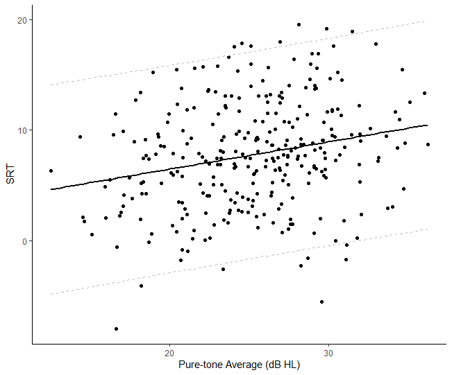
Finally, we are ready to use ggplot2 to visualize the prediction interval in R:
ggplot(data = data, aes(x = PTA4, y = SRT)) +
    geom_point() +
    geom_smooth(method = "lm", color = "black", se = FALSE) +
    geom_line(data = PTA_new_df, aes(x = xvals, y = lwr), linetype = "dashed", color = "grey") +
    geom_line(data = PTA_new_df, aes(x = xvals, y = upr), linetype = "dashed", color = "grey") +
    xlab("Pure-tone Average (dB HL)") +
    ylab("SRT") + theme_classic()Code language: PHP (php)
In the code chunk above, we use ggplot to create a scatter plot with PTA4 as the x-axis and SRT as the y-axis. We add points to the plot with geom_point(). We then add a linear regression line to the plot using geom_smooth() with method “lm”. Moreover, we set se = FALSE to remove the confidence interval. We add two dashed lines for the prediction interval using geom_line(). Here we used PTA_new_df as the data frame. Importantly, we used xvals, lwr, and upr as the prediction interval’s x-axis, lower, and upper values. Finally, we label the x and y-axes with xlab() and ylab() and set the theme to theme_classic(). Here is the resulting prediction plot:
Here are some more data visualization tutorials:
- How to Create a Violin plot in R with ggplot2 and Customize it
- How to Create a Sankey Plot in R: 4 Methods
- ggplot Center Title: A Guide to Perfectly Aligned Titles in Your Plots
Prediction and Confidence Interval in R
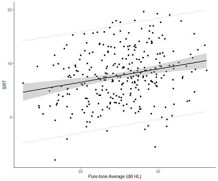
To plot the prediction and confidence interval in R, we can slightly change the code from the last example:
ggplot(data = data, aes(x = PTA4, y = SRT)) +
    geom_point() +
    geom_smooth(method = "lm", color = "black", se = TRUE) +
    geom_line(data = PTA_new_df, aes(x = xvals, y = lwr), linetype = "dashed", color = "grey") +
    geom_line(data = PTA_new_df, aes(x = xvals, y = upr), linetype = "dashed", color = "grey") +
    xlab("Pure-tone Average (dB HL)") +
    ylab("SRT") + theme_classic()Code language: PHP (php)
In the code chunk above, we changed the se argument to TRUE to get this plot:
Plot Prediction Interval for Polynomial Regression in R
Plotting the prediction interval for a polynomial regression in R is straightforward. We can use the same steps as linear regression. For demonstration purposes, we use the Boston housing dataset:
# Load the Boston housing data:
data("Boston", package = "MASS")
# We create a training and a test dataset
training <- Boston[1:406,]
test <- Boston[407:506,]Code language: R (r)
In the code chunk above, the Boston dataset is being split into two sets, training and test, using row indices. The dataset contains 506 observations on housing prices in the Boston area and various other variables that might be related to those prices.
The first line of code, training <- Boston[1:406,], we create a dataframe called training. This dataframe includes the first 406 rows of the Boston dataset, which will be used to train the machine learning model.
In the second line of code, test <- Boston[407:506,] we create another dataframe . The test dataframe includes the remaining 100 rows of the Boston dataset, which will be used to evaluate the performance of the trained model. We will use our example to see how well the polynomial model predicts new data.
Fitting a Polynomial Regression Model
Here we fit a polynomial regression model in R (you can skip to the next step if you already have your model):
# Now we fit a polynomial model to the data
poly_model <- lm(medv ~ poly(lstat, 5), data=training)
summary(poly_model)Code language: R (r)
In the code chunk above, we fit a polynomial model to the data using the lm() function in R. First, we define the model formula using the ~ operator, where medv is the response variable (the median value of owner-occupied homes in $1000s), and poly(lstat, 5) is the predictor variable, which is a polynomial transformation of lstat (the percentage of lower status of the population).
We used the poly() function to create the polynomial transformation, where the second argument (5 in this case) specifies the degree of the polynomial. In this case, we are using a fifth-degree polynomial, which means that the predictor variable is transformed into five new variables with increasing powers of lstat. Finally, we get the summary of the fitted model using the summary() function.
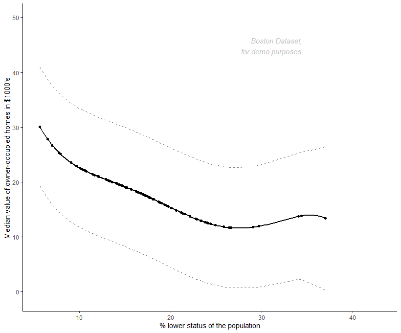
Plotting the Prediction Interval
We are now ready to plot the prediction interval for a polynomial regression in R:
ls_predict <- predict(poly_model, test, interval = "prediction") #
test[c("fit", "lwr", "upr")] <- ls_predict

ggplot(test, aes(lstat, fit)) +
    geom_point() +
    geom_smooth(method = "lm", color = "black", se = TRUE,
                formula = y ~ poly(x, 5, raw = TRUE)) +
    geom_line(aes(y = lwr), linetype = "dashed", color = "grey50") +
    geom_line(aes(y = upr), linetype = "dashed", color = "grey50") +
    xlab("% lower status of the population") +
    ylab("Median value of owner-occupied homes in $1000's.") +
    annotate("text", x = 35, y = 40,
             label = "Boston Dataset,\n for demo purposes",
             hjust = 1.1, vjust = -1.1, colour = "grey50",
             fontface = "italic", alpha = 0.5, size = 4) +

    theme_classic()Code language: PHP (php)
In the code chunk above, ls_predict calculates the prediction intervals of a polynomial model using the testing data, with the interval argument set to “prediction”. The resulting intervals are then added to the testing dataset using test[c("fit", "lwr", "upr")] <- ls_predict, where fit, lwr, and upr are the fitted values, lower bounds, and upper bounds.
We use the ggplot function to visualize the model and prediction intervals. The geom_point layer plots the original data, the geom_smooth layer with method = "lm" adds a line of best fit with polynomial regression, and the geom_line layers add the prediction intervals with dashed lines. Moreover, we use the xlab and ylab arguments to define the x and y-axis labels, respectively. Finally, w use the theme_classic function to apply a classic look to the plot. Here is the resulting plot:
Summary: Prediction Plot in R
In this blog post, you have learned about prediction intervals in R and how to visualize them using ggplot2. Prediction intervals are a statistical method that can estimate the range within which future observations are likely to fall. You can plot prediction intervals in R for various disciplines, including psychology, data science, and hearing science.
To plot a prediction interval in R, you must first fit a model, e.g., polynomial regression, ARIMA, ANCOVA. Once you have a model, you can use the predict() function to generate predictions for new data points. These predictions can then be used to plot the prediction interval using ggplot2.
The blog post also covered confidence intervals, similar to prediction intervals but are used to estimate the range within which the population parameter is likely to fall. The post concludes with an example of how to plot the prediction interval for a polynomial regression model in R.
In summary, this blog post gave you an overview of prediction intervals and how to use R to visualize them. Following the step-by-step instructions, even beginner R programmers can create informative plots to help understand their data.
More R Tutorials:
Here are some more R tutorials that you might find helpful:
- How to Take Absolute Value in R – vector, matrix, & data frame
- R Count the Number of Occurrences in a Column using dplyr
- How to use %in% in R: 7 Example Uses of the Operator
- Select Columns in R by Name, Index, Letters, & Certain Words with dplyr
- How to Remove Duplicates in R – Rows and Columns (dplyr)