In this Python tutorial, we will learn how to plot a confusion matrix using Seaborn. Confusion matrices are a fundamental tool in data science and hearing science. They provide a clear and concise way to evaluate the performance of classification models. In this post, we will explore how to plot confusion matrices in Python.
In data science, confusion matrices are commonly used to assess the accuracy of machine learning models. They allow us to understand how well our model correctly classifies different categories. For example, a confusion matrix can help us determine how many emails were correctly classified as spam in a spam email classification model.
In hearing science, confusion matrices are used to evaluate the performance of hearing tests. These tests involve presenting different sounds to individuals and assessing their ability to identify them correctly. A confusion matrix can provide valuable insights into the accuracy of these tests and help researchers make improvements.
Understanding how to interpret and visualize confusion matrices is essential for anyone working with classification models or conducting hearing tests. In the following sections, we will dive deeper into plotting and interpreting confusion matrices using the Seaborn library in Python.
Using Seaborn, a powerful data visualization library in Python, we can create visually appealing and informative confusion matrices. We will learn how to prepare the data, create the matrix, and interpret the results. Whether you are a data scientist or a hearing researcher, this guide will equip you with the skills to analyze and visualize confusion matrices using Seaborn effectively. So, let us get started!
Table of Contents
- Outline
- Prerequisites
- Confusion Matrix
- Visualizing a Confusion Matrix
- How to Plot a Confusion Matrix in Python
- Synthetic Data
- Preparing Data
- Creating a Seaborn Confusion Matrix
- Interpreting the Confusion Matrix
- Modifying the Seaborn Confusion Matrix Plot
- Conclusion
- Additional Resources
- More Tutorials
Outline
The structure of the post is as follows. First, we will begin by discussing prerequisites to ensure you have the necessary knowledge and tools for understanding and working with confusion matrices.
Following that, we will learn the concept of the confusion matrix, highlighting its importance in evaluating classification model performance. In the “Visualizing a Confusion Matrix” section, we will explore various methods for representing this critical analysis tool, shedding light on the visual aspects.
The heart of the post lies in “How to Plot a Confusion Matrix in Python,” where we will guide you through the process step by step. This is where we will focus on preparing the data for the analysis. Under “Creating a Seaborn Confusion Matrix,” we will outline four key steps, from importing the necessary libraries to plotting the matrix with Seaborn, ensuring a comprehensive understanding of the entire process.
Once the confusion matrix is generated, “Interpreting the Confusion Matrix” will guide you in extracting valuable insights, allowing you to make informed decisions based on model performance.
Before concluding the post, we also look at how to modify the confusion matrix we created using Seaborn. For instance, we explore techniques to enhance the visualization, such as adding percentages instead of raw values to the plot. This additional step provides a deeper understanding of model performance and helps you communicate results more effectively in data science applications.
Prerequisites
Before we explore how to create confusion matrices with Seaborn, there are essential prerequisites to consider. First, a foundational understanding of Python is required. Proficiency in Python and a grasp of programming concepts is needed. If you are new to Python, familiarize yourself with its syntax and fundamental operations.
Moreover, prior knowledge of classification modeling is, of course, needed. You need to know how to get the data needed to generate the confusion matrix.
You must install several Python packages to practice generating and visualizing confusion matrices. Ensure you have Pandas for data manipulation, Seaborn for data visualization, and scikit-learn for machine learning tools. You can install these packages using Python’s package manager, pip. Sometimes, it might be necessary to upgrade pip to the latest version. Installing packages is straightforward; for example, you can install Seaborn using the command pip install seaborn.
Confusion Matrix
A confusion matrix is a performance evaluation tool used in machine learning. It is a table that allows us to visualize the performance of a classification model by comparing the predicted and actual values of a dataset. The matrix is divided into four quadrants: true positive (TP), true negative (TN), false positive (FP), and false negative (FN).
Understanding confusion matrices is crucial for evaluating model performance because they provide valuable insights into the accuracy and effectiveness of a classification model. By analyzing the values in each quadrant, we can determine how well the model performs in correctly identifying positive and negative instances.
The true positive (TP) quadrant represents the cases where the model correctly predicted the positive class. The true negative (TN) quadrant represents the cases where the model correctly predicted the negative class. The false positive (FP) quadrant represents the cases where the model incorrectly predicted the positive class. The false negative (FN) quadrant represents the cases where the model incorrectly predicted the negative class.
We can calculate performance metrics such as accuracy, precision, recall, and F1 score by analyzing these values. These metrics help us assess the model’s performance and make informed decisions about its effectiveness.
The following section will explore different methods to visualize confusion matrices and discuss the importance of choosing the right visualization technique.
Visualizing a Confusion Matrix
When it comes to visualizing a confusion matrix, several methods are available. Each technique offers its advantages and can provide valuable insights into the performance of a classification model.
One common approach is to use heatmaps, which use color gradients to represent the values in the matrix. Heatmaps allow us to quickly identify patterns and trends in the data, making it easier to interpret the model’s performance. Another method is to use bar charts, where the height of the bars represents the values in the matrix. Bar charts are useful for comparing the different categories and understanding the distribution of predictions.
However, Seaborn is one of Python’s most popular and powerful libraries for visualizing confusion matrices. Seaborn offers various functions and customization options, making creating visually appealing and informative plots easy. It provides a high-level interface to create heatmaps, bar charts, and other visualizations.
Choosing the right visualization technique is crucial because it can greatly impact the understanding and interpretation of the confusion matrix. The chosen visualization should convey the information and insights we want to communicate. Seaborn’s flexibility and versatility make it an excellent choice for plotting confusion matrices, allowing us to create clear and intuitive visualizations that enhance our understanding of the model’s performance.
In the next section, we will plot a confusion matrix using Seaborn in Python. We will explore the necessary steps and demonstrate how to create visually appealing and informative plots that help us analyze and interpret the performance of our classification model.
How to Plot a Confusion Matrix in Python
When it comes to plotting a confusion matrix in Python, there are several libraries available that offer this capability.
Steps to Plot a Confusion matrix in Python:
Generating a confusion matrix in Python using any package typically involves the following steps:
- Import the Necessary Libraries: Begin by importing the relevant Python libraries, such as the package for generating confusion matrices and other dependencies.
- Prepare True and Predicted Labels: Collect the true labels (ground truth) and the predicted labels from your classification model or analysis.
- Compute the Confusion Matrix: Utilize the functions or methods the chosen package provides to compute the confusion matrix. This matrix will tabulate the counts of true positives, true negatives, false positives, and false negatives.
- Visualize or Analyze the Matrix: Optionally, you can visualize the confusion matrix using various visualization tools or analyze its values to assess the performance of your classification model.
Seaborn
This post will use Seaborn, one of this task’s most popular and powerful libraries. Seaborn provides a high-level interface to create visually appealing and informative plots, including confusion matrices. It offers various functions and customization options, making it easy to generate clear and intuitive visualizations.
One of the advantages of using Seaborn for plotting confusion matrices is its flexibility. It allows you to create heatmaps, bar charts, and other visualizations, allowing you to choose the most suitable representation for your data. Another advantage of Seaborn is its versatility. It provides various customization options, such as color palettes and annotations, which allow you to enhance the visual appearance of your confusion matrix and highlight important information. Using Seaborn, you can create visually appealing and informative plots that help you analyze and interpret the performance of your classification model. Its powerful capabilities and user-friendly interface make it an excellent choice for plotting confusion matrices in Python.
- How to Make a Violin plot in Python using Matplotlib and Seaborn
- Seaborn Line Plots: A Detailed Guide with Examples (Multiple Lines)
- How to Make a Scatter Plot in Python using Seaborn
The following sections will dive into the necessary steps to prepare your data for generating a confusion matrix using Seaborn. We will also explore data preprocessing techniques that may be required to ensure accurate and meaningful results. First, however, we will generate a synthetic dataset that can be used to practice generating confusion matrices and plotting them.
Synthetic Data
Here, we generate a synthetic dataset that can be used to practice plotting a confusion matrix with Seaborn:
import pandas as pd
import random
# Define the number of test cases
num_cases = 100
# Create a list of hearing test results (Categorical: Hearing Loss, No Hearing Loss)
hearing_results = ['Hearing Loss'] * 20 + ['No Hearing Loss'] * 70
# Introduce noise (e.g., due to external factors)
noisy_results = [random.choice(hearing_results) for _ in range(10)]
# Generate predicted labels (simulated) and add them to the DataFrame
data['PredictedResult'] = [random.choice([True, False]) for _ in range(num_cases)]
# Combine the results
results = hearing_results + noisy_results
# Create a dataframe:
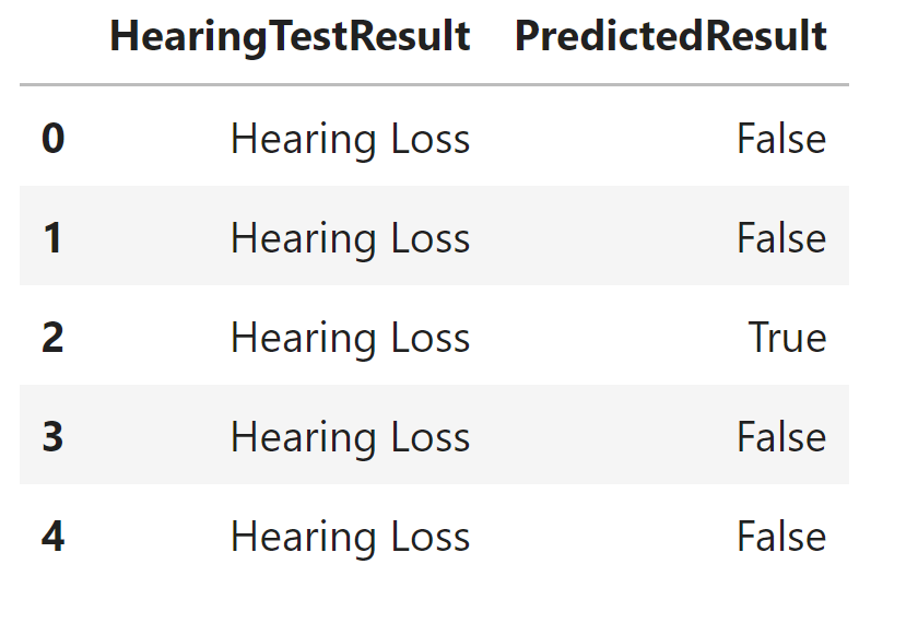
data = pd.DataFrame({'HearingTestResult': results})Code language: PHP (php)In the code chunk above, we first imported the Pandas library, which is instrumental for data manipulation and analysis in Python. We also utilized the ‘random’ module for generating random data.
To begin, we defined the variable num_cases to represent the total number of test cases, which in this context amounts to 100 observations. Next, we set the stage for simulating a hearing test dataset. We created hearing_results, a list containing the categories Hearing Loss and No Hearing Loss. This categorical variable represents the results of a hypothetical hearing test where Hearing Loss indicates an impaired hearing condition and No Hearing Loss signifies normal hearing.
Incorporating an element of real-world variability, we introduced noisy_results. This step involves generating ten observations with random selections from the hearing_results list, mimicking external factors that may affect hearing test outcomes. The purpose is to simulate real-world variability and add diversity to the dataset.
Combining the hearing_results and noisy_results, we created the results list, representing the complete dataset. Finally, we used Pandas to create a dataframe with a dictionary as input. We named it data with a column labeled HearingTestResult, which encapsulates the simulated hearing test data.
Preparing Data
Ensuring data is adequately prepared before generating a confusion matrix using Seaborn involves several necessary steps. First, we may need to gather the data we want to evaluate using the confusion matrix. This data should consist of the true and predicted labels from your classification model. Ensure the labels are correctly assigned and aligned with the corresponding data points.
Next, we may need to preprocess the data. Data preprocessing techniques can improve the quality and reliability of your results. Commonly, we use techniques such as handling missing values, scaling or normalizing the data, and encoding categorical variables. We will not go through all these steps to create a Seaborn confusion matrix plot.
For example, we can remove the rows or columns with missing values or impute the missing values using techniques such as mean imputation or regression imputation. Scaling the data can be important to ensure all features are on a similar scale. This can prevent certain features from dominating the analysis and affecting the performance of the confusion matrix.
Encoding categorical variables is necessary if your data includes non-numeric variables. This process can involve converting categorical variables into numerical representations. We can also, as in the example below, recode the categorical variables to True and False. See How to use Pandas get_dummies to Create Dummy Variables in Python for more information about dummy coding.
By following these steps and applying appropriate data preprocessing techniques, you can ensure our data is ready to generate a confusion matrix using Seaborn. The following section will provide step-by-step instructions on how to create a Seaborn confusion matrix, along with sample code and visuals to illustrate the process.
Creating a Seaborn Confusion Matrix
To generate a confusion matrix using Seaborn, follow these step-by-step instructions. First, import the necessary libraries, including Seaborn and Matplotlib. Next, prepare your data by ensuring you have the true and predicted labels from your classification model.
Step 1: Import the Libraries
Here, we import the libraries that we will use to use Seaborn to plot a Confusion Matrix.
import seaborn as sns
import matplotlib.pyplot as plt
from sklearn.metrics import confusion_matrixCode language: Python (python)
Step 2: Prepare and Preprocess Data
The following step is to prepare and preprocess data. Note that we do not have any missing values in the example data. However, we need to recode the categorial variables to True and False.
data['HearingTestResult'] = data['HearingTestResult'].replace({'Hearing Loss': True,
                                                               'No Hearing Loss': False})Code language: Python (python)
In the Python code above, we transformed a categorical variable, HearingTestResult, into a binary format for further analysis. We used the Pandas library’s replace method to map the categories to boolean values. Specifically, we mapped ‘Hearing Loss’ to True, indicating the presence of hearing loss, and ‘No Hearing Loss’ to False, indicating the absence of hearing loss.
Step 3: Create a Confusion Matrix
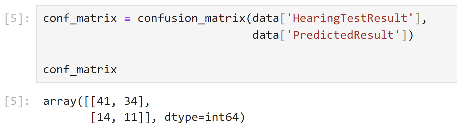
Once the data is ready, we can create the confusion matrix using the confusion_matrix()function from the Scikit-learn library. This function takes the true and predicted labels as input and returns a matrix that represents the performance of our classification model.
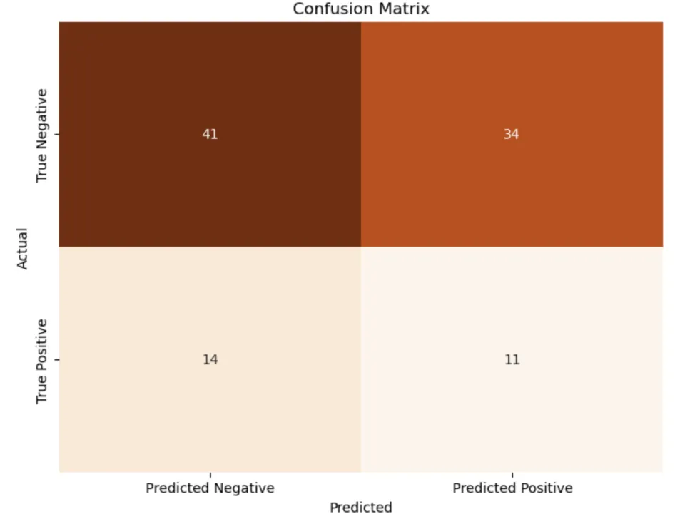
conf_matrix = confusion_matrix(data['HearingTestResult'],
                               data['PredictedResult'])Code language: Python (python)
In the code snippet above, we computed a confusion matrix using the confusion_matrix function from scikit-learn. We provided the true hearing test results from the dataset and the predicted results to evaluate the performance of a classification model.
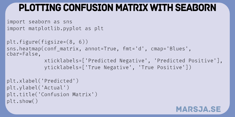
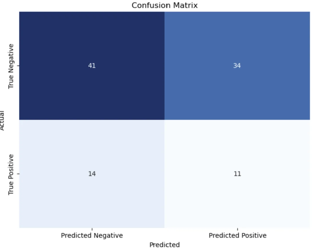
Step 4: Plot the Confusion Matrix with Seaborn
To plot a confusion Matrix with Seaborn, we can use the following code:
# Plot the confusion matrix using Seaborn
plt.figure(figsize=(8, 6))
sns.heatmap(conf_matrix, annot=True, fmt='d', cmap='Blues', cbar=False,
            xticklabels=['Predicted Negative', 'Predicted Positive'],
            yticklabels=['True Negative', 'True Positive'])
plt.xlabel('Predicted')
plt.ylabel('Actual')
plt.title('Confusion Matrix')
plt.show()Code language: Python (python)
In the code chunk above, we created a visual representation of the confusion matrix using the Seaborn library. We defined the plot’s appearance to provide an insightful view of the model’s performance. The sns.heatmap function generates a heatmap with annotations to depict the confusion matrix values. We specified formatting options (annot and fmt) to display the counts, we chose the Blues color palette for visual clarity. Additionally, we customized the plot’s labels with xticklabels and yticklabels denoting the predicted and actual classes, respectively. The xlabel, ylabel, and title functions helped us label the plot appropriately. This visualization is a powerful tool for comprehending the model’s classification accuracy, making it accessible and easy for data analysts and stakeholders to interpret. Here is the resulting plot:
Interpreting the Confusion Matrix
Once you have generated a Seaborn confusion matrix for your classification model, it is important to understand how to interpret the results presented in the matrix. The confusion matrix provides valuable information about your model’s performance and can help you evaluate its accuracy. The confusion matrix consists of four main components: true positives, false positives, true negatives, and false negatives. These components represent the different outcomes of your classification model.
True positives (TP) are the cases where the model correctly predicted the positive class. In other words, these are the instances where the model correctly identified the presence of a certain condition or event. False positives (FP) occur when the model incorrectly predicts the positive class. These are the instances where the model falsely identifies the presence of a certain condition or event.
True negatives (TN) represent the cases where the model correctly predicts the negative class. These are the instances where the model correctly identifies the absence of a certain condition or event. False negatives (FN) occur when the model incorrectly predicts the negative class. These are the instances where the model falsely identifies the absence of a certain condition or event.
By analyzing these components, you can gain insights into the performance of your classification model. For example, many false positives may indicate that your model incorrectly identifies certain conditions or events. On the other hand, many false negatives may suggest that your model fails to identify certain conditions or events.
Understanding the meaning of true positives, false positives, and false negatives is crucial for evaluating the effectiveness of your classification model and making informed decisions based on its predictions. Before concluding the post, we will also examine how we can modify the Seaborn plot.
Modifying the Seaborn Confusion Matrix Plot
We can also plot the confusion matrix with percentages instead of raw values using Seaborn:
# Calculate percentages for each cell in the confusion matrix
percentage_matrix = (conf_matrix / conf_matrix.sum().sum())

# Plot the confusion matrix using Seaborn with percentages
plt.figure(figsize=(8, 6))
sns.heatmap(percentage_matrix, annot=True, fmt='.2%', cmap='Blues', cbar=False,
            xticklabels=['Predicted Negative', 'Predicted Positive'],
            yticklabels=['True Negative', 'True Positive'])
plt.xlabel('Predicted')
plt.ylabel('Actual')
plt.title('Confusion Matrix (Percentages)')
plt.show()Code language: PHP (php)
In the code snippet above, we changed the code a bit. First, we calculated the percentages and stored them in the variable percentage_matrix by dividing the raw confusion matrix (conf_matrix) by the sum of all its elements.
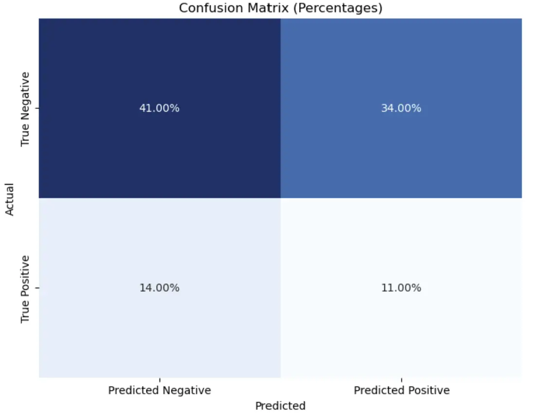
After calculating the percentages, we modified the fmt parameter within the Seaborn heatmap function. Specifically, we set fmt to ‘.2%’ to format the annotations as percentages, ensuring that the values displayed in the matrix represent the proportions of the total observations in the dataset. This change enhances the interpretability of the confusion matrix by expressing classification performance relative to the dataset’s scale. Here are some more tutorials about, e.g., modifying Seaborn plots:
- How to Save a Seaborn Plot as a File (e.g., PNG, PDF, EPS, TIFF)
- How to Change the Size of Seaborn Plots
Conclusion
In conclusion, this tutorial has provided a comprehensive overview of how to plot and visualize a confusion matrix using Seaborn in Python. We have explored the concept of confusion matrices and their significance in various industries, such as speech recognition systems in hearing science and cognitive psychology experiments. By analyzing confusion matrices, we can gain valuable insights into the performance of systems and the accuracy of participants’ responses.
Understanding and visualizing a confusion matrix with Seaborn is crucial for data analysis projects. It allows us to assess classification models’ performance and identify improvement areas. Visualizing the confusion matrix will enable us to quickly interpret the results and make informed decisions based on other measures such as accuracy, precision, recall, and F1 score.
We encourage readers to apply their knowledge of confusion matrices and Seaborn in their data analysis projects. By implementing these techniques, they can enhance their understanding of classification models and improve the accuracy of their predictions.
I hope this article has helped demystify confusion matrices and provide practical guidance on plotting and visualizing them using Seaborn. I invite readers to share this post on social media and engage in discussions about their progress and experiences with confusion matrices in their data analysis endeavors.
Additional Resources
In addition to the information provided in this data visualization tutorial, several other resources and tutorials can further enhance your understanding of plotting and visualizing confusion matrices using Seaborn in Python. These resources can provide additional insights, tips, and techniques to help you improve your data analysis projects.
Here are some recommended resources:
- Seaborn Documentation: The official documentation for Seaborn is a valuable resource for understanding the various functionalities and options available for creating visualizations, including confusion matrices. It provides detailed explanations, examples, and code snippets to help you get started.
- Stack Overflow: Stack Overflow is a popular online community where programmers and data analysts share their knowledge and expertise. Using Seaborn, you can find numerous questions and answers related to plotting and visualizing confusion matrices. This platform can be a great source of solutions to specific issues or challenges.
By exploring these additional resources, you can expand your knowledge and skills in plotting and visualizing confusion matrices using Seaborn. These materials will give you a deeper understanding of the subject and help you apply these techniques effectively in your data analysis projects.
More Tutorials
Here are some more Python tutorials on this blog that you may find helpful:
- Coefficient of Variation in Python with Pandas & NumPy
- Python Check if File is Empty: Data Integrity with OS Module
- Find the Highest Value in Dictionary in Python
- Pandas Count Occurrences in Column – i.e. Unique Values