In this Python data visualization tutorial, we will learn how to create line plots with Seaborn. First, we’ll start with the simplest example (with one line), and then we’ll look at how to change the look of the graphs and how to plot multiple lines, among other things.

Note, the above plot was created using Pandas read_html to scrape data from a Wikipedia table and Seaborn’s lineplot method. All code, including for creating the above plot, can be found in a Jupyter notebook (see towards the end of the post).
Data Visualization Introduction
Now, when it comes to visualizing data, it can be fun to think of all the flashy and exciting methods to display a dataset. However, if we’re trying to convey information, creating fancy and cool plots isn’t always the way to go.
In fact, one of the most powerful ways to show the relationship between variables is the simple line plot. First, we are going to look at how to quickly create a Seaborn line plot. After that, we will cover some more detailed Seaborn line plot examples.
Simple Seaborn Line Plot
To create a Seaborn line plot, we can follow the following steps:
- Import data (e.g., with pandas)
import pandas as pd

df = pd.read_csv('ourData.csv', index_col=0)Code language: JavaScript (javascript)
2. Use the lineplot method:
import seaborn as sns

sns.lineplot('x', 'y', data=df)Code language: JavaScript (javascript)
Importantly, in 1) we need to load the CSV file, and in 2) we need to input the x- and y-axis (e.g., the columns with the data we want to visualize). More details, on how to use Seaborn’s lineplot, follows in the rest of the post.
Prerequisites
Now, before simulating data to plot, we will briefly touch on what we need to follow in this tutorial. Obviously, we need to have Python and Seaborn installed. Furthermore, we will need to have NumPy as well. Note, that Seaborn is depending on both Seaborn and NumPy. This means that we only need to install Seaborn to get all the packages we need. As with many Python packages, we can install Seaborn with pip or conda. If needed, there’s a post about installing Python packages with both pip and conda, available. Check it out.
Simulate Data
In the first Seaborn line graph examples, we will use data that are simulated using NumPy. Specifically, we will create two response variables (x & y) and a time variable (day).
import numpy as np

# Setting a random seed for reproducibility
np.random.seed(3)

# Numpy Arrays for means and standard deviations
# for each day (variable x)
mus_x = np.array([21.1, 29.9, 36.1])
sd_x = np.array([2.1, 1.94, 2.01])

# Numpy Arrays for means and standard deviations
# for each day (variable y)
mus_y = np.array([64.3, 78.4, 81.1])
sd_y = np.array([2.2, 2.3, 2.39])

# Simulating data for the x and y response variables
x = np.random.normal(mus_x, sd_x, (30, 3))
y = np.random.normal(mus_y, sd_y, (30, 3))

# Creating the "days"
day= ['d1']*30 + ['d2']*30 + ['d3']*30

# Creating a DataFrame from a Dictionary
df = pd.DataFrame({'Day':day, 'x':np.reshape(x, 90, order='F'),
                  'y':np.reshape(y, 90, order='F')})
df.head()Code language: Python (python)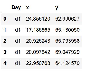
In the code chunk above, we used NumPy to create some data (refer to the documentation for more information) and we then created a Pandas DataFrame from a dictionary. Usually, of course, we read our data from an external data source and we’ll have look at how to do this, as well, in this post. Here are some useful articles:
- How to read and write Excel (xlsx) files in Python with Pandas
- How to read SAS files with Pandas
- How to read SPSS (.sav) files in Python with Pandas
- How to read STATA files in Python with Pandas
Basic Seaborn Line Plot Example
Now, we are ready to create our first Seaborn line plot, and we will use the data we simulated in the previous example. To create a line plot with Seaborn, we can use the lineplot method, as previously mentioned. Here’s a working example plotting the x variable on the y-axis and the Day variable on the x-axis:
import seaborn as sns

sns.lineplot('Day', 'x', data=df)Code language: Python (python)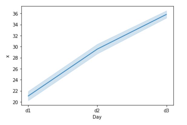
Here we started with the simplest possible line graph using Seaborn’s lineplot. For this simple graph, we did not use any more arguments than the obvious above. Now, this means that our line plot also got the confidence interval plotted. In the next Seaborn line plot example, we are going to remove the confidence interval.
Removing the Confidence Interval from a Seaborn Line Plot
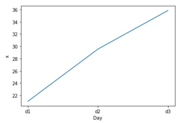
In the second example, we are going to remove the confidence interval from the Seaborn line graph. This is easy to do we just set the ci argument to “None”:
sns.lineplot('Day', 'x', ci=None, data=df)Code language: Python (python)This will result in a line graph without the confidence interval band, that we would otherwise get:
Adding Error Bars in Seaborn lineplot
Expanding on the previous example, we will now, instead of removing, changing how we display the confidence interval. Here, we will change the style of the error visualization to bars and have them display 95 % confidence intervals.
sns.lineplot('Day', 'x', ci=95,
             err_style='bars', data=df)Code language: Python (python)
As evident in the code chunk above, we used Seaborn lineplot and the err_style argument with ‘bars’ as parameter to create error bars. Thus, we got this beautiful line graph:

Note, we can also use the n_boot argument to customize how many boostraps we want to use when calculating the confidence intervals.
Changing the Color of a Seaborn Line Plot
In this Seaborn line graph example, we are going to further extend on our previous example but we will be experimenting with color. Here, we will add the color argument and change the color of the line and error bars to red:
sns.lineplot('Day', 'x', ci=95, color="red",
             err_style='bars', data=df)Code language: Python (python)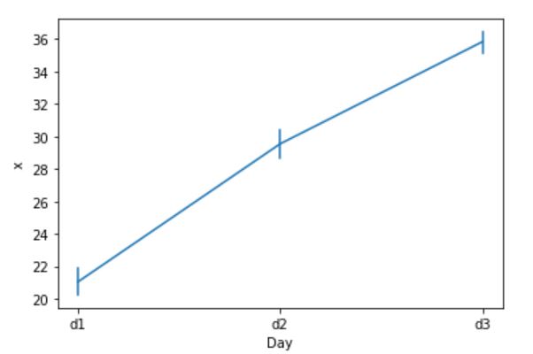
Note, we could experiment a bit with different colors to see how this works. When creating a Seaborn line plot, we can use most color names we can think of. Finally, we could also change the color using the palette argument, but we’ll do that later when creating a Seaborn line graph with multiple lines.
Adding Markers (dots) in Seaborn lineplot
In this section, we are going to look at a related example. Here, however, instead of changing the color of the line graph, we will add dots:
sns.lineplot('Day', 'x', ci=None, marker='o',
             data=df)Code language: Python (python)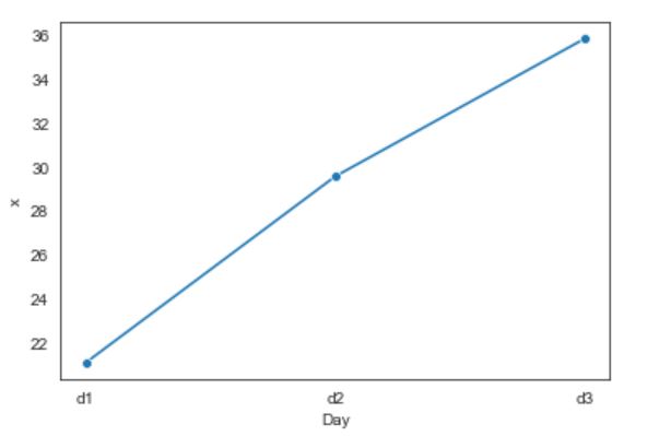
Notice how we used the marker argument here. Again, this is something we will look at more in-depth when creating Seaborn line plots with multiple lines.
Seaborn Line Graphs with Multiple Lines Example
First, we are going to continuing working with the dataset we previously created. Remember, there were two response variables in the simulated data: x, y. If we want to create a Seaborn line plot with multiple lines on two continuous variables, we need to rearrange the data.
sns.lineplot('Day', 'value', hue='variable',
             data=pd.melt(df, 'Day'))Code language: Python (python)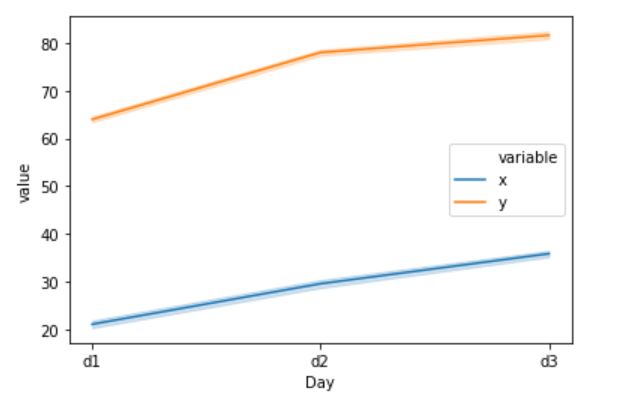
In the code, we use the hue argument and here we put ‘variable’ as a paremter because the data is transformed to long format using the melt method. Note, we can change the names of the new columns:
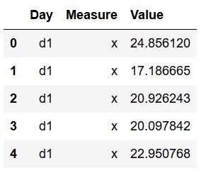
df2 = pd.melt(df, 'Day', var_name='Measure',
              value_name='Value')

sns.lineplot('Day', 'Value', hue='Measure',
             data=df2)Code language: Python (python)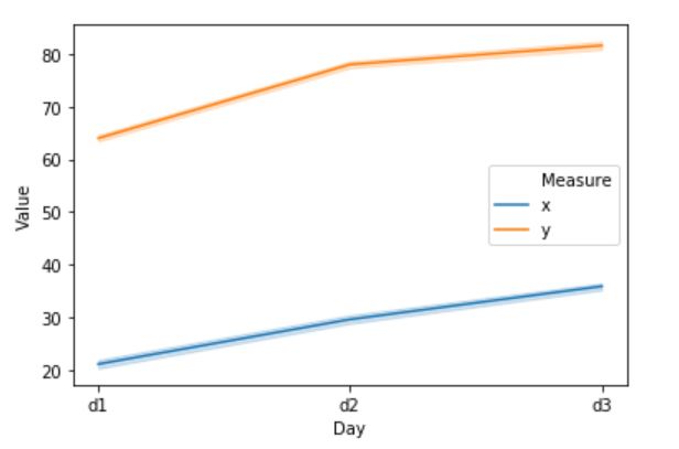
Note, it of course better to give the new columns better variable names (e.g., if we have a real dataset to create a Seaborn line plot we’d probably know). We will now continue learning more about modifying Seaborn line plots.
On a related topic, see the post about renaming columns in Pandas for information about how to rename variables.
How to Change Line Types of a Seaborn Plot with Multiple Lines
In this example, we will change the line types of the Seaborn line graph. Here’s how to change the line types:
sns.lineplot('Day', 'Value', hue='Measure',
             style='Measure', data=df2)Code language: Python (python)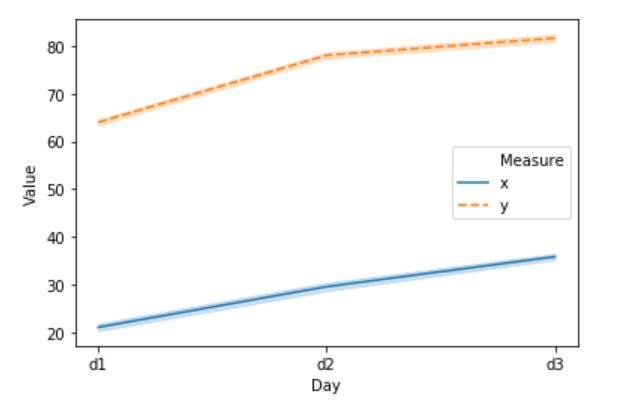
Using the new Pandas dataframe that we created in the previous example, we added the style argument. Here, we used the Measure column (x, y) to determine the style. Additionally, we can choose the style of the lines using the dashes argument:
sns.lineplot('Day', 'Value', hue='Measure',
             style='Measure',
             dashes=[(1, 1), (5, 10)],
             data=df2)Code language: Python (python)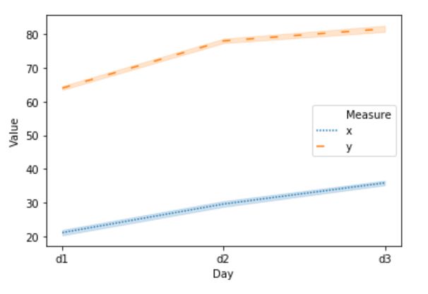
Notice, how we added two tuples to get one loosely dashed line and one dotted line. For more line styles, see the Matplotlib documentation. Changing the line types of a Seaborn line plot may be important if we are to print the plots in black and white as it makes it easier to distinguish the different lines from each other.
Changing the Color of a Seaborn Line Plot with Multiple Lines
In this example, we are going to build on the earlier examples and change the color of the Seaborn line plot. Here, we will use the palette argument (see here for more information about Seaborn palettes).
pal = sns.dark_palette('purple',2)

sns.lineplot('Day', 'Value', hue='Measure',
             style='Measure', palette=pal,
             dashes=[(1, 1), (5, 10)],
             data=df2)Code language: Python (python)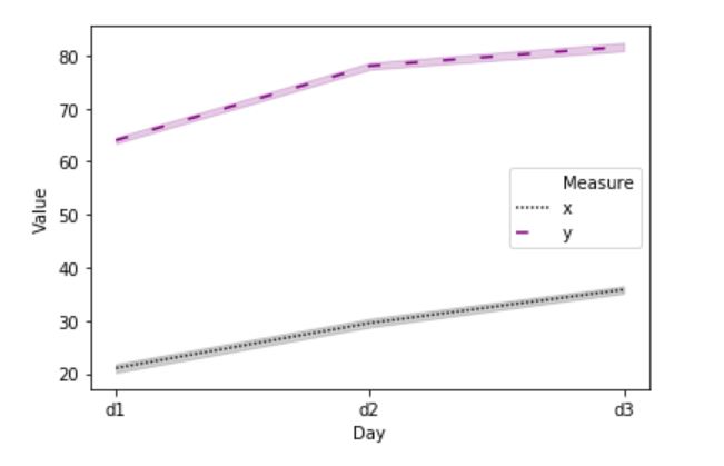
Note that we first created a palette using the dark_palette method. The first argument is probably obvious but the second is due to that we have to lines in our Seaborn line plot. If we, on the other hand, have 3 lines we’d change this to 3, of course.
Adding Dots to a Seaborn Line plots with Multiple Lines
Now, adding markers (dots) to the line plot when having multiple lines is as easy as with one line. Here we add the markers=True:
sns.lineplot('Day', 'Value', hue='Measure',
             style='Measure', markers=True,
             dashes=[(1, 1), (5, 10)],
             data=df2)Code language: Python (python)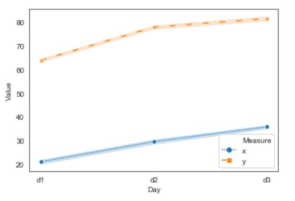
Notice how we get crosses and dots as markers? We can, of course, if we want to change this to only dots:
sns.lineplot('Day', 'Value', hue='Measure',
             style='Measure', markers=['o','o'],
             dashes=[(1, 1), (5, 10)],
             data=df2)Code language: Python (python)
Note, that it is, of course, possible to change the markers to something else. Refer to the documentation for possible marker styles.
Seaborn Line plot with Dates on the x-axis: Time Series
Now, in this example, we are going to have more points on the x-axis. Thus, we need to work with another dataset, and we are going to import a CSV file to a Pandas dataframe:
data_csv = 'https://vincentarelbundock.github.io/Rdatasets/csv/ISLR/Wage.csv'

df = pd.read_csv(data_csv, index_col=0)
df.head()Code language: Python (python)
Refer to the post about reading and writing .csv files with Pandas for more information about importing data from CSV files with Pandas.
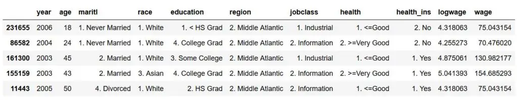
In the image above, we can see that there are multiple variables that we can group our data by. For instance, we can have a look at wage, over time, grouping by education level:
sns.lineplot('year', 'wage', ci=None,
             hue='education', data=df)Code language: Python (python)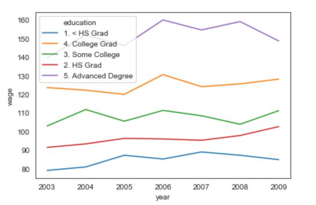
Now, we can clearly see that the legend, in the above, line chart is hiding one of the lines. If we want to move it we can use the legend method:
lp = sns.lineplot('year', 'wage', ci=None,
             hue='education', data=df)
lp.legend(loc='upper right', bbox_to_anchor=(1.4, 1))Code language: Python (python)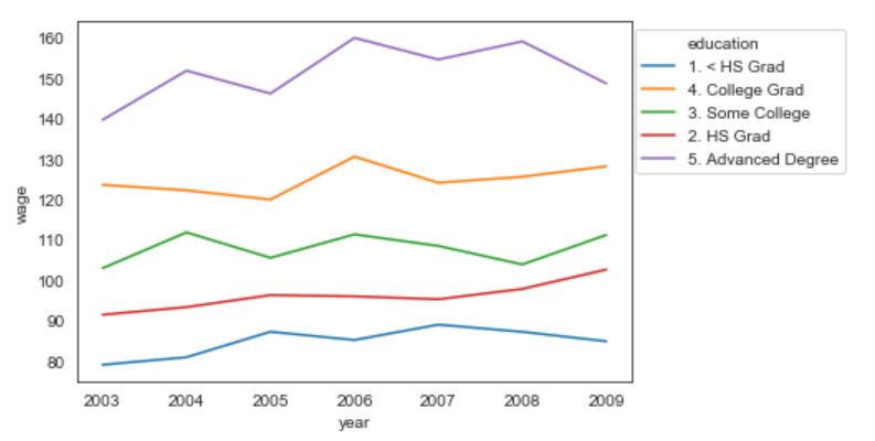
Seaborn Line Plots with 2 Categories using FacetGrid:
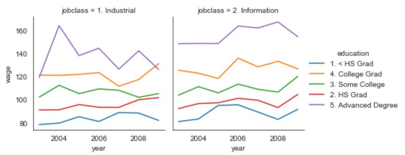
If we, on the other hand, want to look at many categories at the same time, when creating a Seaborn line graph with multiple lines, we can use FacetGrid:
g = sns.FacetGrid(df, col='jobclass', hue='education')
g = g.map(sns.lineplot, 'year', 'wage', ci=None).add_legend()Code language: Python (python)
First, in the above code chunk, we used FacetGrid with our dataframe. Here we set the column to be jobclass and the hue, still, to be education. In the second line, however, we used map and here we need to put in the variable that we want to plot aagainst each other. Finally, we added the legend (add_legend()) to get a legend. This produced the following line charts:
That was it, we now have learned a lot about creating line charts with Seaborn. There are, of course, a lot of more ways we can tweak the Seaborn plots (see the lineplot documentation, for more information).
Additionally, if we need to change the fig size of a Seaborn plot, we can use the following code (added before creating the line graphs):
import matplotlib.pyplot as plt

fig = plt.gcf()
fig.set_size_inches(12, 8)Code language: Python (python)
Finally, refer to the post about saving Seaborn plots if the graphs are going to be used in a scientific publication, for instance.
Summary
In this post, we have had a look at how to create line plots with Seaborn. First, we had a look at the simplest example with creating a line graph in Python using Seaborn: just one line. After that, we continued by using some of the arguments of the lineplot method. That is, we learned how to:
- remove the confidence interval,
- add error bars,
- change the color of the line,
- add dots (markers)
In the last sections, we learned how to create a Seaborn line plot with multiple lines. Specifically, we learned how to:
- change line types (dashed, dotted, etc),
- change color (using palettes)
- add dots (markers)
In the final example, we continued by loading data from a CSV file and we created a time-series graph, we used two categories (FacetGrid) to create two two-line plots with multiple lines. Of course, there are other Seaborn methods that allows us to create line plots in Python. For instance, we can use catplot and pointplot, if we’d like to. All code examples can be found in this Jupyter notebook.
Additional Resources
Here are some additional resources that may come in handy when it comes to line plots, in particular, but also in general when doing data visualization in Python (or any other software). First, you will find some useful web pages on how to making effective data visualizations, communicating clearly, and what you should and not should do. After that, you will find some open access-publications about data visualization. Add a comment below, if there’s a resource missing here.
- About Line Charts (to learn more about line plots)
- Interpreting Line Plots (learn how to interpret your line graphs)
- Making Effective Graphs
- Communicating Clearly with Graphs (PDF)
- Charts Dos and Dont’s
Scientific Publications
Peebles, D., & Ali, N. (2009). Differences in comprehensibility between three-variable bar and line graphs. Proceedings of the Thirty-First Annual Conference of the Cognitive Science Society, 2938–2943. Retrieved from http://citeseerx.ist.psu.edu/viewdoc/summary?doi=10.1.1.412.4953
Peebles, D., & Ali, N. (2015). Expert interpretation of bar and line graphs: The role of graphicacy in reducing the effect of graph format. Frontiers in Psychology, 6(OCT), 1–11. https://doi.org/10.3389/fpsyg.2015.01673