In this post, we are going to learn how to plot histograms with Pandas in Python. Specifically, we are going to learn 3 simple steps to make a histogram with Pandas. Now, plotting a histogram is a good way to explore the distribution of our data.
Note, at the end of this post there’s a YouTube tutorial explaining the simple steps to plot a Histogram with Pandas.
Table of Contents
- Prerequisites
- How to Make a Pandas Histogram
- How to Plot a Histogram with Pandas in 3 Simple Steps:
- How to Plot Histograms by Group using Pandas:
- How to Change the Size of a Pandas Histogram:
- Conclusion: How to Create a Histogram with Pandas in Python
Prerequisites
First of all, and quite obvious, we need to have Python 3.x and Pandas installed to be able to create a histogram with Pandas. Now, Python and Pandas will be installed if we have a scientific Python distribution, such as Anaconda or ActivePython, installed. On the other hand, Pandas can be installed, as many Python packages, using Pip: pip install pandas. Sometimes, when installing Python packages with pip, there’s a newer version of pip. Check the post about how to upgrade pip if needed.
How to Make a Pandas Histogram
Now, before we go on and learn how to make a histogram in Pandas step-by-step here’s how we generally create a histogram using Pandas: pandas.DataFrame.hist(). That is, we use the method available on a dataframe object: df.hist(column='DV'). Note, that DV is the column with the dependent variable we want to plot.
How to Plot a Histogram with Pandas in 3 Simple Steps:
Now, we are ready to learn how to make a Histogram using Pandas. It’s, as previously mentioned, very easy and we will go through each step here.
Note, if we need to visualize the relationship between two variables we may want to make a scatter plot in Python with e.g. Seaborn.
Step 1: Import Pandas
In the first step, we import pandas as pd. That is, write the following on top of the Python script or Jupyter notebook:
import pandas as pdCode language: Python (python)Step 2: Import Data
In the second step, we are going to load data from an Excel file using Pandas read_excel() method. Here’s how to read data:
from pathlib import Path

# Create path to data file
datafile = Path('Simdata', 'play_data.xlsx')

# read the excel file
df = pd.read_excel(datafile,
               index_col=0)Code language: Python (python)
Note, that in the example above the Excel file (i.e., the data) is located in the same folder as the Python script (or Jupyter notebook). It’s also possible to read CSV files into Pandas dataframes. That is if we store our data in that file type.
Step 3: Create the Histogram using Pandas hist()
In the third, and final step, we are going to create a histogram with Pandas. Specifically, we are going to use df.hist() to do this.
# pandas plot histogram
df.hist(column='RT')Code language: Python (python)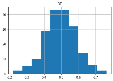
As can be seen in the code chunk above, we have also selected one column (i.e., by “column=’RT’”) to create the histogram from. Note, if we didn’t select the “RT” column, Pandas hist() method would have created histograms of all numeric variables in the dataframe:
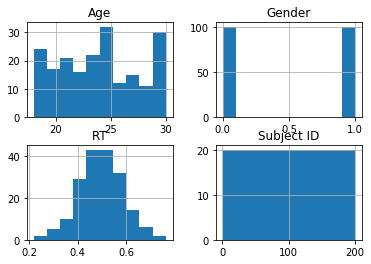
How to Plot Histograms by Group using Pandas:
Now, Pandas hist() have more parameters than the column parameter. In this section, we are going to create a histogram by gender. We will accomplish this by using the by argument:
# Pandas histogram by group:
df.hist(by='Gender',
       column='RT')Code language: Python (python)
In the histogram above, we grouped by gender. It is also possible to group the dataframe, before plotting, using Pandas groupby().
How to Change the Size of a Pandas Histogram:
In this section, we will use the figsize argument to change the size of the histogram:
# Change the size of the Pandas histogram:
df.hist(by='Gender',
       column='RT',
       figsize=[10, 6]))Code language: Python (python)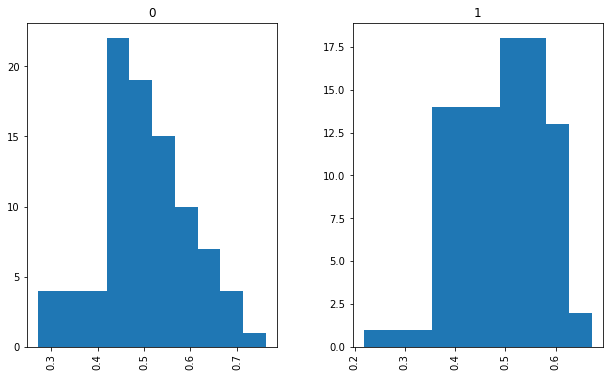
There are, of course, other arguments that can be used when plotting histograms using Pandas. Make sure you check the documentation when needed. For instance, the ticks can be rotated using the xrot argument. Now, with Pandas scatter_matrix method, we can create scatter plots with histograms, so make sure to check that post out.
Here’s a Jupyter notebook with all the code examples.
Conclusion: How to Create a Histogram with Pandas in Python
In this short post, we learned 3 simple steps to plot a histogram with Pandas. Furthermore, we learned how to create histograms by a group and how to change the size of a Pandas histogram. Of course, when it comes to data visualization in Python there are numerous of other packages that can be used. For example, if you use a package, such as Seaborn, you will see that it is easier to modify the plots. For example, using e.g. Matplotlib you can change the Seaborn plot size. That said, hope you learned something from this data visualization tutorial. Drop a comment below if there is something you want me to cover on the blog or if you have any suggestions/corrections.