In this Python data analysis tutorial, we will learn how to carry out exploratory data analysis using Python, Pandas, and Seaborn. The data we are going to explore is data from a Wikipedia article. Furthermore, we will explore the scraped data by grouping it using Python data visualization. More specifically, we will learn how to count missing values, group data to calculate the mean, and then visualize relationships between two variables, among other things. Here, we will learn how to create a scatterplot with Seaborn.
In previous posts, we have used Pandas to import data from Excel and CSV files. In this post, however, we are going to use Pandas read_html, because it has support for reading data from HTML from URLs (https or http). To read HTML Pandas use one of the Python libraries LXML, Html5Lib, or BeautifulSoup4. This means that you have to make sure that at least one of these libraries is installed. In the specific Pandas read_html example here, we use BeautifulSoup4 to parse the HTML tables from the Wikipedia article.
Table of Contents
- Installing the Libraries
- How to Use Pandas read_html
- How to Prepare Data Before Exploring it Using Pandas
- Exploratory Data Analysis in Python
- Data Visualization using Pandas and Seaborn
- Pandas Scatter Plot
- Data Visualization using Seaborn
- Conclusion
Installing the Libraries
Before proceeding to learn how to carry out exploratory data analysis we are going to install the required Python libraries. In this post, we are going to use Pandas, Seaborn, NumPy, SciPy, and BeautifulSoup4. We are going to use Pandas to parse HTML and plotting, Seaborn for data visualization, NumPy and SciPy for some calculations, and BeautifulSoup4 as the parser for the read_html method.
Installing Anaconda is the absolutely easiest method to install all packages needed. If your Anaconda distribution you can open up your terminal and type: conda install <packagename>. That is, if you need to install all the packages:
conda install numpy scipy pandas seaborn beautifulsoup4Code language: Bash (bash)It’s also possible to install using Pip:
pip install numpy scipy pandas seaborn beautifulsoup4Code language: Bash (bash)In a more recent post, you can learn all about installing, using, and upgrading Python packages using both Pip and conda. Finally, sometimes when we install Python packages using pip we may get be noticed that we don’t have the latest version of pip:

If needed, we can, of course, upgrade pip using pip, conda, or anaconda.
How to Use Pandas read_html
In this section, we will work with Pandas read_html to parse data from a Wikipedia article. The article we are going to parse has six tables and there are some data we are going to explore in five of them. We are going to look at Scoville Heat Units and Pod sizes of different chili pepper species.
Pandas read_html example:
Here is an example of how to use Pandas to read HTML tables:
import pandas as pd

url = 'https://en.wikipedia.org/wiki/List_of_Capsicum_cultivars'
data = pd.read_html(url, flavor='bs4', header=0, encoding='UTF8')Code language: Python (python)
In the code above we are, as usual, starting by importing pandas. After that, we have a string variable (i.e., URL) that is pointing to the URL. We are then using Pandas read_html to parse the HTML from the URL. As with the read_csv and read_excel methods, the parameter header is used to tell Pandas read_html on which row the headers are. In this case, it is the first row.
The parameter flavor is used here to make use of beatifulsoup4 as an HTML parser. If we use LXML, some columns in the dataframe will be empty. Anyway, what we get is all tables from the URL. These tables are, in turn, stored in a list (data). In this example the last table is not of interest:
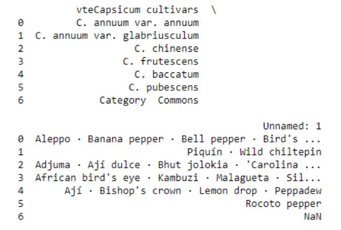
Thus we are going to remove this dataframe from the list:
# Let's remove the last table
del data[-1]Code language: PHP (php)
Merging Pandas Dataframes
The aim of this post is to explore the data and what we need to do now is to add a column in each dataframe in the list. This column will have information about the species and we create a list with strings. In the following for-loop we are adding a new column, named “Species”, and we add the species name from the list.
species = ['Capsicum annum', 'Capsicum baccatum', 'Capsicum chinense',
          'Capsicum frutescens', 'Capsicum pubescens']


for i in range(len(species)):
    data[i]['Species'] = species[i]Code language: Python (python)
Finally, we are going to concatenate the list of dataframes using Pandas concat:
# Concatenating the dataframes:
df = pd.concat(data, sort=False)
df.head()Code language: Python (python)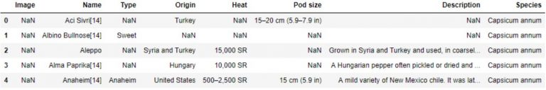
The data we obtained using Pandas read_html can be saved locally using Pandas to_csv or to_excel, among other methods. See the two following tutorials on how to work with these methods and file formats:
In the next section, we are going to prepare the data before performing exploratory data analysis in Python.
How to Prepare Data Before Exploring it Using Pandas
Now that we have used Pandas to read HTML tables and merged the data to the dataframes we need to clean up the data a bit. We will use the method map together with lambda and regular expressions (i.e., sub, findall) to remove and extract certain things from the cells. We are also using the split and rstrip methods to split the strings into pieces. In this example, we want the centimeter values. Because of the missing values in the data, we have to see if the value from a cell (x, in this case) is a string. If not, we will use NumPy’s NaN to code that it is a missing value.
# Remove brackets and whats between them (e.g. [14])
df['Name'] = df['Name'].map(lambda x: re.sub("[\(\[].*?[\)\]]", "", x)
                                         if isinstance(x, str) else np.NaN)

# Pod Size get cm
df['Pod size'] = df['Pod size'].map(lambda x: x.split(' ', 1)[0].rstrip('cm')
                                              if isinstance(x, str) else np.NaN)

# Taking the largest number in a range and convert all values to float
df['Pod size']  = df['Pod size'].map(lambda x: x.split('–', 1)[-1]
                                              if isinstance(x, str) else np.NaN)
# Convert to float
df['Pod size'] = df['Pod size'].map(lambda x: float(x))

# Taking the largest SHU
df['Heat'] = df['Heat'].map(lambda x: re.sub("[\(\[].*?[\)\]]", "", x)
                            if isinstance(x, str) else np.NaN)
df['Heat'] = df['Heat'].str.replace(',', '')
df['Heat'] = df['Heat'].map(lambda x: float(re.findall(r'\d+(?:,\d+)?', x)[-1])
                            if isinstance(x, str) else np.NaN)Code language: Python (python)
Exploratory Data Analysis in Python
In this section we are going to explore the data using Pandas and Seaborn. First we are going to see how many missing values we have, count how many occurrences we have of one factor, and then group the data and calculate the mean values for the variables.
Counting Missing Values
The first thing we will do is count the number of missing values in the different columns. We are going to do this using the isna and sum methods:
df.isna().sum()Code language: Python (python)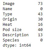
Later in the post, we are going to explore the relationship between the heat and the pod size of chili peppers. Note, there are a lot of missing data in both of these columns.
Counting Categorical Data in a Column
We can also count how many factors (or categorical data; i.e., strings) we have in a column by selecting that column and using the Pandas Series method value_counts:
df['Species'].value_counts()Code language: Python (python)Aggregating by Group
We can also calculate the mean Heat and Pod size for each species using Pandas groupby and mean methods:
df_aggregated = df.groupby('Species').mean().reset_index()
df_aggregatedCode language: Python (python)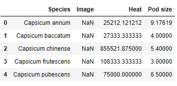
Of course, there are many other ways to explore your data using Pandas methods (e.g., value_counts, mean, groupby). For more information, see the posts Descriptive Statistics using Python and Data Manipulation with Pandas.
Data Visualization using Pandas and Seaborn
In this section, we are going to visualize the data using Pandas and Seaborn. We are going to start to explore whether there is a relationship between the size of the chili pod (‘Pod size’) and the heat of the chili pepper (Scoville Heat Units).
More on Data Visualization using Python, Seaborn, and Pandas:
- How to Make a Scatter Plot in Python using Seaborn
- 9 Data Visualization Techniques You Should Learn in Python
Pandas Scatter Plot
In the first scatter plot, we will use Pandas’ built-in method ‘scatter‘. In this basic example, we will have pod size on the x-axis and heat on the y-axis. We are also getting the blue points by using the parameter c.
ax1 = df.plot.scatter(x='Pod size',
                    y='Heat',
                     c='DarkBlue')Code language: Python (python)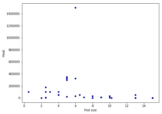
There seems to be a linear relationship between heat and pod size. However, we have an outlier in the data and the pattern may be more clear if we remove it. Thus, in the next Pandas scatter plot example we are going to subset the dataframe taking only values under 1,400,000 SHU:
ax1 = df.query('Heat < 1400000').plot.scatter(x='Pod size',
                    y='Heat',
                     c='DarkBlue', figsize=(8, 6))Code language: Python (python)
We used pandas query to select the rows where the value in the column ‘Heat’ is lower than the preferred value. The resulting scatter plot shows a more convincing pattern:
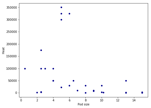
We still have some possible outliers (around 300,000 – 35000 SHU) but we are going to leave them. Note that I used the parameter figsize=(8, 6) in both plots above to get the dimensions of the posted images. That is, if you want to change the dimensions of the Pandas plots you should use figsize.
Now we would like to plot a regression line on the Pandas scatter plot. As far as I know, this is not possible (please comment below if you know a solution and I will add it). Therefore, we are now going to use Seaborn to visualize data as it gives us more control and options over our graphics.
Data Visualization using Seaborn
In this section, we are going to continue exploring the data using the Python package Seaborn. We start with scatter plots and continue with
Seaborn Scatter Plot
Creating a scatter plot using Seaborn is very easy. In the basic scatter plot example below we are, as in the Pandas example, using the parameters x and y (x-axis and y-axis, respectively). However, we have to use the parameter data and our dataframe.
import seaborn as sns

ax = sns.regplot(x="Pod size", y="Heat", data=df.query('Heat < 1400000'))Code language: JavaScript (javascript)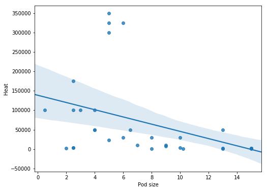
It’s also possible to change the size of a Seaborn plot, of course. For more about creating Scatter Plots in Python check this YouTube Video:
How to Carry out Correlation Analysis in Python
Judging from above there seems to be a relationship between the variables of interest. The next thing we are going to do is to see if this visual pattern also shows up as a statistical association (i.e., correlation). To this aim, we are going to use SciPy and the pearsonr method. We start by importing pearsonr from scipy.stats.
from scipy.stats import pearsonrCode language: Python (python)As we found out when exploring the data using Pandas groupby there was a lot of missing data (both for heat and pod size). When calculating the correlation coefficient using Python we need to remove the missing values. Again, we are also removing the strongest chili pepper using Pandas query.
df_full = df[['Heat', 'Pod size']].dropna()
df_full = df_full.query('Heat < 1400000')
print(len(df_full))
# Output: 31Code language: Python (python)
Note, in the example above we are selecting the columns “Heat” and “Pod size” only. If we want to keep the other variables but only have complete cases we can use the subset parameter (df_full = df.dropna(subset=['Heat', 'Pod size'])). That said, we now have a subset of our dataframe with 31 complete cases and it’s time to carry out the correlation. It’s quite simple, we just put in the variables of interest. We will display the correlation coefficient and p-value on the scatter plot later so we use NumPy’s round to round the values.
Python Correlation Example:
Here we use pearsonr to calculate the correlation coefficient between the heat and size of chili peppers:
corr = pearsonr(df_full['Heat'], df_full['Pod size'])
corr = [np.round(c, 2) for c in corr]
print(corr)
# Output: [-0.37, 0.04]Code language: Python (python)
If we have a lot of variables we want to correlate, we can create a correlation matrix in Python using NumPy or Pandas.
Seaborn Correlation Plot with Trend Line
It’s time to stitch everything together! First, we are creating a text string for displaying the correlation coefficient (r=-0.37) and the p-value (p=0.04). Second, we are creating a correlation plot using Seaborn regplot, as in the previous example.
How to Add Text to a Seaborn Plot
To display the text we use the text method; the first parameter is the x coordinate, and the second is the y coordinate. After the coordinates, we have our text and the size of the font. We are also using set_title to add a title to the Seaborn plot, and we are changing the x- and y-labels using the set method.
text = 'r=%s, p=%s' % (corr[0], corr[1])
ax = sns.regplot(x="Pod size", y="Heat", data=df_full)
ax.text(10, 300000, text, fontsize=12)
ax.set_title('Capsicum')
ax.set(xlabel='Pod size (cm)', ylabel='Scoville Heat Units (SHU)')Code language: Python (python)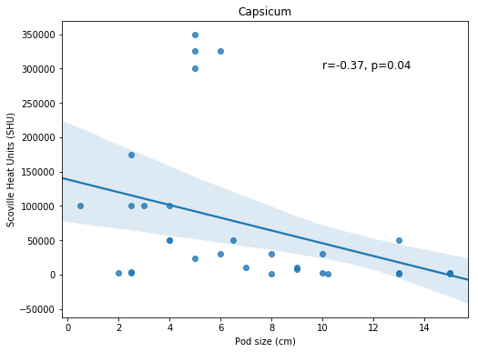
Pandas Bar graph Example
Now we are going to visualize some other aspects of the data. We are going to use the aggregated data (grouped by using Pandas groupby) to visualize the mean heat (Scoville) across species. We start by using Pandas plot method:
df_aggregated = df.groupby('Species').mean().reset_index()
df_aggregated.plot.bar(x='Species', y='Heat')Code language: Python (python)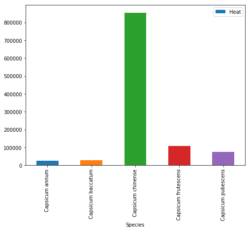
In the image above, we can see that the mean heat is highest for the Capsicum Chinense species. However, the bar graph might hide important information (remember, the scatter plot revealed some outliers). We are therefore continuing with a categorical scatter plot using Seaborn.
Grouped Scatter Plot with Seaborn
Here, we do not add that much compared to the previous Seaborn scatter plots examples. However, we need to rotate the tick labels on the x-axis using set_xticklabels and the parameter rotation.
ax = sns.catplot(x='Species', y='Heat', data=df)
ax.set(xlabel='Capsicum Species', ylabel='Scoville Heat Units (SHU)')
ax.set_xticklabels(rotation=70)Code language: Python (python)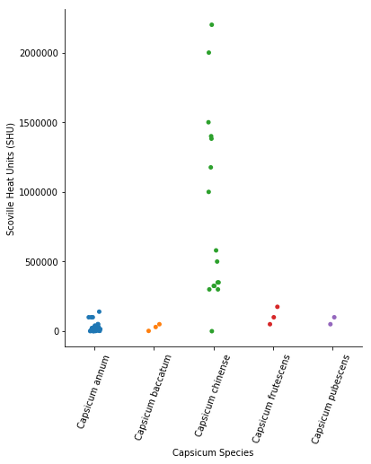
Finally, if we are going to write up the results from this explorative data analysis, we need to save the Seaborn (or Pandas) plots as high-resolution files. This can be done by using Matplotlib and pyplot.savefig().
Conclusion
Now we have learned how to explore data using Python, Pandas, NumPy, SciPy, and Seaborn. Specifically, we have learned how to use Pandas read_html to parse HTML from a URL, clean up the data in the columns (e.g., remove unwanted information), create scatter plots both in Pandas and Seaborn, visualize grouped data, and create categorical scatter plots in Seaborn. We now have an idea of how to change the axis ticks labels rotation, change the y- and x-axis labels, and add a title to Seaborn plots.
Now, there are of course many other methods that you can use when carrying out exploratory data analysis (e.g. with Python). Drop a comment below, for your favorite ways to explore your data!