data visualization

R violin plot

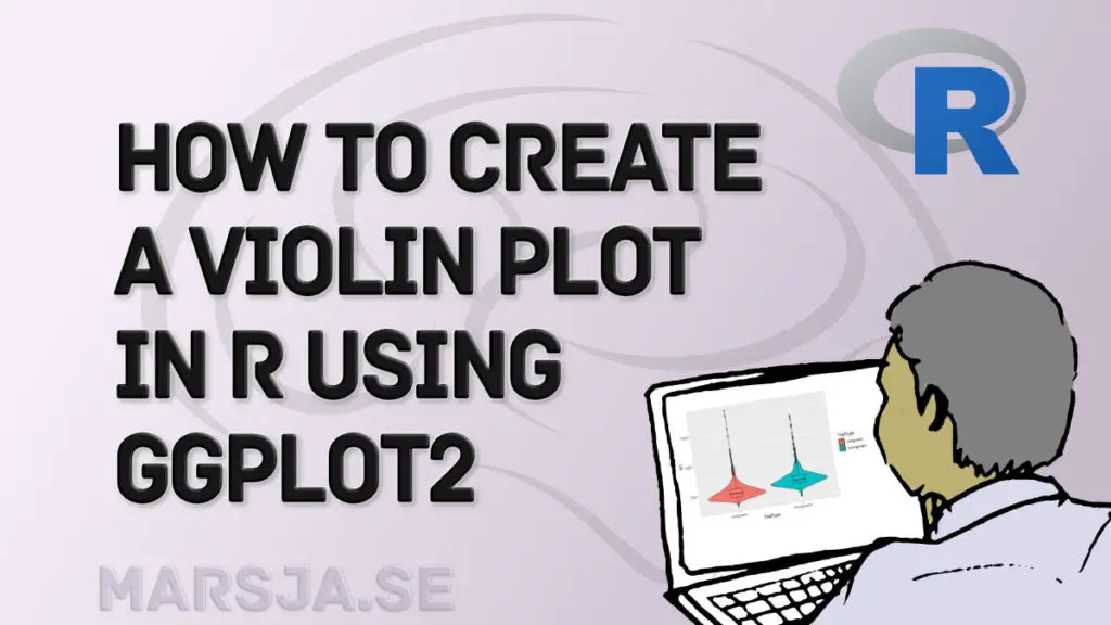
How to Create a Violin plot in R with ggplot2 and Customize it

This data visualization tutorial will teach us how to make a violin plot in R using ggplot2. We can use several techniques to visualize data (see, for example, the Python-related post “9 Data Visualization Techniques You Should Learn in Python“) to visualize our data in r. Briefly described, violin plots combine a box plot and

How to Create a Violin plot in R with ggplot2 and Customize it Read More »

How to Make a Violin plot in Python using Matplotlib and Seaborn

In this Python data visualization tutorial, we will learn how to create a violin plot in Python with Matplotlib and Seaborn. We can carry out several techniques for visualizing data (see the post 9 Data Visualization Techniques You Should Learn in Python for some examples). Violin plots combine both the box plot and the histogram.

How to Make a Violin plot in Python using Matplotlib and Seaborn Read More »

9 Data Visualization Techniques You Should Learn in Python

With the ever-increasing volume of data, it is impossible to tell stories without visualizations. Data visualization is an art of how to turn numbers into useful knowledge. Using Python we can learn how to create data visualizations and present data in Python using the Seaborn package. In this post we are going to learn how

9 Data Visualization Techniques You Should Learn in Python Read More »

Scroll to Top