With the ever-increasing volume of data, it is impossible to tell stories without visualizations. Data visualization is an art of how to turn numbers into useful knowledge. Using Python we can learn how to create data visualizations and present data in Python using the Seaborn package.
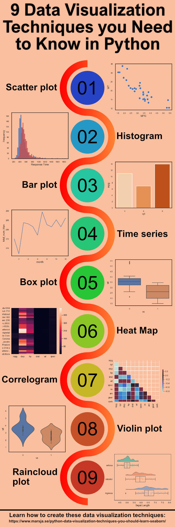
In this post we are going to learn how to create the following 9 plots:
- Scatter Plot
- Histogram
- Bar Plot
- Time Series Plot
- Box Plot
- Heat Map
- Correlogram
- Violin Plot
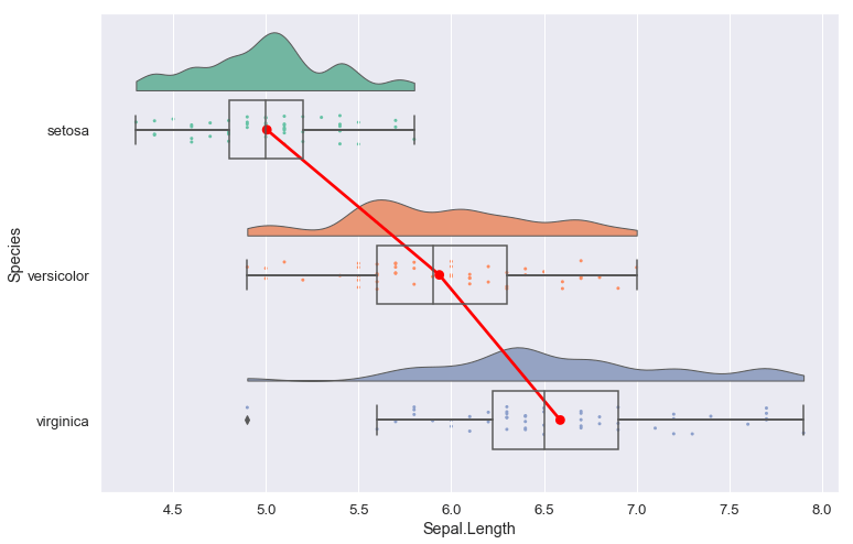
- Raincloud Plot
In the next section, before we get into the Python data visualization examples, you will learn about the package we will use to create the plots.
Python Data Visualization Tutorial: Seaborn
As previously mentioned in this Python Data Visualization tutorial we are mainly going to use Seaborn but also Pandas, and Numpy. However, to create the Raincloud Plot we are going to have to use the Python package ptitprince.