How to Make a Volcano Plot in R using ggplot2

In this volcano plot in R tutorial, we will use ggplot2, a package for creating beautiful and customizable graphics in R. A volcano plot in R is a scatter plot showing the relationship between the fold change and the statistical significance in certain data types.

Outline

This data visualization tutorial will start by learning the prerequisites to follow the post. To create a volcano plot in R, you follow these general steps that we will learn in this post;:

  1. Prepare your data
  2. Plot the data using ggplot2

Read more

Exploring response time distributions using Python

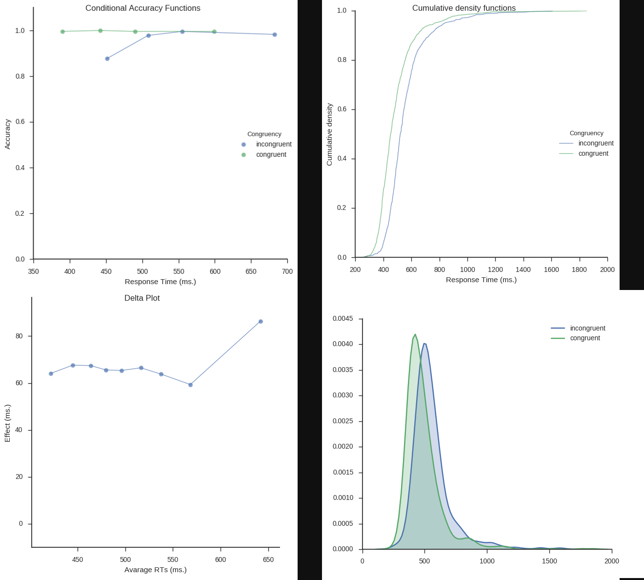
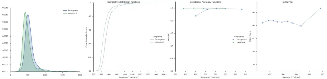
Inspired by my post for the JEPS Bulletin (Python programming in Psychology), where I try to show how Python can be used from collecting to analyzing and visualizing data, I have started to learn more data exploring techniques for Psychology experiments (e.g., response time and accuracy). Here are some methods, using Python, for visualization of distributed data that I have learned; kernel density estimation, cumulative distribution functions, delta plots, and conditional accuracy functions. These graphing methods let you explore your data in a way just looking at averages will not (e.g., Balota & Yap, 2011).

Kernel density estimation, Cumulative distribution functions, Delta plots, and Conditional Accuracy Functions

Required Python packages

I used the following Python packages; Pandas for data storing/manipulation, NumPy for some calculations, Seaborn for most of the plotting, and Matplotlib for some tweaking of the plots. Any script using these functions should import them:

Read more